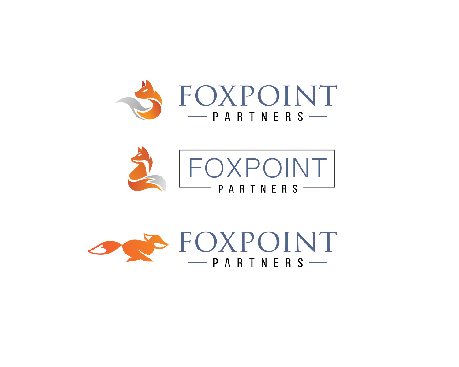
logo design for niche financial firm located in Foxpoint section of Providence, RI
Vous souhaitez remporter un projet comme celui-ci ?
Ce client a reçu 290 designs de logo de la part de 88 designers. Il a choisi ce design de logo de ndrowbee comme design gagnant.
Inscrivez-vous Trouvez des Projets de Design- Garanti
-
 US$150
-
 290 designs
-
 88 designers
Brief de Design de Logo
We need a logo for a company based in Providence, RI named Foxpoint Partners. We have two divisions. One buys and sells lottery receivables. The other one lends to real estate developers and investors ("hard money loans").
But we also raise funds for the real estate lending fund, as our lending is privately funded (i.e. non-deposit taking institution).
We want the logo to be very simple, and we like some of the financial ones such as Blackstone where the logo is simply the words in negative (i.e. white letters on colored background). But we would also like to see a logo with letters simply enclosed in a rectangle (no negative).
We would prefer thin letters, no serif, but please provide both serif and non serif examples. Thin box outline. One version with a fox in it might be helpful (Foxpoint Partners, get it?)
And then anything else you think of. We liked the color red last time, but please try other colors as well. A dark blue might be good, but if we were good designers, we wouldn't need you. I will probably be giving a fair amount of feedback to you to guide people to what we want, especially given the short timeframe.
We think we really want this to run for three days, but that is not one of the default choices, so please get submissions in as soon as possible, particularly so we can work to alter to suit.
Keep in mind that this is a financial firm. Particularly on the lending side, so quality, security, high-class operation are essential to communicate.
See some qualifications in "nice to haves".
Marché(s) Cible(s)
property investors and developers, lottery winners, buyers of and investors in financial instruments
Secteur / Type d'entité
Financial
Texte du logo
Foxpoint Partners
Styles de logo qui vous intéressent
Logo mot symbole
Logo (texte seulement)
Styles de police à utiliser
Couleurs
Le designer choisit les couleurs à utiliser dans le design.
Aspect
Chaque curseur illustre les caractéristiques de la marque client et le style que doit transmettre votre design de logo.
Élégant
Audacieux
Léger
Sérieux
Traditionnel
Moderne
Sympathique
Professionnelle
Féminin
Masculin
Coloré
Conservateur
Économique
Haut de gamme
Exigences
Doit avoir
- The name of the company. At least one submission needs to include a fox, and at least one submission needs to not include a fox. (Despite the fact that I am calling it a "word mark" logo.
Bien d'avoir
- I explained this in the long project description, but we think we would like thin sans serif letters enclosed in a thin rectangle. We would like letters in both serif and sans serif styles for comparison. (Again, despite the fact that I am stating that it should be a sans serif.)
Ne doit pas comporter
- I didn't express a color preference, but I don't think yellow or green will work for us. You can try, but I doubt either of those will work for us.