The Partnership Practice Logo
Vous souhaitez remporter un projet comme celui-ci ?
Ce client a reçu 164 designs de logo de la part de 52 designers. Il a choisi ce design de logo de OneSource Creative comme design gagnant.
Inscrivez-vous Trouvez des Projets de Design- Garanti
-
 US$500
-
 164 designs
-
 52 designers
Brief de Design de Logo
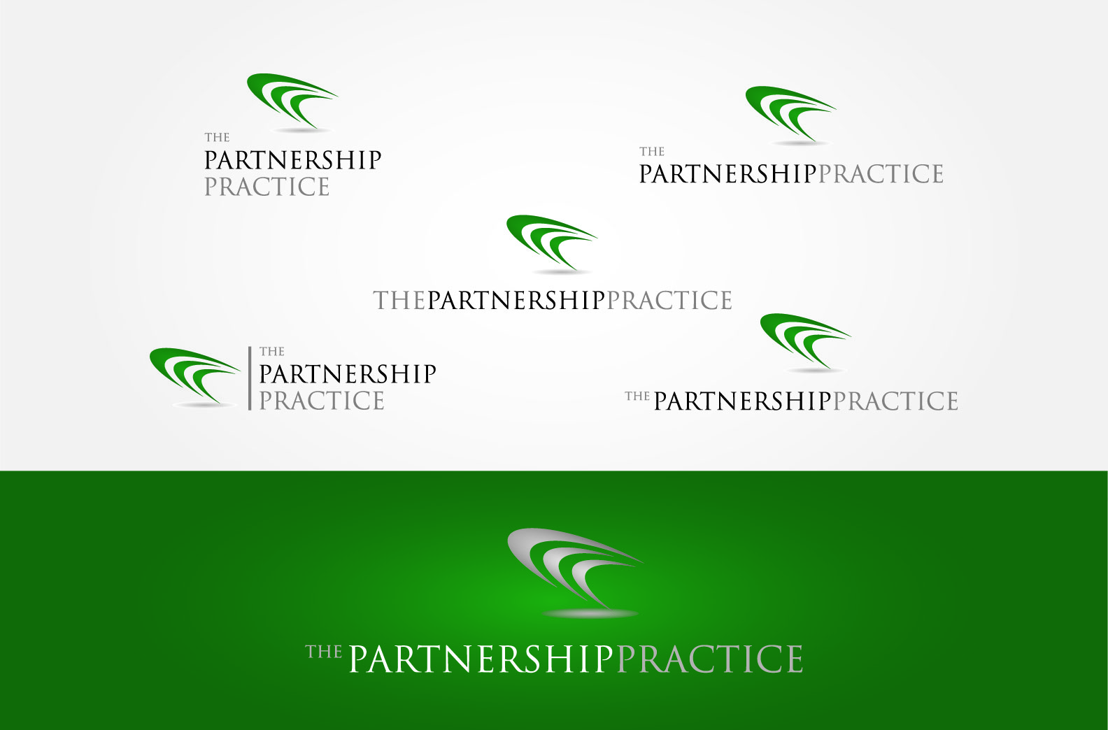
The Partnership Practice is a new marketing services company that specialises in finding, negotiating and leveraging partnerships. For example, we might create a partnership between a beer brand and a football team or a bank and a music event or a utilities company and an Arts festival. The business has 3 main areas of expertise. brand partnerships, business partnerships and partnership services. The Partnership Practice needs a logo !
Mises à jour
Hi Guys,
Thanks for all the hard work - there is some really great thinking. After looking at all the proposals, I dont think the Celtic weave & celtic ring is working like I thought it would so please feel free to forget about it and find another interesting way of approaching the brief.
Thanks,
Lucy
Marché(s) Cible(s)
The company is targeting large corporations of all kinds. All over the world. On one hand this means the business has to be taken seriously so we cannot rely on gimmicks or cheap iconography and on the other we need a fresh contemporary feel (to demonstrate creativity). The current market is filled with companies that have way too abstract names – The Partnership Practice states exactly what it does and what it stands for.
Texte du logo
The Partnership Practice
Exigences
Doit avoir
- - The Partnership Practice wording should be used in full.
- - We must reflect that the business is SERIOUS ABOUT WHAT IT DOES but has A CREATIVE EDGE. We’re as serious as Accenture or IBM but as creative as Apple.
- - We need an icon/hot button of some sort that sits alongside or above or below the wording. This will not be an image or character – more like the star on the BP logo or the colored windows on the Microsoft Windows logo or the apple for apple.
- - Tone : Fresh, Dynamic, Makes a statement DEFINITELY NOT too abstract
- - ONE IDEA I HAD BUT AM NOT SURE IS WORKING IN THE DESIGNS I HAVE SEEN SO FAR :- CELTIC MARRIAGE METAPHOR
- You will see in the attachments examples of a celtic weave and celtic wedding ring. Celtic Scottish wedding practices were part of ceremonies for many hundreds of years. Tying the knot originated from the bride and groom ripping their wedding plaids (clan tartans) and tying the two strips together as a symbol of the unity of the two families. Celtic wedding bands were worn as a symbol of this unity. The celtic wedding ring, with its 3 rings could be a starting point for the icon.
Bien d'avoir
- - The business proposition is “Accelerating 3rd party return” which could be incorporated if the design allows (but it is not an absolute necessity, don’t want things to get too cluttered)
- - The number 3 features prominently in this business – 3 parts of the business ; 3 parties in each project (The Partnership Practice plus 2 partners)
- - Our business ethos could be considered (Shared Agenda, Shared Risk, Shared Reward) ; again a 3 !
Ne doit pas comporter
- Please please please no basic partnership references – we’ve seen them all. No interest in considering hand shaking, hand holding, zippers, basic word play, old style text, smiling faces, people arm-in-arm, etc etc.