Logo design for [re-branding] digital marketing agency.
Vous souhaitez remporter un projet comme celui-ci ?
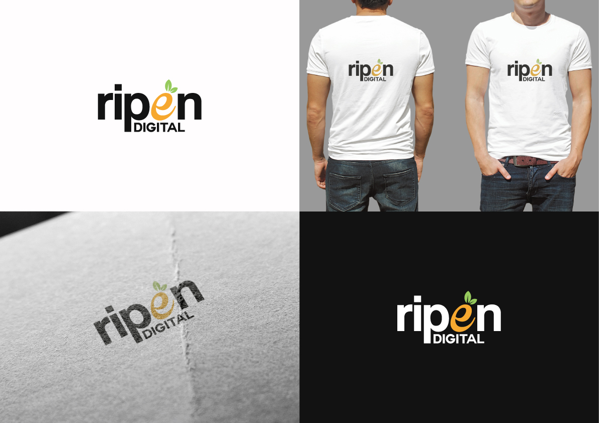
Ce client a reçu 240 designs de logo de la part de 86 designers. Il a choisi ce design de logo de The Marble Peach comme design gagnant.
Inscrivez-vous Trouvez des Projets de Design- Garanti
-
 US$150
-
 240 designs
-
 86 designers
Brief de Design de Logo
I need a new logo for my digital marketing agency, currently going through a re-branding.
RIPEN Digital provides inbound marketing services, designed to attract, convert, & close new prospects for our clients ("RIPEN" their sales funnel). I've been contracting for 5-6 years as a side hustle under another LLC and now that I've taken the plunge to work full-time on the agency I'd like to rebrand/add some legitimacy to my brand. Definitely want to play on the "ripening your customer base", "fruitful marketing" aspect.
I'm open to your full creativity, but I do have a few preferences/wants:
-I'd prefer to maintain a 16:9 aspect ratio (but don't let this stop you if you have another creative idea in mind).
-I'd like the main colors of the logo to be: #96c95c and #f9a82f (very citrus feel). Again, this is a preference, and if you feel like you'd prefer to use different shades, etc., please feel free to do so.
-I have a preference for flat design
-I had envisioned incorporating a slice of citrus fruit (flat design), or a drop of fresh squeezed juice somewhere into the logo. Definitely not a requirement, but just something I had brainstormed.
As reference, I really like the look/layout of this logo (NewsCred): http://19871-presscdn.pagely.netdna-cdn.com/wp-content/themes/newscred/assets/img/v3/press/newscred-logo-primary-rgb.png
Thanks,
James
Marché(s) Cible(s)
Small/mid-sized businesses.
Secteur / Type d'entité
Marketing
Texte du logo
RIPEN Digital
Styles de logo qui vous intéressent
Logo pictural
Un objet réel (texte facultatif)
Logo abstrait
Conceptuel / symbolique (texte facultatif)
Logo mot symbole
Logo (texte seulement)
Logo de Lettermark
Acronyme ou logo texte (texte seulement)
Styles de police à utiliser
Couleurs
Couleurs choisies par le client et à utiliser dans le design de logo:
Aspect
Chaque curseur illustre les caractéristiques de la marque client et le style que doit transmettre votre design de logo.
Élégant
Audacieux
Léger
Sérieux
Traditionnel
Moderne
Sympathique
Professionnelle
Féminin
Masculin
Coloré
Conservateur
Économique
Haut de gamme
Exigences
Doit avoir
- -I'd like the main colors of the logo to be: #96c95c and #f9a82f (very citrus feel).
Bien d'avoir
- -I'd prefer to maintain a 16:9 aspect ratio (but don't let this stop you if you have another creative idea in mind).
- -I have a preference for flat design
- -I had envisioned incorporating a slice of citrus fruit (flat design), or a drop of fresh squeezed juice somewhere into the logo. Definitely not a requirement, but just something I had brainstormed.
- -"RIPEN" should ideally be the main focus of the logo/big & bold. "Digital" can be small/creatively worked in somehow
Ne doit pas comporter
- N/A