Children's nonprofit golf tournament logo
Vous souhaitez remporter un projet comme celui-ci ?
Ce client a reçu 65 designs de logo de la part de 23 designers. Il a choisi ce design de logo de Jay Design comme design gagnant.
Inscrivez-vous Trouvez des Projets de Design-
 US$150
-
 65 designs
-
 23 designers
Brief de Design de Logo
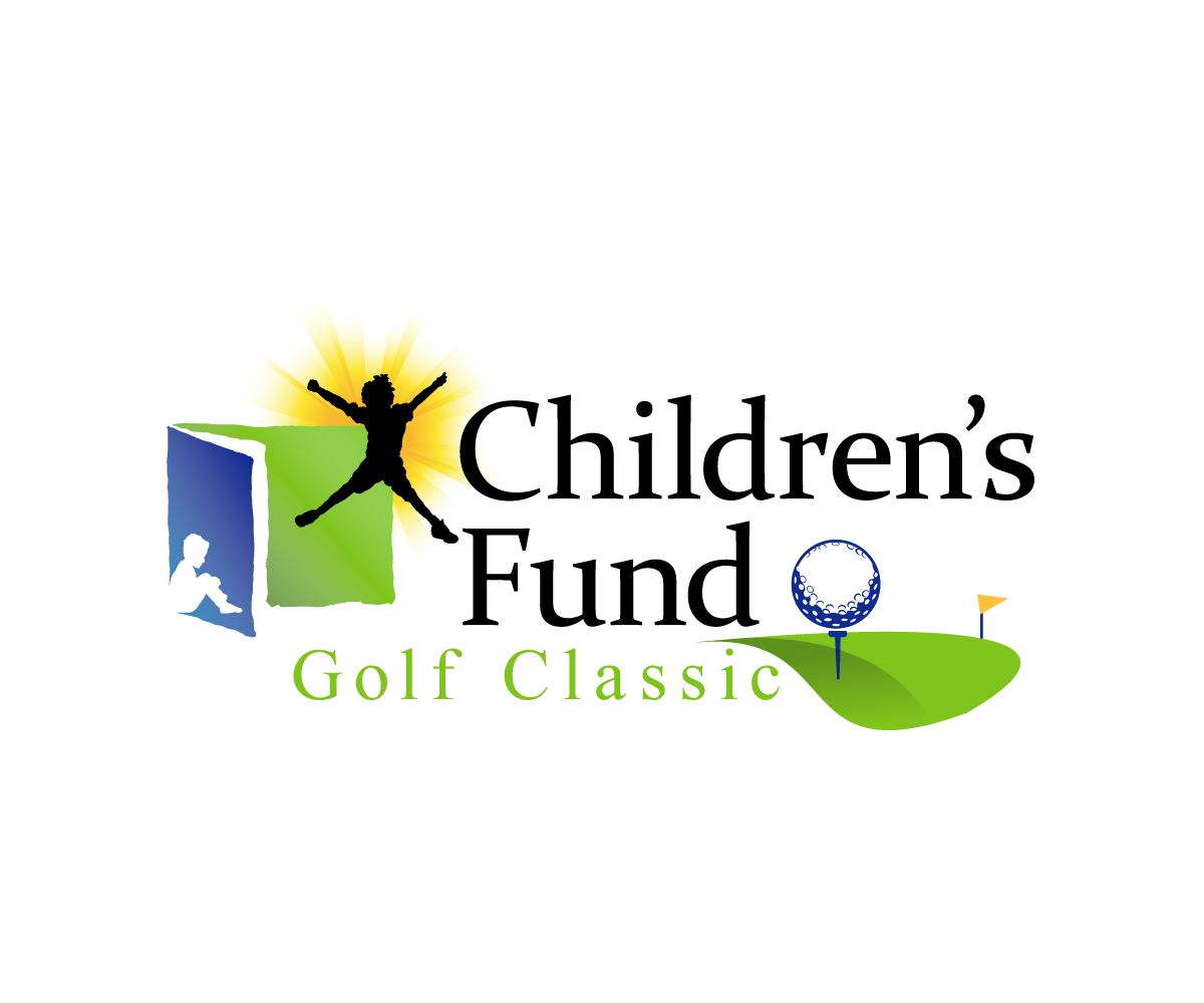
This project requires the creation of a logo for a golf tournament for Children's Fund, a 30 year old nonprofit in San Bernardino, CA. We would like the new golf classic logo to be a hybrid of our Children's Fund logo. If you look at the logo we designed for our 30th anniversary, you can see how the original nonprofit logo is still entact but we've added a special element (the 30) in the bottom right side of the logo. We want to stick to this methodology and use the original nonprofit logo for our golf classic logo, but place something like a golf ball in the bottom right hand side of the logo. We want to keep the original nonprofit logo in place, but remove the tagline and insert "Golf Classic" in there with some graphic element in the bottom right of the logo.
Marché(s) Cible(s)
high income, golfers, people who want to support children.
Secteur / Type d'entité
Non Profit
Texte du logo
Children's Fund Golf Classic
Styles de police à utiliser
Aspect
Chaque curseur illustre les caractéristiques de la marque client et le style que doit transmettre votre design de logo.
Élégant
Audacieux
Léger
Sérieux
Traditionnel
Moderne
Sympathique
Professionnelle
Féminin
Masculin
Coloré
Conservateur
Économique
Haut de gamme
Exigences
Doit avoir
- Must have the original nonprofit logo in it (Children's fund with the blue and green boxes, the yellow starburst and the two kid shadows.) Do not use the tagline. Must have some graphic element in the bottom right side of the logo (like we did in the provided sample 30th anniversary logo.)
Bien d'avoir
- golf ball, tee, golf flag
- Colors of our logo. Do not add any additional colors.
- Blue: CMYK: 100/68/0/12
- Yellow: 0/24/94/0
- Green: 50/0/100/0
Ne doit pas comporter
- too much...want to keep it pretty simple and not stray too much from the original feel and tone of the nonprofit logo.