Business Card Upgrade
Vous souhaitez remporter un projet comme celui-ci ?
Ce client a reçu 159 designs de carte de visite de la part de 34 designers. Il a choisi ce design de carte de visite de KD Designz comme design gagnant.
Inscrivez-vous Trouvez des Projets de Design- Garanti
-
 US$465
-
 159 designs
-
 34 designers
Brief de Design de Carte de Visite
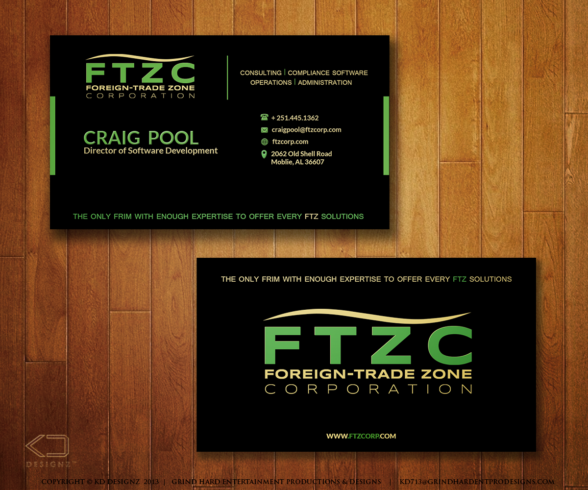
I have designed our business card using our new logo. I think it needs imporovements. We used to have two cards for our business. One card was for our software business, and the other was for our consulting business. We are now in the process of combining our websites, marketing, name, and a new logo.
Our goal is to have a really sharp professional logo. One reason I designed the card the way I did was that our Titles are sometimes long, and by separating the person's name and title, it shows up very well and the title can be adjusted no matter how long it is. Sometimes the title can be 4 or 5 words or more.
We really like our logo on black as it shows up very nice. Our PMS colors are as follows: 368C and 459C.
The Designer that will be working with us will need to deliver the following:
The front and back of the Business Card Design will need to be delivered in a high quality JPEG, and
The front and back of the Business Card Design in Illustrator Format .ai
Any fonts will need to be sent to us if they are not standard and are required to open the Illustrator file correctly.
To help us get a good idea of the card with a title, please use the title: " Director of Software Development "
NOTE: The chosen designer will be selected to design our new letterhead within 2 weeks from the closing of this contest.
Mises à jour
To help us make sure the card design works with longer titles, please use the followign job title on the card:
"Director of Software and Product Development"
Added Saturday, October 19, 2013
ALL DESIGNERS:
1. I appreciate the different angles you are showing the cards, but please be sure and always show the direct view, so I can see the layout and what the person I hand the card will see.
2. Please do not use white. Please use off white as I don't care for white cards and they get dirty easy and do not represent the designs well.
Added Saturday, October 19, 2013
Dear Designers,
Please provide samples straight one as a viewer of the card will see. Some of the angles that are presented make it impossible to tell how everything fits, and sometimes even makes areas look skewed. So, please provide a straight sample view.
Added Sunday, October 20, 2013
Marché(s) Cible(s)
Fortune 500 company executives such as Vice Presidents, and Directors
Secteur / Type d'entité
Software
Aspect
Chaque curseur illustre les caractéristiques de la marque client et le style que doit transmettre votre design de logo.
Élégant
Audacieux
Léger
Sérieux
Traditionnel
Moderne
Sympathique
Professionnelle
Féminin
Masculin
Coloré
Conservateur
Économique
Haut de gamme
Exigences
Doit avoir
- Professional looking Card.
Our customers are Directors, Vice Presidents, and Presidents of companies as large as Fortune 500 companies. The card needs to get attention wile still looking professional.
Delivery of the finished product in Illustrator Format with any fonts needed to edit the text or open the file.
The card will be a heavy stock with a soft touch coating for that silk feel.