 Rafraîchir
New User Registration Welcome/Walkthrough Sequence
Vous souhaitez remporter un projet comme celui-ci ?
Ce client a reçu 28 designs application de la part de 4 designers. Il a choisi ce design application de Wolfpencil Designs comme design gagnant.
Inscrivez-vous Trouvez des Projets de Design
- Garanti
-
 US$200
-
 28 designs
-
 4 designers
Brief de Design Application
We have a group communications app that needs to display a simple and informative series of distinct visuals that can help explain the value of our app and how it works quickly and easily to our new users. A short phrase may be used as a caption for each visual, but the graphic itself should convey most of the concept as described below in the same order explained below.
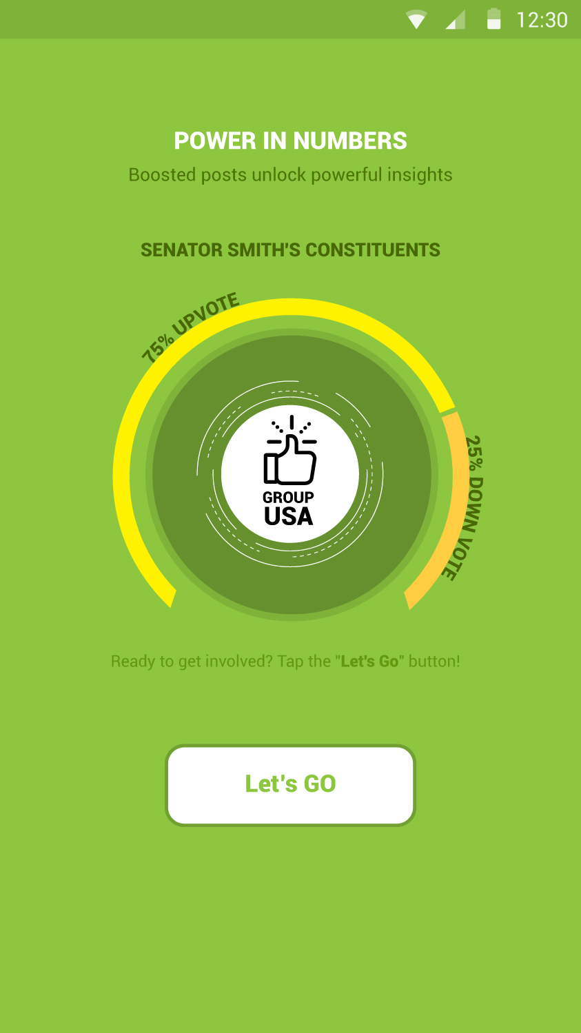
Users are linked to their electeds leaders and their town/state/country groups. Users can also create or join any other groups. Users can create posts in any of their groups, which can be seen by all group members. When a user creates a post, only his followers get a push notification at first. Posts can be upvoted or downvoted by anyone in the group. If a post gets enough votes, it is "boosted" - that means that all group members will receive push notification alert.
We think this can be described in a series of 5-8 simple images. We plan to display these images as an automated sequence after a new user completes user registration. Probably fade-in/fade-out from one to the next automatically. We prefer a design that takes up 1/2 to 3/4 of the screen (not full screen).
Some ideas that we've had (just suggestions - we are looking for your creativity!):
For elected leaders: small stock avatars of real people could work
For groups: group icons could work
For notifications: concentric, fading rings around the avatar of the user(s) receiving the notification
For followers: smiley avatar
For non-follower group members: anonymous avatar
Ideally, each image should be strong enough to stand on its own in case we want to use an individual image somewhere else in the app. However, we do plan to sequence them one after-another for the user welcome after successful registration.
Marché(s) Cible(s)
A broad audience of mobile app users.
Secteur / Type d'entité
Communications
Styles de police à utiliser
Couleurs
Le designer choisit les couleurs à utiliser dans le design.
Aspect
Chaque curseur illustre les caractéristiques de la marque client et le style que doit transmettre votre design de logo.
Élégant
Audacieux
Léger
Sérieux
Traditionnel
Moderne
Sympathique
Professionnelle
Féminin
Masculin
Coloré
Conservateur
Économique
Haut de gamme
Exigences
Doit avoir
- The series of images must adequately explain: "Users are linked to their electeds leaders and their town/state/country groups. Users can also create or join any other groups. Users can create posts in any of their groups, which can be seen by all group members. When a user creates a post, only his followers get a push notification at first. Posts can be upvoted or downvoted by anyone in the group. If a post gets enough votes, it is "boosted" - that means that all group members will receive push notification alert."
- The images should be expected to be viewed on no larger than 3/4 of a mobile screen size.
Bien d'avoir
- Some ideas that we've had (just suggestions - we are looking for your creativity!):
- For elected leaders: small stock avatars of real people could work
- For groups: group icons could work
- For notifications: concentric, fading rings around the avatar of the user(s) receiving the notification
- For followers: smiley avatar
- For non-follower group members: anonymous avatar
- However, you can come up with your own ideas too! A modern / flat design is preferred.
- Ideally, each image should be strong enough to stand on its own in case we want to use an individual image somewhere else in the app. However, we do plan to sequence them one after-another for the user welcome after successful registration.
Ne doit pas comporter
- Should not be complex. These screens should be designed to look at very quickly as part of the new user experience.
- The images should *NOT* be full screen. They should *NOT* be app screens. They should *not* be text heavy.