Transcend Wellness Spa needs a Logo that tells clients how unique we are and really stands out !
Vous souhaitez remporter un projet comme celui-ci ?
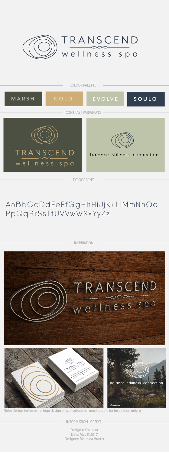
Ce client a reçu 246 designs de logo de la part de 60 designers. Il a choisi ce design de logo de Maurissahunter comme design gagnant.
Inscrivez-vous Trouvez des Projets de Design- Garanti
-
 A$150
A$150
-
 246 designs
-
 60 designers
Brief de Design de Logo
Looking for a logo for our expanding business - we have grown from a Massage Therapy Clinic to a fully Integrated Health and Wellness Spa for Mind Body and Soul. We offer the professionalism in treatments like Chiro Physio and Massage that a Clinic would offer , and we offer it in a completely Zen like Spa setting with features like a Zen garden , Lounge for clients to sit and read from our library , juice bar for clients to use etc. I like to think of us as a Wellness Connection - giving people a place to connect with therapists of their choice and also with like minded people through workshops for yoga , meditation , and self help. Our signage needs to pop ! I am inspired by the Canadian company signage and interiors " Saje " I like their 3D lettering, whites on dark and dark on white and copper tones - I also like the company " LUSH " and the way their simplistic black and white pops out. Also the Toronto Hammam Spa signage pops quite nicely - though a little too swirly for me - theirs is also nice. I dont want anything to busy - I like the idea of 2 types of font with 2 colours. It would be nice if the letters would work together - ie the T and W or the T the W and the S or the W and the S .... I am open to a symbol also - to represent healing , connecting , well being. We were thinking of puting 3D lettering on a reclaimed barn wood backdrop - but are also open to a clean coloured or black or white back drop too. We called the business Transcend as it means to go above and beyond expectations ..... I am attaching our previous logo ( Transcend Therapeutics ) It is a little busy and though very pretty - doesn't really stand out for signage. Our building is a century old home and we have a kinda farm house sheek thing going on inside with reclaimed woods , black and crisp white and silver and grey tones and punches of green with grass and living walls - a nice mix of modern and old - I would be open to adding wording under the logo - like relax , rejuvenate , restore , balance , etc
I added some colours in the bottom colour selection - but in truth the colour options are open. As I said interior colours are reclaimed dark wood, white and black tile , silver lighting fixtures and pops of grass green in foliage. accent walls will be white fau brick , white fau birch , Hale Navy blue by Benjamin Moore paints and some light grey tones.
Mises à jour
Project Deadline Extended
Reason: I am extending this deadline as I see great potential and I am so impressed with the quality of some existing designs and I feel another 48 hours will benefit this project. Though this extension is automatically put to 5 days I have a personal deadline of April 30th when I plan to hand over my final design to my signage contractor. Thank you all for your time and energy in this project.
Added Saturday, April 29, 2017
Marché(s) Cible(s)
all ages - professionals with work health benefits - across from a train station so will have many drive by clients viewing street signage
Secteur / Type d'entité
Health And Wellness
Texte du logo
Transcend Wellness Spa
Styles de logo qui vous intéressent
Logo pictural
Un objet réel (texte facultatif)
Logo abstrait
Conceptuel / symbolique (texte facultatif)
Logo mot symbole
Logo (texte seulement)
Logo de Lettermark
Acronyme ou logo texte (texte seulement)
Styles de police à utiliser
Couleurs
Couleurs choisies par le client et à utiliser dans le design de logo:
Aspect
Chaque curseur illustre les caractéristiques de la marque client et le style que doit transmettre votre design de logo.
Élégant
Audacieux
Léger
Sérieux
Traditionnel
Moderne
Sympathique
Professionnelle
Féminin
Masculin
Coloré
Conservateur
Économique
Haut de gamme
Exigences
Doit avoir
- Wording that is clear and pops on signage.
Bien d'avoir
- a symbol or a play on letters that will allow people to think of our Spa when they see an abreviated version
Ne doit pas comporter
- busy patterns