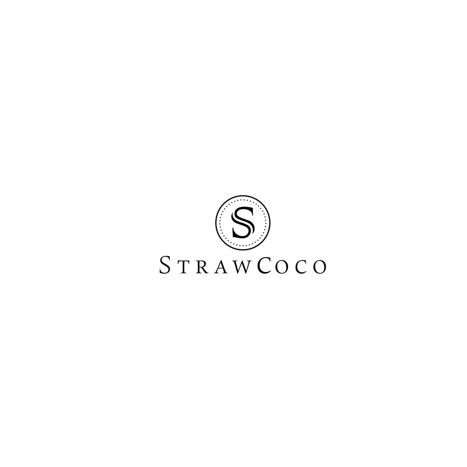
Logo for online artistic stationery retailer
Vous souhaitez remporter un projet comme celui-ci ?
Ce client a reçu 197 designs de logo de la part de 64 designers. Il a choisi ce design de logo de Toseenjessey comme design gagnant.
Inscrivez-vous Trouvez des Projets de Design-
 A$150
A$150
-
 197 designs
-
 64 designers
Brief de Design de Logo
StrawCoco, on online stationery retailer needs a logo (text and symbol) that can be used for printing as well as embossing or engraving onto products.
The brand name originates from the founders (mum and dad business, mum being the Strawberry, sweet, cheerful, cute and dad being the tough, serious, hard nut)
Marché(s) Cible(s)
Our customer base is fairly artistic and creative such as writers, photographers, illustrators.
Our products are described as rustic, vintage, beautiful, cute, functional and high quality and often purchased for events like weddings, pregnancy, travel.
Secteur / Type d'entité
Online Shopping
Texte du logo
StrawCoco
Styles de logo qui vous intéressent
Logo pictural
Un objet réel (texte facultatif)
Logo abstrait
Conceptuel / symbolique (texte facultatif)
Logo mot symbole
Logo (texte seulement)
Logo de Lettermark
Acronyme ou logo texte (texte seulement)
Styles de police à utiliser
Couleurs
Couleurs choisies par le client et à utiliser dans le design de logo:
Aspect
Chaque curseur illustre les caractéristiques de la marque client et le style que doit transmettre votre design de logo.
Élégant
Audacieux
Léger
Sérieux
Traditionnel
Moderne
Sympathique
Professionnelle
Féminin
Masculin
Coloré
Conservateur
Économique
Haut de gamme
Exigences
Doit avoir
- We've attached 2 PNG files for reference to indicate how we would like the company name to be displayed.
- Symbol guidelines
- ✶ Simple, not too many lines or shapes (can be used for engraving)
- ✶ Monochrome
- ✶ Able to be recognized when printed small (1.5cm)
- ✶ Can be abstract (as long as there's some relationship back to our company characteristics)
- The attached SVG of a coconut with a straw matches the above technical guidelines though it's not a prescription for what we would like to see in the finished symbol.
- We'd prefer to see something more feminine than masculine.
Bien d'avoir
- Symbol separate to the company name is preferred as the symbol may be printed / engraved separately on it's own.
- Preference to anyone that can find a way to simply integrate S and C into the symbol and still retain the rustic, vintage, beautiful, playful/cute characteristics.