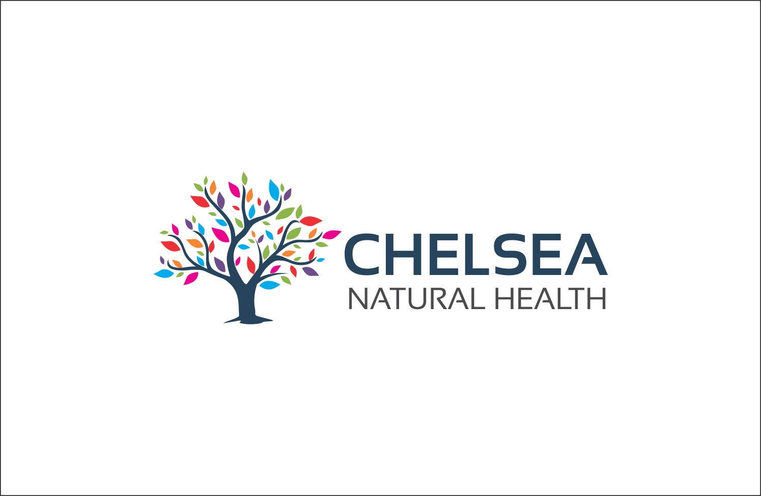
New logo for London-based Natural Health Centre
Vous souhaitez remporter un projet comme celui-ci ?
Ce client a reçu 161 designs de logo de la part de 53 designers. Il a choisi ce design de logo de SEOanalyst comme design gagnant.
Inscrivez-vous Trouvez des Projets de Design- Garanti
-
 £210
£210
-
 161 designs
-
 53 designers
Brief de Design de Logo
We are a natural health clinic based in Chelsea, London, looking for a new logo. We like the idea of using the tagline "All the elements required for optimum health". I have played around in Illustrator, trying to work up ideas based on….
For us the core focus is Nature and Natural Health. We are not a spa but a broad mix of natural therapies for mind and body. We are also in a very smart area of London, so need something that looks “upmarket”. We always fancy trying to find a way to introduce a bit of tongue-in-cheek / fun into the branding, but as a natural health clinic we haven't found a way to do that as people want their health taken seriously. What we definitely don’t want is anything run of the mill, anything too scientific, anything spa-related (we aren’t a spa), use of the da Vinci man, or stock lifestyle images of people with white teeth eating apples / playing tennis, or the classic medical symbols (intertwined serpents) if you get my drift. We don’t want an image that looks too corporate, especially if it ends up looking like a big pharma company logo. So far we have looked at images of trees, hands, trees and hands, elements of the periodic tables etc. We aren’t necessarily tied to an image, a working of the initials / words of our business name would be considered. We currently use an orange and green as our colours (www.chelseanaturalhealth.co.uk for current logo and colours) and although not wedded to them, would probably lie to work them in somehow.
The image that has multiple, coloured hands (….) we liked, but it didn’t test well – people thought it was for a nursery, or thought it a bit childish. The Willow tree we like, but want to explore a way of maybe making it less formulaic and more tree-like (more but not too many leaves like a willow tree actually looks maybe??). The periodic table logos we like, but think they might be too scientific for people to “get”.
We think it a good idea to avoid a design with too much fine detail, and the prevalent use of the logo will be on business cards, web site masthead and letterhead - fine detail will be lost in these smaller format uses...
When submitting a design, please could you add a small summary of why you have chosen the colours and design you have created. We are curious to know the thinking behind the creation.
Also, please can you only submit designs as a letterhead type view, from straight in front, not an angled view (hope that make sense!). A lot of designs so far have been submitted overlaid on office walls, on a black or some other type of textured background. We feel it would be much easier for us to get a feel for the design by seeing it in the context we will be using it in.
Thank you
Secteur / Type d'entité
Health And Wellness
Texte du logo
Chelsea Natural Health
Styles de logo qui vous intéressent
Logo pictural
Un objet réel (texte facultatif)
Logo abstrait
Conceptuel / symbolique (texte facultatif)
Logo mot symbole
Logo (texte seulement)
Logo de Lettermark
Acronyme ou logo texte (texte seulement)
Aspect
Chaque curseur illustre les caractéristiques de la marque client et le style que doit transmettre votre design de logo.
Élégant
Audacieux
Léger
Sérieux
Traditionnel
Moderne
Sympathique
Professionnelle
Féminin
Masculin
Coloré
Conservateur
Économique
Haut de gamme
Exigences
Doit avoir
- see project description
Bien d'avoir
- see project description
Ne doit pas comporter
- see project description