Water 4 Diary - Icon Designs
Vous souhaitez remporter un projet comme celui-ci ?
Ce client a reçu 31 designs icône de la part de 8 designers. Il a choisi ce design icône de slapBackChewLater comme design gagnant.
Inscrivez-vous Trouvez des Projets de Design- Garanti
-
 US$430
-
 31 designs
-
 8 designers
Brief de Design Icône
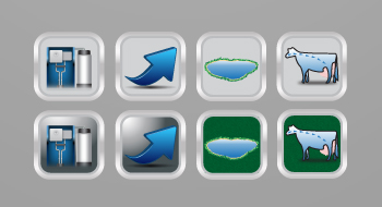
Water 4 Dairy designs, manufactures, sells, installs, and maintains water systems for dairy farms. We sell our water systems using four key messages - source, science, system, and success.
We need four separate stand alone icons (source, science, system, and success) that have the same theme as the logo.
Below are the details of what each logo means:
SOURCE - This icon will identify with the source water. Source water is the raw water farms use as drinking water for their cattle. This water comes from wells or ponds.
SCIENCE - There is a lot of academic research supporting that cows drink more water when the water is clean, fresh, and odor free water. The more water cows drink, the more milk they will produce, and subsequently more money the dairy farmer will make.
SYSTEM - This icon represents our system installed in the dairy barn and is viewed as a major piece of equipment in their dairy barn.
SUCCESS - This icon represents the increase in revenue and benefits to their dairy operation. We have a number of installations of our system at dairy barns and they have all experienced increased production and/or benefits from our equipment.
*Side note: These icons will be used in three additional design projects in the very near future (and posted as new jobs on this site):
Flash File Design - We will used these icons in a flash file to interact with our existing logo.
Flat Sheet Design - Each icon will be featured in a flat sheet to further describe our core messaging to the dairy farmer.
Website Design - Each icon will be featured in their respective section of our website to further describe our messaging to the dairy farmer.
Mises à jour
We have revised the scope of this project to provide a clear and concise ask.
Added Wednesday, January 04, 2012
Project Deadline Extended
Reason: A lot of feedback that designers did not have enough time to contribute.
Added Wednesday, January 04, 2012
Marché(s) Cible(s)
The target market for our product is dairy farmers. They are very smart and hardworking people. That being said they like simplicity so please keep the icons simple, simple, simple, and simple :)
Secteur / Type d'entité
Farmer
Aspect
Chaque curseur illustre les caractéristiques de la marque client et le style que doit transmettre votre design de logo.
Élégant
Audacieux
Léger
Sérieux
Traditionnel
Moderne
Sympathique
Professionnelle
Féminin
Masculin
Coloré
Conservateur
Économique
Haut de gamme
Exigences
Doit avoir
- The icons must use blue colors. Most major dairy manufacturers use mid to dark blues in their equipment manufacturing. See Boumatic or De Leval as examples.
The icons must be similar in size and shape so that when used in our website and flat sheets they all fit within the same family of design.
The icons must be balanced in terms of their design characteristics using simple lines with a clean finish.
Bien d'avoir
- The colors White and Stainless Steel are the other two predominant colors used in dairy manufacturing. It would be nice to see any variations with these colors included. Also the color highlight of burnt orange - see attached logo samples from delaval, boumatic and gea.