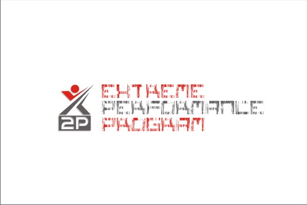
Extreme Performance Program
Vous souhaitez remporter un projet comme celui-ci ?
Ce client a reçu 49 designs de logo de la part de 17 designers. Il a choisi ce design de logo de subhadip comme design gagnant.
Inscrivez-vous Trouvez des Projets de Design- Garanti
-
 €150
€150
-
 49 designs
-
 17 designers
Brief de Design de Logo
This logo is for now for personal use.
I engage myself in a demanding training (physically, mentally and professionally).
I prefer a logo with a picture, try to find an arrangement with the letter X P P (for Xtreme Performance Program), or X2P... or whatever you want...
This can lead to a business card project or the renewal of my actual professional website and logo (www.sd-image.be).
The logo should demonstrate power, force, discipline, elite, high performance, ... well, I guess you get the point ! But not too fancy, it should look professional : the simpler the better.
Maybe something that looks high-tech, not too "heavy"
Mises à jour
I would like to thank all of you.
Added Tuesday, January 03, 2012
First, thanks to all of your for the work already done !
As it takes a lot of time to reply to each of you separately, I will do it in general, so everyone could beneficiate from advices.
Of course, you can take comments aimed for other designer for you, but most of the time, try to stay in your ideas :-)
So,
Craiger64 (551966 & 552078), the XP to the power 2 could be a good idea, the second seems too flat for me, the first one with the P on the X was good. You can also try to make something purely abstract.
Pablo (554045, 552082, 552462), I really like the abstract logo you have made. I don't want to have SD coaching in the logo and you have corrected in the last essay, it is very good. The choice of the colors are relevant to me and the fact that you have presented the logo with a business card talks to me a lot ! To further improve this logo, try to put P2 or 2P somewhere. Put 2P at the end of the word "program" may not be a good idea (in my opinion). Even if the logo is pretty good to me, I have shown it to friends and they found it maybe a bit too aggressive. Do you think it could be a way to have it just slightly less aggressive ? (but slightly ! :-) )
Design09 (552687, 552701 & 552891) thanks for the work you have done. what you propose to me is not exactly what I am looking for. Maybe you could try something more futuristic and maybe more abstract; using a X2P is a good idea, but you can also try something more abstract, in which, I could guess the X2P ? I eliminate for now your design to keep clear the best one. It is a fairly good first proposition, but need improvement. 552891 is better than the two other (in my opinion) but still need something more.
Omee (552791) thanks for the job, there are ideas. I don't request talking about consultancy, strategy and so on, so it is not compulsory to put it on the logo (I prefer not having this words in my logo). Maybe look to other logo I have selected to know what I am really looking for ? Anyway, thanks for your help
Ficius flavius (552053) you have taken my comments into account about titanium and I thank you for that. but your logo is still too smooth to my eyes. The one of Pablo may be a bit too aggressive, you could find a balance between both ideas ?
Giovanni (552168) it is also one of my preferred. simple, futuristic. Unfortunately, I can't say to you what you can improve :-s maybe find a figurative logo to add on it ? I consider your design, but a little something is missing in my opinion.
Subhadip (552231), same comment that for Giovanni. I like what you have done. it is simple yet impactful. The X is a pretty great idea !! Maybe the "2P" looks too simple or unfinished besides ? could work on the 2P to make more strong, a bit more aggressive ? thanks a lot, please made some change and submit new ideas !!
Logo craft production (552794 & 552796), thanks for your work ! the 552794 makes me thinking at indians !! funny but not what I am looking for :-). 552796 is a better one in my opinion maybe you could try to make a more abstract logo ? without imitating, look at the other selected, there are on the way on what I like.
Added Tuesday, January 03, 2012
Hello all !
Added Wednesday, January 04, 2012
Marché(s) Cible(s)
If I engage in coaching with this idea, the target should be C-level or people from Knowledge-intensive firm
Secteur / Type d'entité
Training
Texte du logo
(None provided)
Styles de logo qui vous intéressent
Logo abstrait
Conceptuel / symbolique (texte facultatif)
Aspect
Chaque curseur illustre les caractéristiques de la marque client et le style que doit transmettre votre design de logo.
Élégant
Audacieux
Léger
Sérieux
Traditionnel
Moderne
Sympathique
Professionnelle
Féminin
Masculin
Coloré
Conservateur
Économique
Haut de gamme
Exigences
Bien d'avoir
- .