

 Rafraîchir
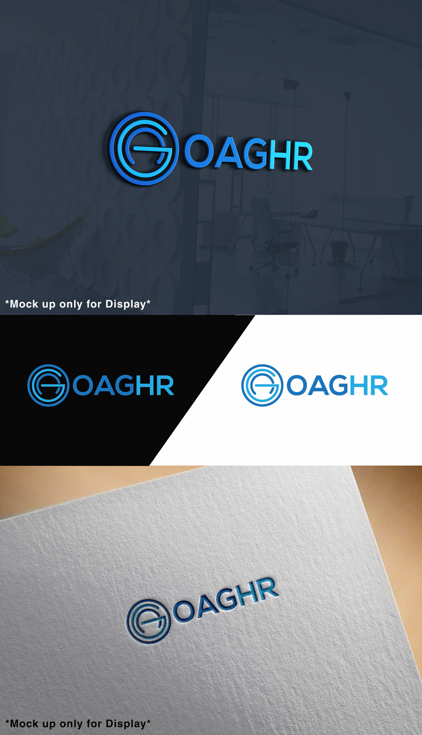
OAG International HR Consultancy Pte Ltd - needs a logo design.
Vous souhaitez remporter un projet comme celui-ci ?
Ce client a reçu 114 designs de logo de la part de 40 designers. Il a choisi ce design de logo de sonym comme design gagnant.
Inscrivez-vous Trouvez des Projets de Design
-
 S$150
S$150
-
 114 designs
-
 40 designers
Brief de Design de Logo
I need a new logo design for my Human Resources consultancy company. I am based in Singapore (although I was brought up in UK) and as a professional interim HR Director, do a variety or roles and projects, mainly for MNC's and relating to some kind of change management. I am expected to hit the ground running!
The logo I currently have is not seen as professional enough and the legal company name is too long! Please see attached business card to show you the current logo. (Note the address is no longer correct.)
I will use the winning logo to set up a webpage and for business cards, letter heads and other advertising. So there will be additional work required at a later date.
Marché(s) Cible(s)
Mainly MNC companies or new start ups. I need to attract the HR recruiting teams and senior managers /CEO's of organisations.
Secteur / Type d'entité
Business Consultant
Texte du logo
OAG HR (open to suggestions re name for logo - refer project description and must haves)
Styles de logo qui vous intéressent
Logo d'Enseigne
Logo contenu dans une forme



Logo de figurine
Logo avec illustration ou personnage


Logo mot symbole
Logo (texte seulement)


Logo de Lettermark
Acronyme ou logo texte (texte seulement)



Styles de police à utiliser


Couleurs
Couleurs choisies par le client et à utiliser dans le design de logo:
Aspect
Chaque curseur illustre les caractéristiques de la marque client et le style que doit transmettre votre design de logo.
Élégant
Audacieux
Léger
Sérieux
Traditionnel
Moderne
Sympathique
Professionnelle
Féminin
Masculin
Coloré
Conservateur
Économique
Haut de gamme
Exigences
Doit avoir
- UPDATE TO BRIEF: To date I have received some good designs using my letters fairly standard text, but no one has taken the existing logo and tried to make it better. I still like the current logo, but as I have said in my project description, it is seen too childlike and not professional. I would really like to see if anyone can improve on the current version. The rest of my brief still remains.
- The design needs to look professional and eye catching (i.e. when you look at the logo, it should say.... a well dressed business person that you can trust and respect - is modern and relevant, but NOT stuffy and old fashioned!).
- Whilst I want the logo to contain my name OAG, I do want to shorten the long company name. Ideally I would like OAG letters (and it can also have HR if you think this will work?) incorporated in the logo itself.....something like I have already, but better! I personally do like the existing logo as it was designed by using shapes instead of letters for my name, however this is seen as too childlike.
Bien d'avoir
- Whilst I want the logo to look professional (but not too corporate!), it should also be clean and crisp; and communicate energy, enthusiasm and what I do i.e. HR and working in partnership with the business!
- I like the existing logo colours (as UK), but this isn't essential - hence I had said no preference as you may have better ideas! Living in Singapore, the orchid is the national flower - and the colour is purple - the flag is red and white, so I am happy for you to consider blending the 2 counties colours of flags and flowers.
- I also like the idea of the shapes that spell out my name - albeit this currently is seen as too childish - so it needs to be more of a corporate style.
- UPDATE TO BRIEF: I also like the grey as well as the blues which have come through in some of the designs - maybe with a hint of red. I have also shown some suggested colours below rather than saying no preference - as I am now homing in on the preferred colours. Thank you all.
Ne doit pas comporter
- Fyi there is already a company called OAG International - so unfortunately you can't use this.