iOS App logo for Reps - Workout Tracker
Vous souhaitez remporter un projet comme celui-ci ?
Ce client a reçu 100 designs icône de la part de 16 designers. Il a choisi ce design icône de David Manso comme design gagnant.
Inscrivez-vous Trouvez des Projets de Design-
 US$400
-
 100 designs
-
 16 designers
Brief de Design Icône
Reps is a workout log for the iPhone. It allows you to keep track of your weights and reps at the gym and to keep track of your strength progress. The App is one of the most popular gym apps in Sweden and has gotten nice reviews because of its simplicity and ease of use.
We are very happy with the application design, but the App Icon leaves a lot to be desired. Now we need your help to make an awesome App Icon for Reps!
Mises à jour
Hi!
Added Saturday, October 12, 2013
Marché(s) Cible(s)
Reps is designed for people who want to keep track of their strength progress in the gym. Most people that use Reps are male 18-35 years old.
Also it is an app for medium to advanced gym trainers and is not aimed at beginners.
Secteur / Type d'entité
Gym
Aspect
Chaque curseur illustre les caractéristiques de la marque client et le style que doit transmettre votre design de logo.
Élégant
Audacieux
Léger
Sérieux
Traditionnel
Moderne
Sympathique
Professionnelle
Féminin
Masculin
Coloré
Conservateur
Économique
Haut de gamme
Exigences
Doit avoir
- Barbells or dumbbells would be nice, but if you can find another way to convey that this is a gym app, feel free.
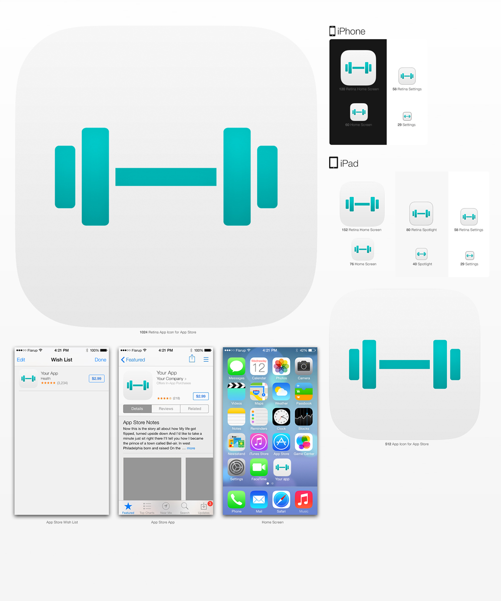
The icon should to be in 1024x1024 pixels so that I can use it for the AppStore but the most important thing is that it looks excellent on the iphone. That is 120x120 pixels. It should work at 76x76 also, since this is what the ipad mini uses. It is important that I get the original file so that I can export at a new size if Apple decides to change the resolutions.
Bien d'avoir
- It would be nice if the icon is consistent with the iOS7 experience. However, the icon should be able to generate sales, so if you need to deviate from the iOS7 design language to make it stand out, please do so. Use your judgement;)
Also, please look at the screenshots attached so that the app icon suits the application. The colors used in the app are #9A9A9A and #00CCCC and black and white. You can use them if you like, but you don't have to, your choice!
Ne doit pas comporter
- The design should not contain any text. We are planning on renaming the application, so the app name should not be in there.
Please don't use any stock icons.
Don't use "long shadow design" http://www.hongkiat.com/blog/long-shadow-design/ as I think it almost always look better without the shadow.