Academic group needs icon set for web app supporting patients making health decisions
Vous souhaitez remporter un projet comme celui-ci ?
Ce client a reçu 18 designs icône de la part de 9 designers. Il a choisi ce design icône de bdesigner9 comme design gagnant.
Inscrivez-vous Trouvez des Projets de Design- Garanti
-
 C$190
C$190
-
 18 designs
-
 9 designers
Brief de Design Icône
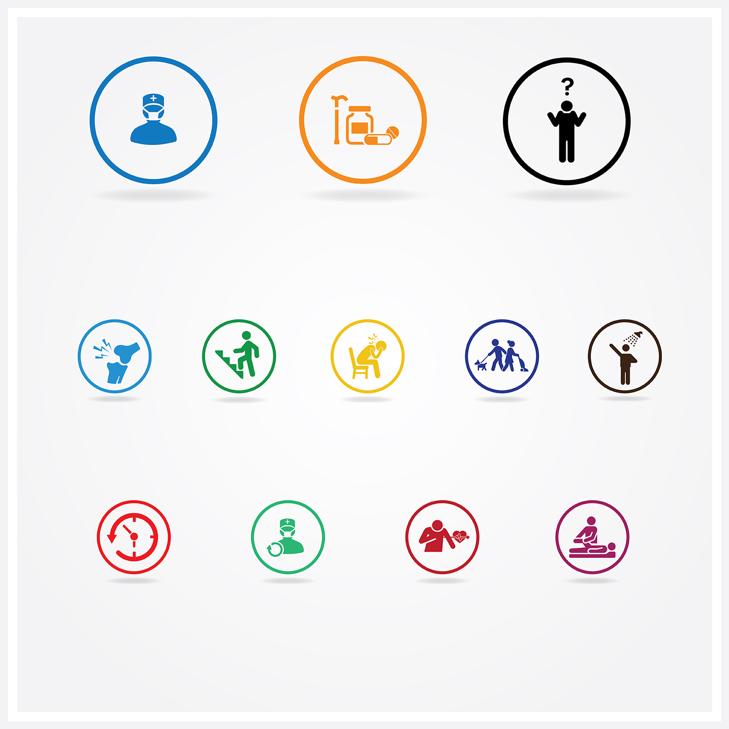
We require a set of 12 small icons for use in our web application, which helps patients make choices between treatments. Each treatment has different features.
Icons 1 to 3 refer to the treatments themselves and should be twice the width as the height (96x48) and will be in the headings of a table describing each treatment.
• Icon 1 is for knee replacement surgery – we need a visual of a knee with a surgeon.
• Icon 2 is for non surgical treatment (pain meds/ walking aid/ physiotherapy/ weight management).
• Icon 3 is for ‘not sure’ – this will be for when a patient is not sure which option they prefer.
Icons 4 to 12 should be square (48x48) and will be in the rows of the table. These should be generic and not related to knee pain unless they specifically relate to surgery.
• Icon 4 is for pain. This section will describe how much pain the patient might have after treatment.
• Icon 5 is for mobility. This section will describe how the patient’s mobility will change after treatment.
• Icon 6 is for anxiety /depression. This section will describe how the patient’s anxiety/depression will change after treatment.
• Icon 7 is for usual activities defined as work, study, housework, family of leisure activities. This section describes how the patient’s ability to conduct usual activities might change after treatment.
• Icon 8 is for self care such as washing and dressing themselves. This section describes how the patient’s ability to self-care might change after treatment.
• Icon 9 is for recovery period after surgery and refers to the time this might take.
• Icon 10 is for chance of repeat surgery – where the chance the surgery might not be successful.
• Icon 11 is for complications in surgery ranging from mild to serious.
• Icon 12 is for the need of physiotherapy after surgery or for non surgical treatments.
Marché(s) Cible(s)
patients of all ages including over 60
Secteur / Type d'entité
Health
Couleurs
Couleurs choisies par le client et à utiliser dans le design de logo:
Aspect
Chaque curseur illustre les caractéristiques de la marque client et le style que doit transmettre votre design de logo.
Élégant
Audacieux
Léger
Sérieux
Traditionnel
Moderne
Sympathique
Professionnelle
Féminin
Masculin
Coloré
Conservateur
Économique
Haut de gamme
Exigences
Doit avoir
- Keep the Icons as clean and simple as possible.
- The deliverable should be made through a vector program (e.g. Illustrator)
- Only use black white blue and orange
Bien d'avoir
- for a style, please look at the https://thenounproject.com/ or the winner of this contest
- http://icon.designcrowd.ca/contest.aspx?id=138593