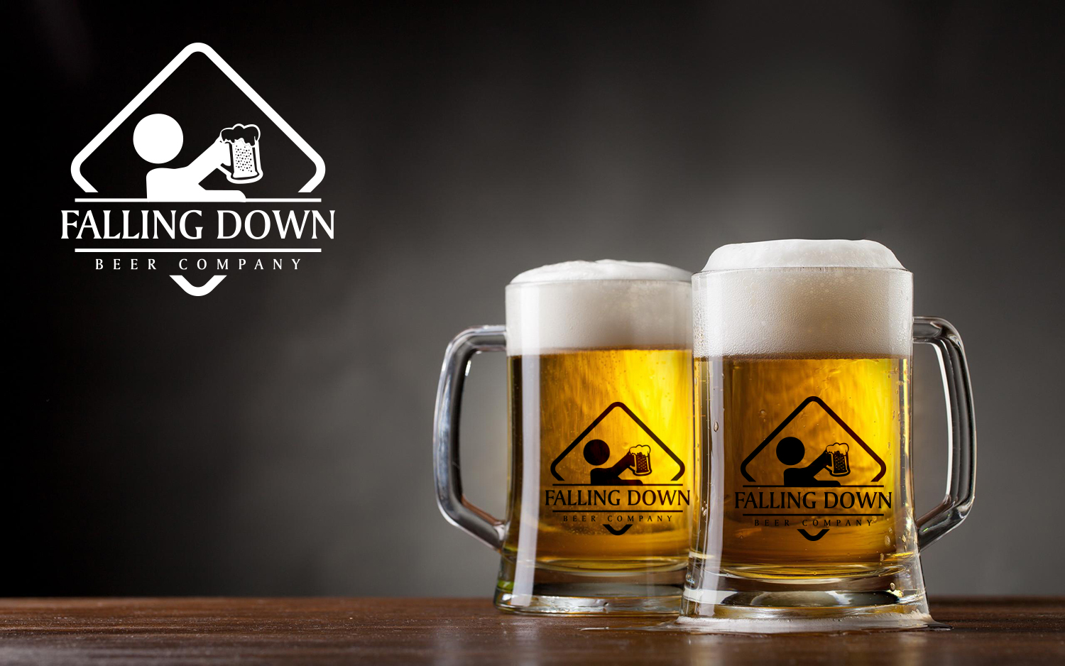
Falling Down logo redesign to make easier for printing and glassware
Gagnant
Vous souhaitez remporter un projet comme celui-ci ?
Ce client a reçu 81 designs de logo de la part de 30 designers. Il a choisi ce design de logo de IMD-HUB comme design gagnant.
Inscrivez-vous Trouvez des Projets de Design-
 US$150
-
 81 designs
-
 30 designers
Brief de Design de Logo
We need to redesign our logo to make is simpler. Logo should use as few colors as possible and be able to transfer easily to glassware, shirts and coaster. The current logo has too many gradients (bad for printing) and isn't bright enough. Would like to keep general "caution sign" feel. Despite our name, you cannot actually show anyone falling down. Attached is old logo or visit our website www.fallingdownbeer.com
Secteur / Type d'entité
Printing
Texte du logo
Falling Down Beer Company
Styles de logo qui vous intéressent
Logo d'Enseigne
Logo contenu dans une forme
Logo pictural
Un objet réel (texte facultatif)
Aspect
Chaque curseur illustre les caractéristiques de la marque client et le style que doit transmettre votre design de logo.
Élégant
Audacieux
Léger
Sérieux
Traditionnel
Moderne
Sympathique
Professionnelle
Féminin
Masculin
Coloré
Conservateur
Économique
Haut de gamme
Exigences
Doit avoir
- A Pantone standard bright yellow for easy printing
- Caution Sign style
Bien d'avoir
- A black and white version (or easy to make BW) for single color transfers to shirts and glassware
Ne doit pas comporter
- Any depiction of over intoxication
Fichiers
JPG
logo_shield_only_nostalk_400 Tuesday, 07 February 2017 19:18:47
mardi 7 février 2017
Paiements
1e place
US$150