"Rhodium", a VoIP application needs a logo design
Vous souhaitez remporter un projet comme celui-ci ?
Ce client a reçu 317 designs de logo de la part de 108 designers. Il a choisi ce design de logo de Joe Seph comme design gagnant.
Inscrivez-vous Trouvez des Projets de Design- Garanti
-
 US$300
-
 317 designs
-
 108 designers
Brief de Design de Logo
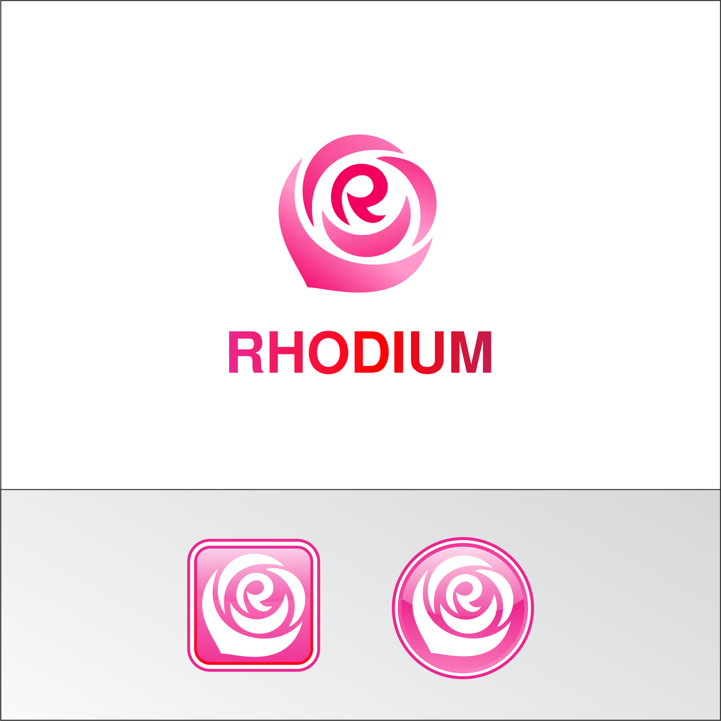
We need a logo design for a VoIP application named "Rhodium". Rhodium works as a combination of appliance and smartphone application and it is targeted to small to medium businesses. While the logo will be put both on appliance and on smartphone application, some emphasis is put on that the logo mark being an application icon. Rhodium is a chemical element with atomic number 45. It's named Rhodium because one of its chlorine compounds shows rosy color. Thus we want the logo color to be "rosy-red"-ish. The logo may include some image to suggest rose flower but not mandatory. Messages we want to deliver with the logo are; "friendly", "ease of use", "reliable".
Mises à jour
Initially, we thought the rose is "nice to have". However, now we have so many good designs with rose, thus it is now "must have". We don't think we end up choosing a design without rose.
Added Sunday, February 5, 2017
Marché(s) Cible(s)
Small to Medium Businesses. The industry is a little bit conservative and the average age a bit higher thus prefer "friendly" than "super-cool".
Secteur / Type d'entité
Telecommunications
Texte du logo
Rhodium
Styles de logo qui vous intéressent
Logo abstrait
Conceptuel / symbolique (texte facultatif)
Logo mot symbole
Logo (texte seulement)
Styles de police à utiliser
Couleurs
Couleurs choisies par le client et à utiliser dans le design de logo:
Aspect
Chaque curseur illustre les caractéristiques de la marque client et le style que doit transmettre votre design de logo.
Élégant
Audacieux
Léger
Sérieux
Traditionnel
Moderne
Sympathique
Professionnelle
Féminin
Masculin
Coloré
Conservateur
Économique
Haut de gamme
Exigences
Doit avoir
- "Rhodium" wordmark logo and logo mark which is usable for smartphone icon.
Bien d'avoir
- The logo that reminds "rose", or even explicitly showing "rose" somewhere may be nice but just a non-designer idea and you can completely ignore this.
- Many people relate rose with the letter "O" of "rhOdium", however, I'd want to see more idea relating the rose with "R", the initial letter. It is particularly nice when used as a smartphone icon.
- You can also ignore the color I chose below.