Redesign criminal justice consulting website
Vous souhaitez remporter un projet comme celui-ci ?
Ce client a reçu 52 web designs de la part de 12 designers. Il a choisi ce web design de LogoDesigns.ae comme design gagnant.
Inscrivez-vous Trouvez des Projets de Design- Garanti
-
 US$800
-
 52 designs
-
 12 designers
Brief de Web Design
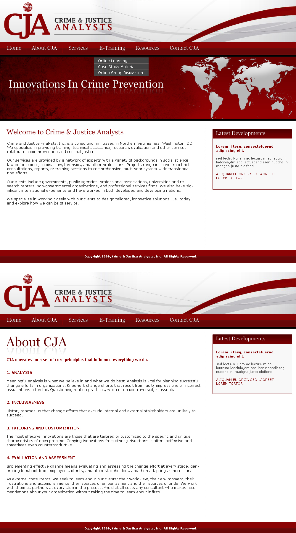
We run a small professional services firm that does research, evaluation, consulting, and training on criminal justice issues. We need to redesign our website (www.cjanalysts.com). The existing site is something we made ourselves. It is unprofessional and does not do a good job of communicating what we do or who we are.
We would like the new site to provide a basic overview of what we do. Moreover, we would like it to communicate several themes that represent who we are:
* global
* innovative
* analytical
* practical
We view the principal design challenge as figuring out a subtle, interesting, and graphically appealing way to communicate these themes.
Mises à jour
We would like to thank you for the many fine designs so far. We appreciate your energy and creativity and look forward to seeing more designs. After seeing the first batch of submissions, we want to provide some feedback that might be useful as you consider providing new designs or revisions to existing designs.
1. We would really like to avoid typical criminal justice or government icons like fingerprints, magnifying glasses, prisons, judges' gavels, the Supreme Court, or the Statue of Liberty.
2. We don't want to feature our contact information or web address on the home page. We will feature that information on our "contact cja" page.
3. Any stock photographs or images should be meaningful in communicating themes that are important to us: innovative, analytical, and global. Some of the designs are succeeding in communicating the global theme, but not the innovative and analytical themes. The great design challenge in this contest is in thinking through subtle ways of communicating these themes rather than using cliches (like lightbulbs)... the winning designer will likely be the one that meets this particular challenge.
4. We want the site to match the color of our logo. It can use other colors as well, as long as those colors coordinate with our logo colors.
You're terrific... thanks for all your hard work so far!
Ed
We have selected five finalists and are working our way through them now. We expect to have the winner selected within the next day or two. Our apologies for the delay.
Marché(s) Cible(s)
Our primary customers are governments, research firms, criminal justice agencies, and schools. The people who we want to find our site are seeking research, evaluation, training, or consulting services related to crime, criminal justice, or policing.
Secteur / Type d'entité
Consulting
Nombre de Pages Demandé
2 pages
Exigences
Doit avoir
- 1. We would like the site to use our logo. It is attached (please use the maroon 4-color version with the company name but without the slogan). The site should also use the colors present in our logo. It may use other colors as well, as long as these colors coordinate with the logo colors.
- 2. For main pages or buttons, we need the following:
- *Home
- *About CJA
- *Services
- *E-Training
- *Resources
- *Contact CJA
- 3. We like simple, crisp, subtle designs over "busier," cluttered, or very complex designs.
- 4. We'd like to receive, at a minimum, the home page and a sample inner page.
Bien d'avoir
- We need some help in thinking through what regions or sections should exist on the home page. We are thinking about having a window on there where we can make announcements about recent developments like new reports, new e-training videos, new photographs, etc... We are open to suggestions here.
Ne doit pas comporter
- 1. Gimmicky or overused clipart.
- 2. Cliched images associated with criminal justice, including magnifying glasses, scales of justice, etc... Our logo makes a subtle nod to criminal justice through the use of a fingerprint as the dot on the "J" in the company initials. That''s sufficient for our purposes. Concentrate instead on the themes listed above.
- 3. Major use of colors that don't match our logo, like blue.