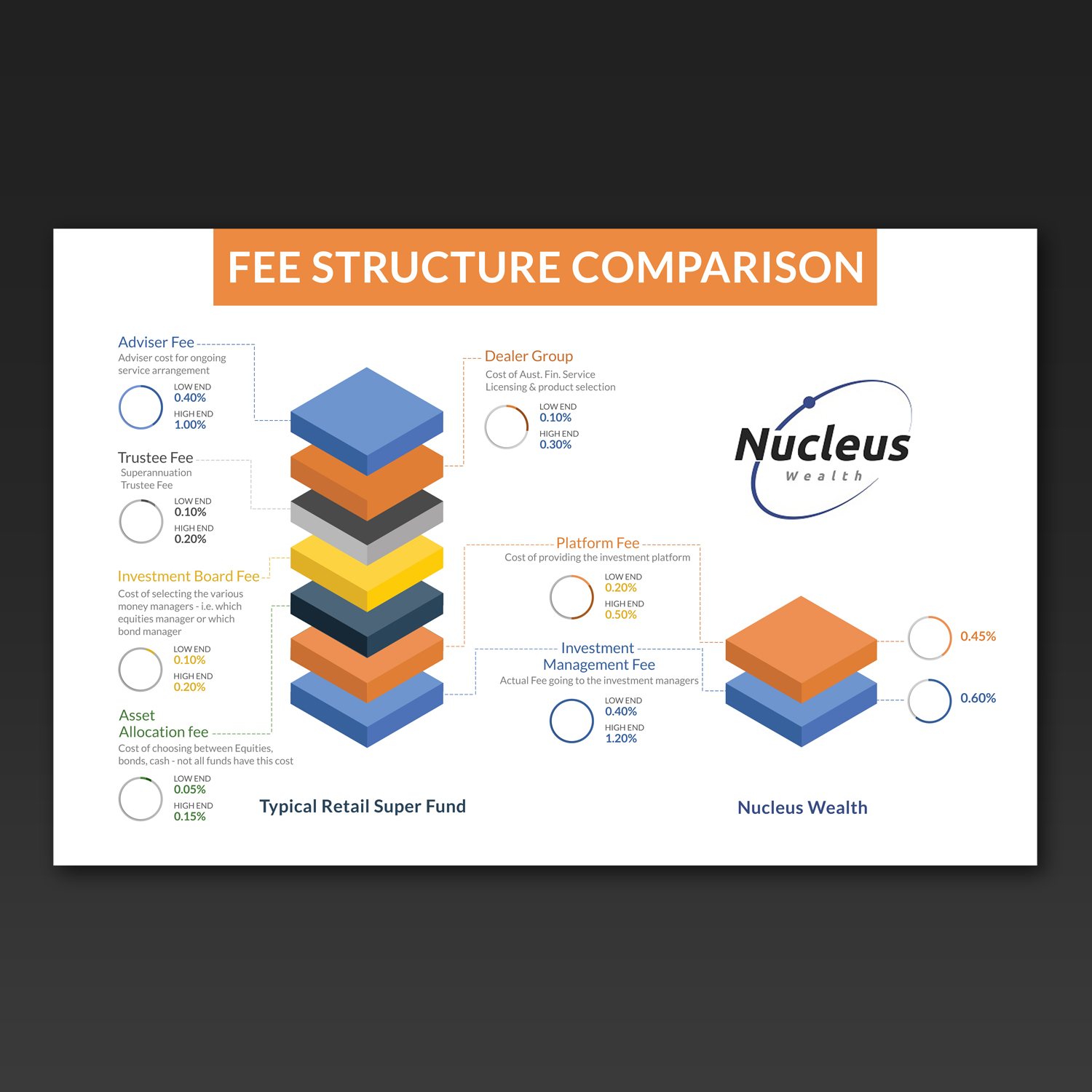
Info graphic to explain a fee hierarchy
Vous souhaitez remporter un projet comme celui-ci ?
Ce client a reçu 17 designs graphiques de la part de 5 designers. Il a choisi ce design graphique de Kishaloy_D comme design gagnant.
Inscrivez-vous Trouvez des Projets de Design- Garanti
-
 A$140
A$140
-
 17 designs
-
 5 designers
Brief de Design Graphique
We need a clean and current feeling graphical representation of what a typical fee structure looks like from our competitors, with an accompanying one highlighting the simplicity and transparency of ours.
We will be using this online on our web page and in blog posts. Solutions that can be animated would be looked upon favourably.
however, ideally would like to avoid any Flash based solutions.
I have provided the fee structure comparison and some notes for each component of a typical fee in both excel and a jpg of the excel file. Not fussed with the graph design however a 'stacked' fee graph could get the point across nicely. Up to you.
I have provided a low and high estimate for our competitors. You don't have to include the figures however the proportions in the graph could be a way around cluttering the design with numbers.
I have also included our logo to give you an idea of colours.
Marché(s) Cible(s)
Gen X and Gen y, internet savvy, financially competent
Secteur / Type d'entité
Financial Service
Styles de police à utiliser
Aspect
Chaque curseur illustre les caractéristiques de la marque client et le style que doit transmettre votre design de logo.
Élégant
Audacieux
Léger
Sérieux
Traditionnel
Moderne
Sympathique
Professionnelle
Féminin
Masculin
Coloré
Conservateur
Économique
Haut de gamme
Exigences
Doit avoir
- Graphical based solution - easy to read and understand
Bien d'avoir
- Potential to be animated, PSD (or similar) with layering so that it is easy to implement for use with HTML 5 or JQuery web pages
Ne doit pas comporter
- Flash solutions