Professional logo needed for a growing health blog
Vous souhaitez remporter un projet comme celui-ci ?
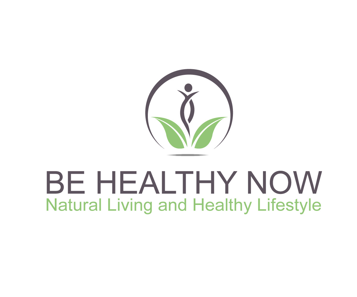
Ce client a reçu 270 designs de logo de la part de 66 designers. Il a choisi ce design de logo de logoguider comme design gagnant.
Inscrivez-vous Trouvez des Projets de Design-
 £110
£110
-
 270 designs
-
 66 designers
Brief de Design de Logo
I need a professional logo for a health blog with a name 'Be Healthy Now'. The tagline I am currently using is 'Natural living and healthy lifestyle' and this should come as a part of a logo, just underneath (this may change in the future). The main focus should be on 'Be Healthy Now' wording of course and the logo should work also without 'Natural Living and Healthy Lifestyle' text. I prefer pastel green colours for the logo as this is what it's currently used on the website (see the file attached for colours which I like), however I am open to other additional colours such as pastel purple to be part of a logo but only if it works with green and comes across as: trustworthy, professional, authority, approachable. I don't want anything too complicated, just something that will stand out from other blogs which use just text for logo. Colours shouldn't be too strong but there should be enough contrast against the white blackground. Please don't use the following colours: yellow, red, orange, brown, pink.
I am not a fan of bold text for 'Be Healthy Now' and I prefer flat and clean logos. No handwriting please as to me this does not look professional and it's hard to read.
If possible, the logo should demonstrate a holistic approach to health and this is what my blog is about.
More details in the file uploaded - please read the document as there are some important information in there.
Mises à jour
Project Deadline Extended Reason: The logos which have been submitted are not exactly what I wanted. The best is to look at the brief again, especially the uploaded file where you will find a colour palette which I like. Please avoid blue colour and purple as I don't think that works. I would rather stick to greens, pastel dark green especially. Focus is on natural, holistic approach to health. The graphics shouldn't be too complicated and the font should look professional and portray authority and trust. Added Friday, January 6, 2017
Marché(s) Cible(s)
variety of people but mostly 25-40yrs old, more females than males, interested in how to be healthier and how to improve their lives to be healthier, seeking inspiration for a healthier lifestyle. Mostly UK based.
Secteur / Type d'entité
Health And Wellness
Texte du logo
Be Healthy Now, Natural Living and Healthy Lifestyle
Styles de police à utiliser
Aspect
Chaque curseur illustre les caractéristiques de la marque client et le style que doit transmettre votre design de logo.
Élégant
Audacieux
Léger
Sérieux
Traditionnel
Moderne
Sympathique
Professionnelle
Féminin
Masculin
Coloré
Conservateur
Économique
Haut de gamme
Exigences
Doit avoir
- Please see the colours which I like in the attached document.
- Part of the logo should be simple a graphic/symbol which can be used on it's own.
- The logo should work with or without the text 'Natural Living and Healthy Lifestyle'
- The logo should be flat, clean and simple.
- The logo text 'Be Healthy Now' should be elegant but easy to read. It could be serif or sans serif, depending on what works better. The text 'Natural Living and Healthy Lifestyle' should be sans serif, also easy to read with enough contrast.
- -------Please make this text in sentence case not capitals.---------- It doesn't have to spread the same length as 'Be Healthy Now' text
- Both fonts should match well to create a professional, trustworthy look.
- Need Ai. and PSD. editable files at the end of the project.
Bien d'avoir
- I like clean designs with not too many graphics.
Ne doit pas comporter
- I don't like circular logos
- Avoid colours: yellow, orange, red, blue, pink.
- Avoid 3d logos.
- Don't use a tree in the logo as I don't think it works very well.
- Try not to use blueberry instead of letter 'O' as I don't think it works very well.
- Don't use a blueberry in a logo as it doesn't come across too professional.
- Do not use 'BHN' in the logo.