"Mobile Libraries" Clamshell Packaging Design Required
Vous souhaitez remporter un projet comme celui-ci ?
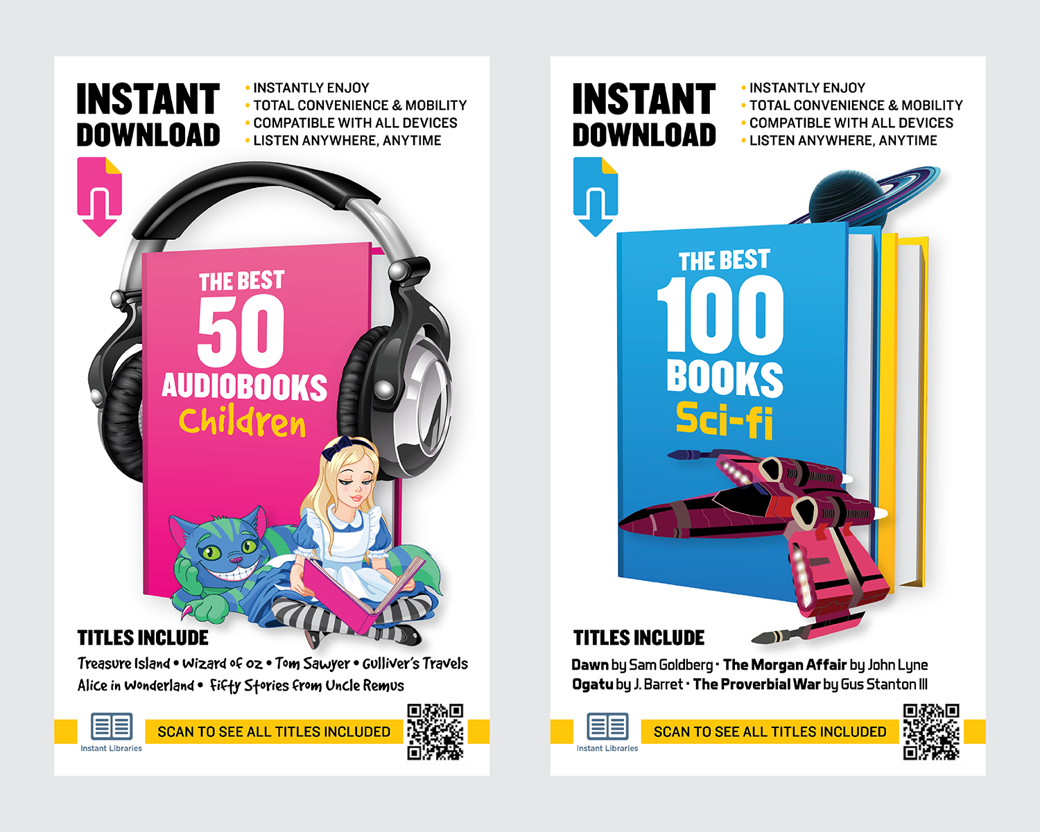
Ce client a reçu 27 designs emballage de la part de 4 designers. Il a choisi ce design emballage de RoundYellow comme design gagnant.
Inscrivez-vous Trouvez des Projets de Design-
 US$400
-
 27 designs
-
 4 designers
Brief de Design Emballage
Pardon the lengthy explanation but here goes…
…and please read very carefully as this is important. Otherwise you may be wasting your time (and mine) by submitting a proposal not in line with what we need.
So about 2 years ago our publishing company introduced a new product to retail called "e-GO! Libraries" - these are USB Memory flash drives that come pre-loaded with various book collections we offer. For example one version come pre-loaded with 550 Classic AudioBooks. This particular product line has been doing very well and based on its success we recently introduced a new product line called "Instant Libraries" – instead of offering USB drives, these "gift cards" allows the customer, using a scratch off code on the back, to download various book collections online.
The problem is, the retail market (Walmart, Target, Best Buy) etc does NOT like the packaging we created for this new product "Instant Libraries"
What we've been told is that the current packaging for Instant Libraries (will refer to" IL" from here on) does not "pop off the shelve" – what they mean by this, is if these cards are hanging on a peg somewhere in a store, surrounded by hundreds of other products, the packaging is not strong enough to attract the customer's attention.
Peoples simply won't be interested enough to stop and pick one up to find out more.
Most retailers say they prefer the sting of our older product line "e-GO! Library" > they say it is more colorfoul, the covers help distinguish that the product offers books and in general it's more catching to the eye.
I am attaching various fotos of the current packaging for the e-GO! Library line so you can see what I mean.
Again it is NOT the e-GO! Library that needs redesigning it's the Instant Libraries. I am simply showing you examples of e-GO! Library to show you what the retailers are preferring.
Now there are 7 Instant Libraries cards that we need to offer:
100 Romance Books
100 Mystery Books
100 Sci-Fi Books
100 Horror/Thriller Books
100 Classic Books
plus…
50 Classic Children's AudioBooks
50 Classic AudioBooks
I am attaching a file that contains all 7 of these current designs. I personally liked these designs. I thought they were modern, clean, and clever. But according to the retailers we overshot the moon and lost them.
It is important that all 7 of these cards maintain a similar design but offer some aspect that will help the consumer distinguish them. For example you will see that the "Romance" design we had created uses rose pedals, while the "Horror" design uses blood. Again this was just our idea but I am illustrating a point.
I am including a file that contains all the text needed on the card. Everything you see on the current design needs to be on these new ones. You can play around with it, but you can't remove any of the text (or the QR code). The only thing I want to change as far as text is at the top: I want the very top of the card to say "Instantly Download" then "the Best 50 AudioBooks" or whatever the card may be.
The only other thing that I would like, but is not a must since space is limited is out logo. If you can fit that in great…but it's a low priority item and not as important as most of the other elements. Sorry the file is not a vector as our designer is away right now and I don't have the vector with me.
These cards are going to be printed and inserted into clamshell packaging just like the e-GO! Library. They are going to be the same size. The insert (printed area) will be 95 wide by 157 high. I am attaching those specs as well.
The reason I am posting here is that our team needs some new perspectives on these. We seem to be a bit stuck in our ways. So I'm coming back to design crowd hoping for some fresh ideas.
Again what we're being told by retailers is that we have half a second to grab someone's attention when they are strolling down the aisle. This product, unlike milk is not something that a customer is looking for. It's something that will only move off the shelf if we are able to pull them in. They then have to understand what the heck these cards are
So those 2 elements (attention, explanation) are crucial.
Again people seem to like what we did with the e-GO! Library packaging. The only major comment we got on those is that retailers wanted us to name some of the titles on the front plus add a QR code to the full lists. We did this with the Instant Libraries, but it seems that's the only thing they like from that.
I will also attach a mosaic of covers in case you want to try to use something similar. This is only if you want to try with this element. But not a must.
I look forward to seeing your suggestions. If you have questions please ask.
Thank you,
Nic
PS.forgot to mention that high-print-quality (300DPI) PSDs are expected for all 7 cards. Thanks
PPS. I dropped this in the community chat, but thought it be a good idea to re-paste here:
Here are a few links to some product packaging (in a series) which I quite like. Modern, clean, catchy:
http://www.packiii.com/wp-content/uploads/2013/03/Product-Packaging-Design-Cornish-Orchards-Packaging-Design-Companies-Firm-Agenciess.jpg
http://www.launchprivatelabel.com/wp-content/uploads/2014/03/pet-food-packaging-ideas.png
https://s-media-cache-ak0.pinimg.com/564x/21/30/ed/2130edcd6397c9aed27d2f3e5a669914.jpg
http://www.packiii.com/wp-content/uploads/2013/03/Best-Health-Basics-Packaging-Design-Layout.jpg
Mises à jour
I have awarded the prize to a design that really stood out for us. But I want to thank everyone who submitted a design. There were a number of quality designs and I appreciate everyone's efforts. Thank you kindly! Nic
Added Thursday, December 29, 2016
Marché(s) Cible(s)
retailers (Walmart, Target, Best Buy)
Styles de police à utiliser
Aspect
Chaque curseur illustre les caractéristiques de la marque client et le style que doit transmettre votre design de logo.
Élégant
Audacieux
Léger
Sérieux
Traditionnel
Moderne
Sympathique
Professionnelle
Féminin
Masculin
Coloré
Conservateur
Économique
Haut de gamme
Exigences
Doit avoir
- See project description in detail as well as attached text file
Bien d'avoir
- Here are a few links to some product packaging (in a series) which I quite like. Modern, clean, catchy:
- http://www.packiii.com/wp-content/uploads/2013/03/Product-Packaging-Design-Cornish-Orchards-Packaging-Design-Companies-Firm-Agenciess.jpg
- http://www.launchprivatelabel.com/wp-content/uploads/2014/03/pet-food-packaging-ideas.png
- https://s-media-cache-ak0.pinimg.com/564x/21/30/ed/2130edcd6397c9aed27d2f3e5a669914.jpg
- http://www.packiii.com/wp-content/uploads/2013/03/Best-Health-Basics-Packaging-Design-Layout.jpg
Ne doit pas comporter
- Anything not in the description -space is tight and the important elements needed have been covered/included