

 Rafraîchir
Canadian Supercomputing Conference Needs a Logo
Vous souhaitez remporter un projet comme celui-ci ?
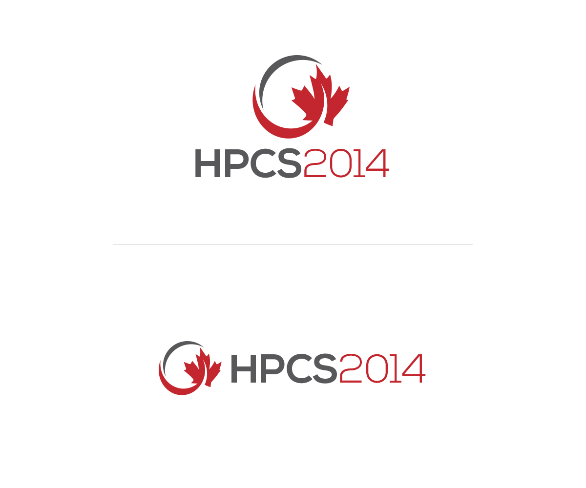
Ce client a reçu 77 designs de logo de la part de 33 designers. Il a choisi ce design de logo de AGD comme design gagnant.
Inscrivez-vous Trouvez des Projets de Design
- Garanti
-
 US$400
-
 77 designs
-
 33 designers
Brief de Design de Logo
We need a logo for HPCS, our annual Canadian High Performance Computing conference, the annual meeting of everyone in Canada who works on really, really big computers.
We need it for HPCS 2014, but would like something that could be re-used in the coming years. The logo should feel modern, professional, high-tech, and, preferably, be immediately identifiable as Canadian. Easiest way to do this would be to incorporate the maple leaf. The worst way to do this would be to include a beaver. Don't include a beaver.
CDMN has a fantastic logo (http://www.cdmn.ca) that has the right feel. They'd probably frown on us stealing it though.
Text accompanying the logo can be "HPCS 2014" or "HPCS" or even nothing at all. If no text, please suggest what title font I should use when incorporating the logo into materials. If using "2014" as part of the logo, it should be in such a way that it is easily changed in subsequent years.

Mises à jour
Hi everyone, thanks for the designs. Some strong entries are starting to emerge. Just a note that I'm hoping to avoid 0's and 1's as a design element to make it 'digital.' It's been done a bit too much in our particular space to be interesting.
Added Wednesday, October 02, 2013
Project Deadline Extended
Reason: Thanks for the designs everyone. Out of town for a bit. Need an extra week to get designs to the committee.
Added Sunday, October 06, 2013
Thanks everyone for the great designs. Most of them have incorporated a maple leaf in some way. Just want to make sure if you have any non-maple leaf ideas, I see those too. Don't want to box in your creativity!
Added Tuesday, October 08, 2013
Secteur / Type d'entité
Tech
Texte du logo
HPCS 2014 (the 2014 is optional but if there, should be able to be changed to 2015, etc)
Styles de logo qui vous intéressent
Logo pictural
Un objet réel (texte facultatif)



Logo abstrait
Conceptuel / symbolique (texte facultatif)



Logo de Lettermark
Acronyme ou logo texte (texte seulement)



Aspect
Chaque curseur illustre les caractéristiques de la marque client et le style que doit transmettre votre design de logo.
Élégant
Audacieux
Léger
Sérieux
Traditionnel
Moderne
Sympathique
Professionnelle
Féminin
Masculin
Coloré
Conservateur
Économique
Haut de gamme
Exigences
Doit avoir
- Must be an order of magnitude better than any of our previous logos: http://hpcs.ca/previoushpcs
Ne doit pas comporter
- Probably goes without saying, but nothing kitschy like beavers or mounties or moose.