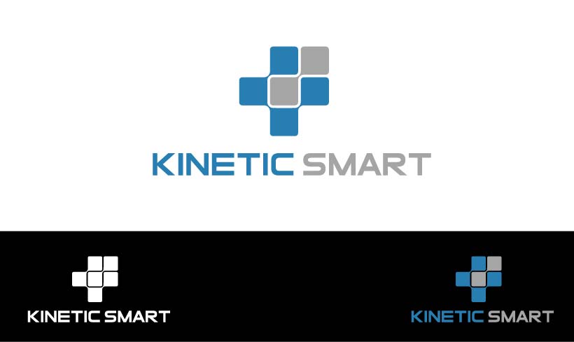
Design our new Kinetic Smart payment tech company logo

Vous souhaitez remporter un projet comme celui-ci ?
Ce client a reçu 149 designs de logo de la part de 48 designers. Il a choisi ce design de logo de gutsdudi comme design gagnant.
Inscrivez-vous Trouvez des Projets de Design- Garanti
Brief de Design de Logo
Backstory: Our Atlanta-based startup has been around for a year and a half and now it's starting to take off. We're moving quickly to being a larger, fast growing company.
Accepting card payments is hard, awkward and big legacy companies treat customers like numbers. Kinetic Smart is different.
We are design-centric (big Design Thinking practitioners), always start from the human being and work out toward solutions and we love what we do.
The Kinetic Smart team are your "phone-a-friend" in the payments industry.
Logo: we have a logo today. We like it a lot but do feel like we need a badge that conveys better that we know what we're doing and can be trusted, but something that's also a little more exciting and captures the attention on first sight.
We are bringing something new and sensible and the team care deeply about solving the right problems for merchants and businesses in the best possible way. How can we spark a good feeling in the prospect or client who sees the logo? How might we ignite them to want to find out more or engage? How can we portray a sense that we're familiar and care a lot about their success?
Marché(s) Cible(s)
Small to mid-sized businesses that have physical premises and need to accept payments by credit and debit cards. Also customers of those merchants/businesses need to be able to recognize the badge.
If you've ever been in to a local store or shop, that's the person we're hoping to appeal to the most.
Secteur / Type d'entité
Financial Service
Texte du logo
Kinetic Smart
Styles de logo qui vous intéressent
Logo d'Enseigne
Logo contenu dans une forme
Logo abstrait
Conceptuel / symbolique (texte facultatif)
Styles de police à utiliser
Couleurs
Couleurs choisies par le client et à utiliser dans le design de logo:
Aspect
Chaque curseur illustre les caractéristiques de la marque client et le style que doit transmettre votre design de logo.
Élégant
Audacieux
Léger
Sérieux
Traditionnel
Moderne
Sympathique
Professionnelle
Féminin
Masculin
Coloré
Conservateur
Économique
Haut de gamme
Exigences
Doit avoir
- A unique and striking badge. Trusting colors, approachable, opinionated.
Bien d'avoir
- You do not have to use the letters K and S to make up the badge! Icon creativity is strongly encouraged.
- The words Kinetic Smart alongside the badge would be nice, but not essential as our branding emphasis will be on the badge itself.
- As some of the devices we design for only have Windows 256 color palettes, less or no gradients would be helpful.
- Simplicity is more interesting than complex designs.
- Less sharp angles, more curves.
Ne doit pas comporter
- The current logo has an S that's similar to the styling of a bad WW2 badge. We don't want that.
- If your design has to include text, please avoid all UPPERCASE TEXT.
- The visual concepts of a stylized letter "K" can lead to a prominent back arrow "first glance" visual. Please avoid this if you can.
- The letter "K" is used is many prominent retailer logos, just as Kellogs, K-Mart. Please avoid similarities to these mainstream logos.