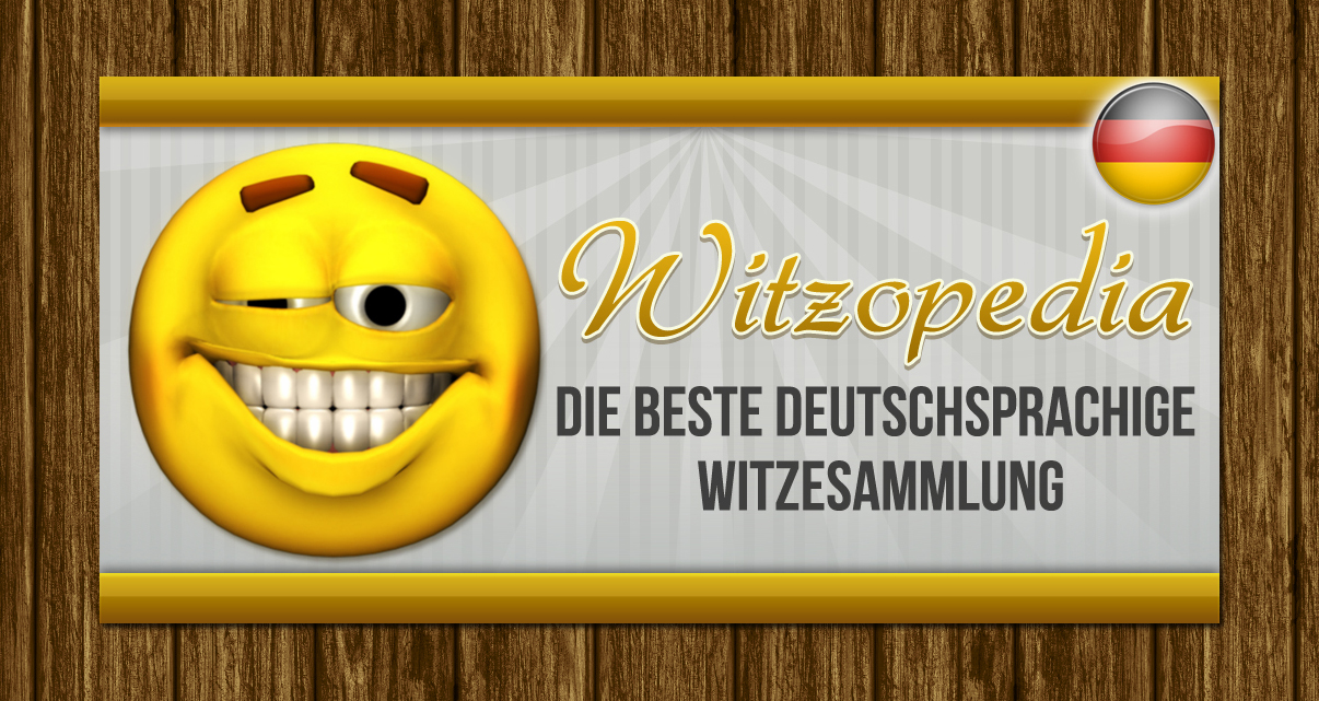
Promotion Graphic for my Andorid App (Jokspedia)

Vous souhaitez remporter un projet comme celui-ci ?
Ce client a reçu 28 designs de bannière de la part de 4 designers. Il a choisi ce design de bannière de Levardos comme design gagnant.
Inscrivez-vous Trouvez des Projets de Design- Garanti
Brief de Design de Bannière
Hi!
I'm looking for a new promotional graphic for my apps in the Google Play App Market.
I would like to use the same graphic for the following Apps:
https://play.google.com/store/apps/details?id=com.anjokes.apps.jokes.de
https://play.google.com/store/apps/details?id=com.anjokes.apps.jokes.en
https://play.google.com/store/apps/details?id=com.anjokes.apps.jokes.it
https://play.google.com/store/apps/details?id=com.anjokes.apps.jokes.es
https://play.google.com/store/apps/details?id=com.anjokes.apps.jokes.fr
The idea is to have a title and a sub-title like a moto as a difference between the banners. I could have than for the English version:
Jokspedia
The great Jokes Collection
and for German:
Witzopedia
Die beste deutschsprachige Witzesammlung
It should be possible that on the final result it is possible to change the text on the graphic (own Text-layer or a different solution). One additional idea would be also to incooparate somehow a flag for every of the five different languages (English, German, Italien, French, Spanish).
In cases when an App is selected by Google to be featuered in a Category the promotial graphic is used. The Google guidelines are described here:
http://android-developers.blogspot.co.at/2011/10/android-market-featured-image.html
One sample where the promotion graphic is used is on the Editors Choise page. Two samples are attached.
The graphic should be funny and interesting so the people would like to download the app. The existing logo can be reused and is attached.
Aspect
Chaque curseur illustre les caractéristiques de la marque client et le style que doit transmettre votre design de logo.