

 Rafraîchir
Update optical engineering firm logo or propose how to use current one (font, color, positioning)
Vous souhaitez remporter un projet comme celui-ci ?
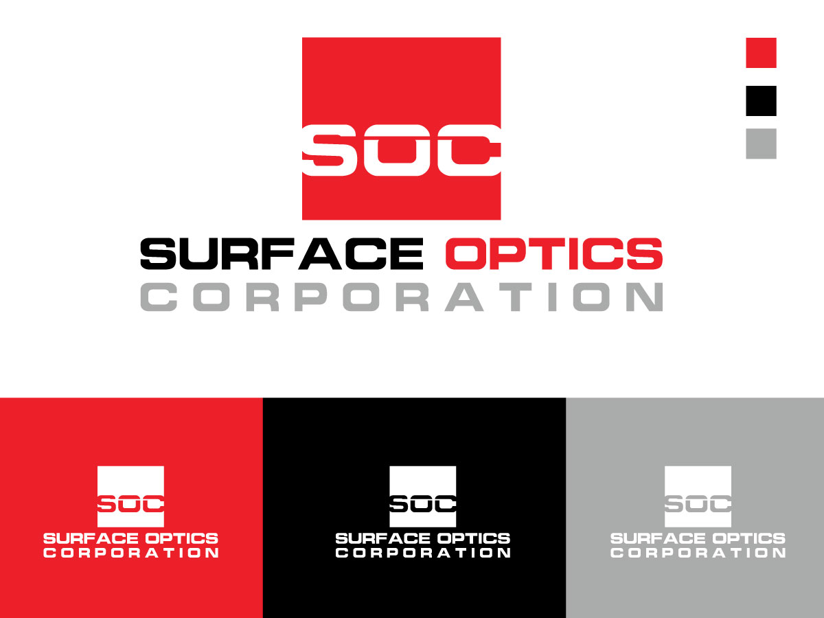
Ce client a reçu 131 designs de logo de la part de 51 designers. Il a choisi ce design de logo de Quick™ comme design gagnant.
Inscrivez-vous Trouvez des Projets de Design
-
 US$286
-
 131 designs
-
 51 designers
Brief de Design de Logo
Want to update our logo or alternatively come up with a better way to use the existing symbol.
What font should the company name be in? What color should the logo be and how do we use it on dark, light, photo backgrounds? What amount of spacing should there be between the company name and the logo? How do we use the logo and company name horizontally and vertically?
The logo is based off of the diagram for how light reflects off a surface (see attached). For a new logo we are imagining a simplification that keeps the aspect of the logo that shows light hitting and then reflecting off the surface.
Our colors are red, black, grey and white but we don't have any sort of branding guide or rules on how much or little to use those colors.
Company description: Surface Optics Corporation offers a single engineering and manufacturing source for characterization, control, and exploitation of the optical properties of surfaces. Our unique understanding of customers’ needs allows us to offer engineering services, proprietary analytical software, reflectometers, hyperspectral and multispectral imagers, and surface coating products that are cost effective, innovative, and provide unsurpassed performance.
www.surfaceoptics.com

Mises à jour
Project Deadline Extended
Reason: Would like to extend deadline since designer requested I do so.
Added Monday, January 30, 2017
Marché(s) Cible(s)
military R&D, university researchers, industrial
Secteur / Type d'entité
It Company
Texte du logo
Surface Optics Corporation
Styles de logo qui vous intéressent
Logo abstrait
Conceptuel / symbolique (texte facultatif)



Styles de police à utiliser

Couleurs
Couleurs choisies par le client et à utiliser dans le design de logo:
Aspect
Chaque curseur illustre les caractéristiques de la marque client et le style que doit transmettre votre design de logo.
Élégant
Audacieux
Léger
Sérieux
Traditionnel
Moderne
Sympathique
Professionnelle
Féminin
Masculin
Coloré
Conservateur
Économique
Haut de gamme
Exigences
Doit avoir
- Work well on both a dark or light background. Not required to use any particular shade of red(s), but am looking for some combination of reds, grays, white or black.
- Surface Optics must be together.
Bien d'avoir
- Open to having just "Surface Optics" in the logo rather than the full "Surface Optics Corporation", interested in the possibilities of both.
Ne doit pas comporter
- No rainbow related designs, many of our competitors use this theme.


