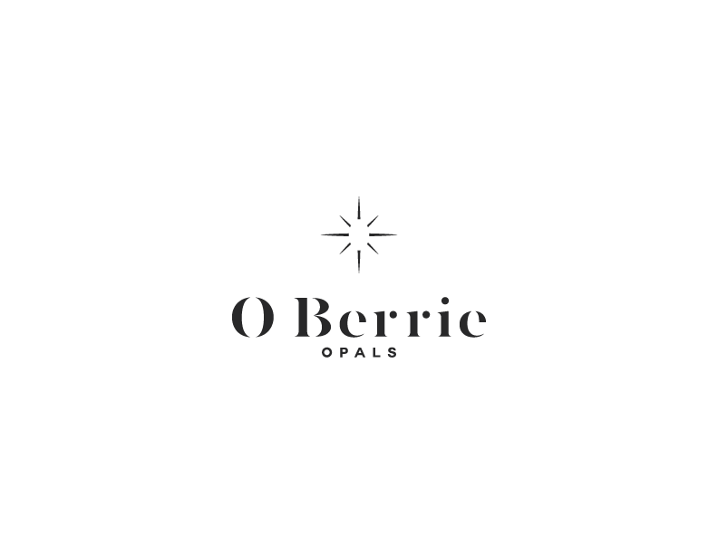
Fine Opal Jewellery Needs a Logo Design

Vous souhaitez remporter un projet comme celui-ci ?
Ce client a reçu 15 designs de logo de la part de 3 designers. Il a choisi ce design de logo de Psych artist comme design gagnant.
Inscrivez-vous Trouvez des Projets de DesignBrief de Design de Logo
I need a logo to market fine handmade opal jewellery. The opals have been mined at our mine in western Queensland and have been cut, polished and set by arguably Australia's leading opal artisan. The design should communicate quality, elegance and creativity to reflect the products. Each piece of jewellery is handmade, some with the addition of a pearl, sapphire, diamond or a combination of these. As no two pieces of opal are the same, the range is extensive. There are rings, earrings, pendants and necklaces all of individual design and style on offer. Opals come in nearly all colours with mixtures and colour bars of blues, reds, greens, purples, yellows, pinks, oranges and whites. Each piece has been set in either gold, sterling silver, white gold and some in combinations of these. There does not necessarily have to be a symbol, the logo could just be the script of the name but I'd love to see what you can do. I think the name is catchy and lends itself to being the hero of the design. Coloured or straight black is also up to you. The name is in reference to my grandmother who is my inspiration. The highest quality opal is formed in very hard rock and from this rock in remote, hard, inhospitable landscape comes the unique beauty and vibrancy of opals. Similar to the gem that was my grandmother, Olive Berrie. The logo can include or not include the fullstop between O and Berrie. The font that is used could either be modern to fit with the contemporary designs of the products or script like to reflect the elegance of the jewellery.
Marché(s) Cible(s)
Women who appreciate individually designed jewellery priced above chain jewellery stores. Each piece is handmade and every piece of opal is different.
Secteur / Type d'entité
Jewelry
Texte du logo
O. Berrie Opals
Styles de logo qui vous intéressent
Logo d'Enseigne
Logo contenu dans une forme
Logo pictural
Un objet réel (texte facultatif)
Logo abstrait
Conceptuel / symbolique (texte facultatif)
Logo de figurine
Logo avec illustration ou personnage
Logo mot symbole
Logo (texte seulement)
Logo de Lettermark
Acronyme ou logo texte (texte seulement)
Styles de police à utiliser
Aspect
Chaque curseur illustre les caractéristiques de la marque client et le style que doit transmettre votre design de logo.
Élégant
Audacieux
Léger
Sérieux
Traditionnel
Moderne
Sympathique
Professionnelle
Féminin
Masculin
Coloré
Conservateur
Économique
Haut de gamme
Exigences
Doit avoir
- The words O. Berrie Opals (with or without the fullstop, that's up to you).
Bien d'avoir
- Maybe in a logo that is not straight script something could be done with the two letter Os? Not a must have, just a possible idea..... Script only seems elegant as well so I am very open to all ideas.
Ne doit pas comporter
- Though my grandmother's name was Olive Berrie, I'm not sure that the use of symbols relating to olives or berries would be suitable? I tend to think of restaurants or things relating to food or poker machines when I see these and I'm not sure that it would work with opal jewellery. If you think it might work I would be happy to be convinced otherwise! Please don't use any symbols reflective of a typical gem that has been faceted. Polished opals are a cabochon and so are very different to a stone cut with facets.