Semi-professional basketball team needs an updated logo design
Vous souhaitez remporter un projet comme celui-ci ?
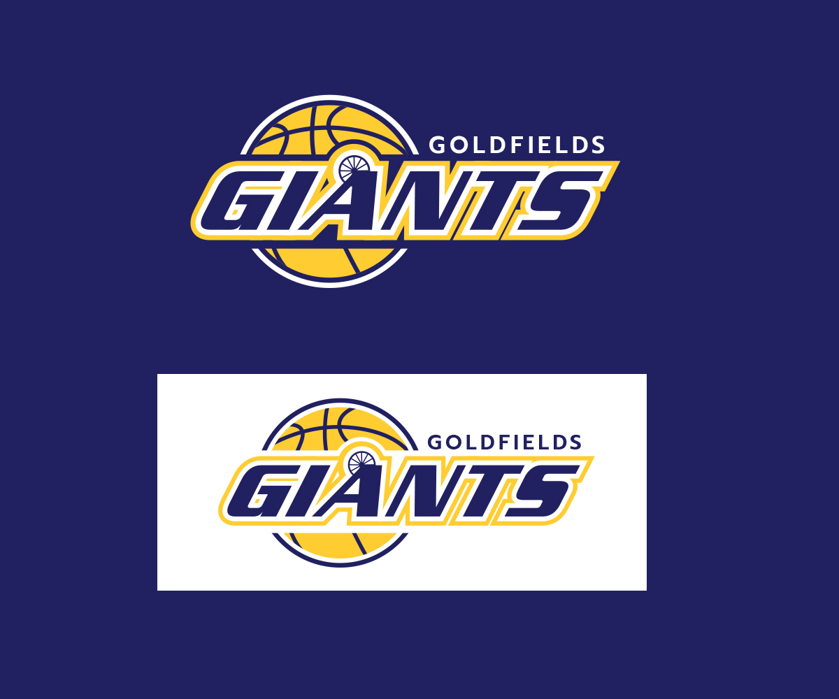
Ce client a reçu 83 designs de logo de la part de 35 designers. Il a choisi ce design de logo de JLG Studios comme design gagnant.
Inscrivez-vous Trouvez des Projets de Design- Garanti
-
 A$150
A$150
-
 83 designs
-
 35 designers
Brief de Design de Logo
We are a semi-professional basketball club and would like either a new logo, or to provide us with an update to one of our old logos. We would like to see different options, feel free to use your creativity to design us a fresh new logo, alternatively help us relive our past and create a design to replicate one of our previous logo's which is very popular with our board and supporters. We have attached a copy of the old logo for your reference. We are based in Kalgoorlie, Western Australia.
Marché(s) Cible(s)
Basketball and sports fans
Secteur / Type d'entité
Club
Texte du logo
Goldfields Giants
Styles de logo qui vous intéressent
Logo d'Enseigne
Logo contenu dans une forme
Logo pictural
Un objet réel (texte facultatif)
Logo abstrait
Conceptuel / symbolique (texte facultatif)
Logo de figurine
Logo avec illustration ou personnage
Logo mot symbole
Logo (texte seulement)
Logo de Lettermark
Acronyme ou logo texte (texte seulement)
Styles de police à utiliser
Aspect
Chaque curseur illustre les caractéristiques de la marque client et le style que doit transmettre votre design de logo.
Élégant
Audacieux
Léger
Sérieux
Traditionnel
Moderne
Sympathique
Professionnelle
Féminin
Masculin
Coloré
Conservateur
Économique
Haut de gamme
Exigences
Doit avoir
- Has to have our exact team colours, they are:
- Blue - Hex Code: 000066 RGB: 0,0,102
- Yellow - Hex Code: FFCC33 RGB: 255,204,51
- 'White' can also be used if required.
- It must also have "Goldfields Giants" in the logo, with an emphasis on 'Giants'.
Bien d'avoir
- We would like it to represent our region, we are in a mining town called Kalgoorlie in Australia. We would like some of the options to be a replication of one of our old logo's, which we have attached for reference. We would also like some to be fresh and new, so you can use your own creativity here.
- Note: The "A" on our old logo is designed like a mining headframe, we would like this to be included in the logo (though not a deal breaker) in the same way it has been in our old logo. I have attached photos of an A-Frame so you know what it looks like.
- We have also included our latest logo, which is the one without the headframe.