FUNKY urban short stay ppty rental LOGO
Vous souhaitez remporter un projet comme celui-ci ?
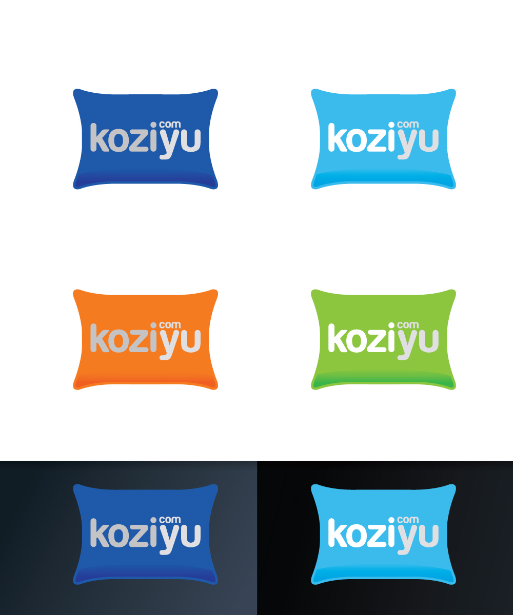
Ce client a reçu 493 designs de logo de la part de 68 designers. Il a choisi ce design de logo de Sergio Coelho comme design gagnant.
Inscrivez-vous Trouvez des Projets de Design- Garanti
-
 US$250
-
 493 designs
-
 68 designers
Brief de Design de Logo
LOGO with PILLOW motto/icon/image -- Property manager in Big Asian city doing short term rental management (like Airbnb). Target mkt is upper-mids to premium... want playful, fun, trendy, young logo for millineals age 30+ . Colors should be comforting, cool colors which comfort the eyes, convey cozy and comfortable, warm and inviting. Company brand name is koziyu.com, focus on getting correct FONT and integrating motto/image. to convey cozy + you.
Mises à jour
the brief is being updated so please submit new designs Added Monday, November 21, 2016
Project Deadline Extended Reason: extending deadline to allow submissions with icon/logo/fun picture/image to be included as brief amended. thanks and good luck! Added Tuesday, November 22, 2016
Marché(s) Cible(s)
Asian millenneals. Age 30+. Urban, upper middle class. Educated, type that seeks a travel and overnight experience that is fun, safe, comfortable.
Secteur / Type d'entité
Management
Texte du logo
koziyu.com
Styles de logo qui vous intéressent
Logo d'Enseigne
Logo contenu dans une forme
Logo pictural
Un objet réel (texte facultatif)
Logo abstrait
Conceptuel / symbolique (texte facultatif)
Styles de police à utiliser
Aspect
Chaque curseur illustre les caractéristiques de la marque client et le style que doit transmettre votre design de logo.
Élégant
Audacieux
Léger
Sérieux
Traditionnel
Moderne
Sympathique
Professionnelle
Féminin
Masculin
Coloré
Conservateur
Économique
Haut de gamme
Exigences
Doit avoir
- must have a funky image... i want a cartoon like image possibly PILLOW. the words can be resting above the PILLOW, on top of the p"low (in 3d) or the mini-pillow can be the "o". Must have clever FONT
- De-emphasize the .com by making smaller and/or .com from the dot in "i"
Bien d'avoir
- FONT could be 1960s-1970 newspaper print or similar, or font that works best
- Can show kozi and yu as different words by using capital letters or different colors or different shades as idea
Ne doit pas comporter
- The wrong font. Font should not be elitist or too high class. Should not have uninviting or cold and harsh color scheme.