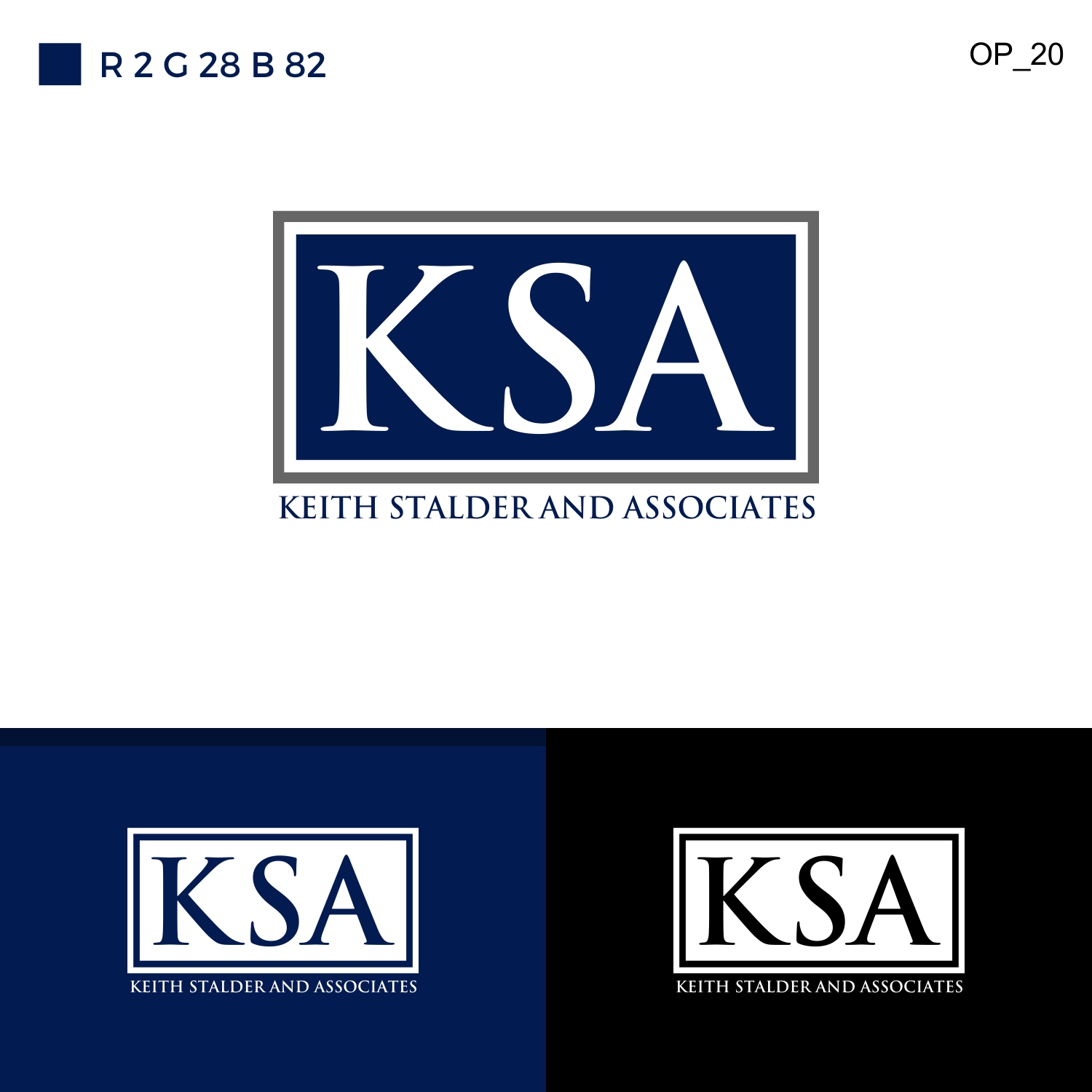
Quick Logo Update: KSA Logo Update

Vous souhaitez remporter un projet comme celui-ci ?
Ce client a reçu 29 designs de logo de la part de 3 designers. Il a choisi ce design de logo de White sky comme design gagnant.
Inscrivez-vous Trouvez des Projets de DesignBrief de Design de Logo
We are doing a refresh to our logo, because we have had some difficulty with printing and business cards.
1. We like the dual border around the rectangle: grey, white, and navy are strong, clean colors. Our previous color scheme would print as purple, so we need a blue/navy that will print as blue/navy.
2. We prefer a font with serif, but not so much that the letters bleed together. The letters must be distinct from one another, in this instance. Palatino Linotype or Goudy Old Style translated well when we tried them.
3. No recognizable fonts, like Calibri or Comic.
4. It should be clean, refined. We aren't looking for edginess, we are consulting professionals so it should reflect this.
5. We need one version in Black and White (or Grayscale), one in color with a white background, one in color with a black background, and one with "Keith Stalder and Associates" printed clearly beneath the logo.
6. We need high resolution JPG files for each.
Secteur / Type d'entité
Government
Texte du logo
KSA
Styles de logo qui vous intéressent
Logo mot symbole
Logo (texte seulement)
Logo de Lettermark
Acronyme ou logo texte (texte seulement)
Styles de police à utiliser
Aspect
Chaque curseur illustre les caractéristiques de la marque client et le style que doit transmettre votre design de logo.
Élégant
Audacieux
Léger
Sérieux
Traditionnel
Moderne
Sympathique
Professionnelle
Féminin
Masculin
Coloré
Conservateur
Économique
Haut de gamme
Exigences
Doit avoir
- We are doing a refresh to our logo, because we have had some difficulty with printing and business cards.
- 1. We like the dual border around the rectangle: grey, white, and navy are strong, clean colors. Our previous color scheme would print as purple, so we need a blue/navy that will print as blue/navy.
- 2. We prefer a font with serif, but not so much that the letters bleed together. The letters must be distinct from one another, in this instance. Palatino Linotype or Goudy Old Style translated well when we tried them.
- 3. No recognizable fonts, like Calibri or Comic.
- 4. It should be clean, refined. We aren't looking for edginess, we are consulting professionals so it should reflect this.
- 5. We need one version in Black and White (or Grayscale), one in color with a white background, one in color with a black background, and one with "Keith Stalder and Associates" printed clearly beneath the logo.
- 6. We need high resolution JPG files for each.
Bien d'avoir
- We are doing a refresh to our logo, because we have had some difficulty with printing and business cards.
- 1. We like the dual border around the rectangle: grey, white, and navy are strong, clean colors. Our previous color scheme would print as purple, so we need a blue/navy that will print as blue/navy.
- 2. We prefer a font with serif, but not so much that the letters bleed together. The letters must be distinct from one another, in this instance. Palatino Linotype or Goudy Old Style translated well when we tried them.
- 3. No recognizable fonts, like Calibri or Comic.
- 4. It should be clean, refined. We aren't looking for edginess, we are consulting professionals so it should reflect this.
- 5. We need one version in Black and White (or Grayscale), one in color with a white background, one in color with a black background, and one with "Keith Stalder and Associates" printed clearly beneath the logo.
- 6. We need high resolution JPG files for each.
Ne doit pas comporter
- We are doing a refresh to our logo, because we have had some difficulty with printing and business cards.
- 1. We like the dual border around the rectangle: grey, white, and navy are strong, clean colors. Our previous color scheme would print as purple, so we need a blue/navy that will print as blue/navy.
- 2. We prefer a font with serif, but not so much that the letters bleed together. The letters must be distinct from one another, in this instance. Palatino Linotype or Goudy Old Style translated well when we tried them.
- 3. No recognizable fonts, like Calibri or Comic.
- 4. It should be clean, refined. We aren't looking for edginess, we are consulting professionals so it should reflect this.
- 5. We need one version in Black and White (or Grayscale), one in color with a white background, one in color with a black background, and one with "Keith Stalder and Associates" printed clearly beneath the logo.
- 6. We need high resolution JPG files for each.