Logo Design For Property Search Company
Vous souhaitez remporter un projet comme celui-ci ?
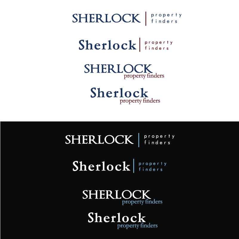
Ce client a reçu 97 designs de logo de la part de 27 designers. Il a choisi ce design de logo de Stephanie Soon comme design gagnant.
Inscrivez-vous Trouvez des Projets de Design- Garanti
-
 £130
£130
-
 97 designs
-
 27 designers
Brief de Design de Logo
I run a property search service finding properties for people wanting to purchase property in London who dont have the time to find their own home or investment property. We are NOT an estate agent. We act for the buyer, whereas estate agents deal with one particular area and only represent the seller.
We deal with the whole of central london and also market ourselves to people overseas and beyond.
Sherlock is my surname, and is also synonomous with Sherlock Homes, as well as the city of London.
There are three of us in the company.
The service we offer is very personal, so we do not want to convey the image of a large global, impersonal company. More along the lines of a medium sized consultancy. Our service is professional and personalised aimed at finding our cleints the perfect home or a solid property investment.
We are very much about selling the personality and expertise to the target market and thus the forthcoming website will represent this.
My website will be have a simple, but engaging design, so the logo should ideally compliment this.
We would like a wordmark logo. This should be a clean and modern typeface. No techy designs please.
If you want to add a bit of original detail to one of the letters then i am happy for you to do this, but nothing too obvious and cliched.
In terms of the colour - we are open to your suggestion, but if you could submit your design in two/three differetn colour, that woudl be appreciated.
The colours which we think may work are
- A white typeface on a deep blue background,
- A blue typeface on a white background
- A sharp blue on a black background.
I have attached a couple of very rough examples of how the website will look for some guidance. In all circumstances the logo will go in the top left corner.
The type style is really important!
Mises à jour
Dear Designer,
Thank you for your submissions so far.
I would like to let you know that i have had to change the name of my company to Sherlock Property Finders. In addition to this, we now need WORDMARK logos only. Sorry for the confusion and change of plan, but this is essential.
I have updated my brief and also uploaded a copy of the visuals for my website.
The budget has now been increased to £120.00 total. This is not showing as live yet, but will do once the guys at design crowd come back online.
Best of luck.
Matt Sherlock
Sherlock Property Finders
Marché(s) Cible(s)
male and female age 25-55 mostly living within the UK, but some investors too from Russia, Italy, USA and rest the of continental Europe.
Secteur / Type d'entité
Real Estate
Texte du logo
Sherlock Property Finders
Styles de logo qui vous intéressent
Logo mot symbole
Logo (texte seulement)
Exigences
Bien d'avoir
- Modern yet stylish design.