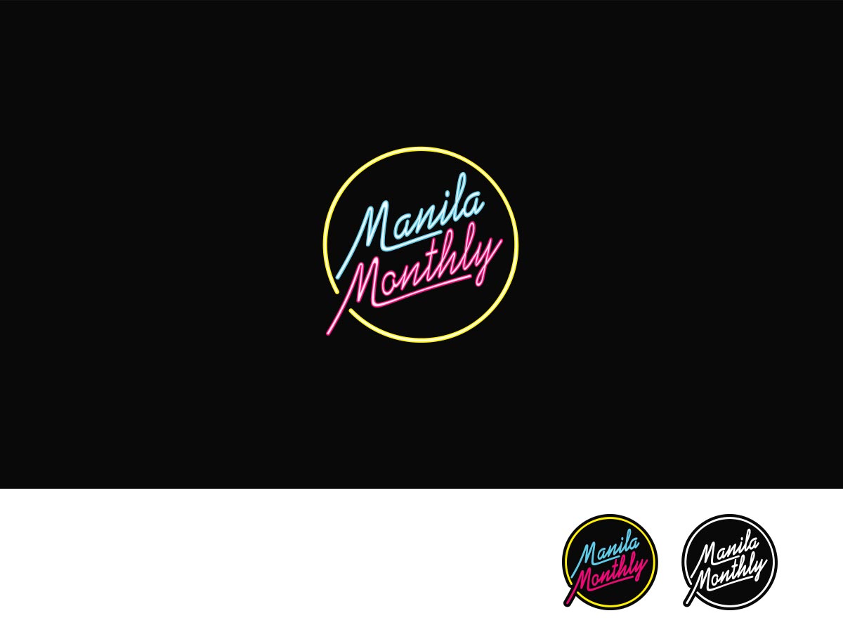
Logo for a Pinoy Snack Subscription Box Named Manila Monthly, a fun non serious logo

Vous souhaitez remporter un projet comme celui-ci ?
Ce client a reçu 42 designs de logo de la part de 14 designers. Il a choisi ce design de logo de ArtTank comme design gagnant.
Inscrivez-vous Trouvez des Projets de Design- Garanti
Brief de Design de Logo
Playful, fun and non serious. We're only selling Pinoy snacks here. Bright neon lights for text saying Manila Monthly on a darker shaded backdrop. This will be the logo. Bright texts is desired!
Please see the uploaded pictures to get an idea.
I need two logos. One for web use, the second for printing on a box.
You know when Pepsi featured a Pepsi bottle named "Pilipinas"? We will ideally feature snack/drink items like that. Remember when Buzzfeed featured Pilipino snacks..
Our product was inspired by snack boxes such as SnackFever and JapanCrate. This will be for a company that makes Pilipino snacks such as Iced Gems, Haw Haw or Potchi available to the rest of the world.
Mises à jour
I'm choosing from the logo work of 3 designers. Keeping you posted!
Added Saturday, October 15, 2016
No worries for any further designs. I picked a winner.
Added Sunday, October 16, 2016
Thank you for all designers who contributed. I wish I can give a participation payment or 2nd, 3rd place but the limited budget does not allow me to do so. Rest assured that other than 1st spot, there were 3 other designers whose work qualifies in its own. I wish I can pay you more for the great works!
Added Tuesday, October 18, 2016
Marché(s) Cible(s)
People 18 years old to 39 years old..
Texte du logo
Manila Monthly
Styles de logo qui vous intéressent
Logo mot symbole
Logo (texte seulement)
Styles de police à utiliser
Aspect
Chaque curseur illustre les caractéristiques de la marque client et le style que doit transmettre votre design de logo.
Élégant
Audacieux
Léger
Sérieux
Traditionnel
Moderne
Sympathique
Professionnelle
Féminin
Masculin
Coloré
Conservateur
Économique
Haut de gamme
Exigences
Doit avoir
- I need two versions. First is the web version of the logo, that's easy to use for social media such as Facebook, Instagram or Twitter and easy to use for CRATEJOY. Second is the print version, that's easy to print on the center of a box..
- The web version must be easy to use for the profile photo of twitter and Facebook.
- The print version must fit a space of 6 inches horizontally, and 4.5 inches vertically.. that's going to be printed on the center front top face of a box. The print version must run with only 3 colors. You can have more colors with the web version of the logo.
- It must have NEON LIGHTS
- It must have a COOL, MODERN backdrop
- It must eminently, prominently feature Manila Monthly as its text. Catch an eye.
- It must be a logo that I can use for 36 months straight. Solid logo.
Bien d'avoir
- I'd like a 2017 styled design.. I will launch the company next year, is why. If you have a better idea for the font, style and theme, let me know.
Ne doit pas comporter
- No generic or cliched references to Pilipino culture such as ADOBO, LUMPIA, LECHON .. no food references like that. It's great and all but I'd like for us to be known for more than our food.. be above typical stereotypes..