Crisp, clean, feminine logo for wedding industry company
Vous souhaitez remporter un projet comme celui-ci ?
Ce client a reçu 79 designs de logo de la part de 30 designers. Il a choisi ce design de logo de Winged_Graphics comme design gagnant.
Inscrivez-vous Trouvez des Projets de Design- Garanti
-
 US$160
-
 79 designs
-
 30 designers
Brief de Design de Logo
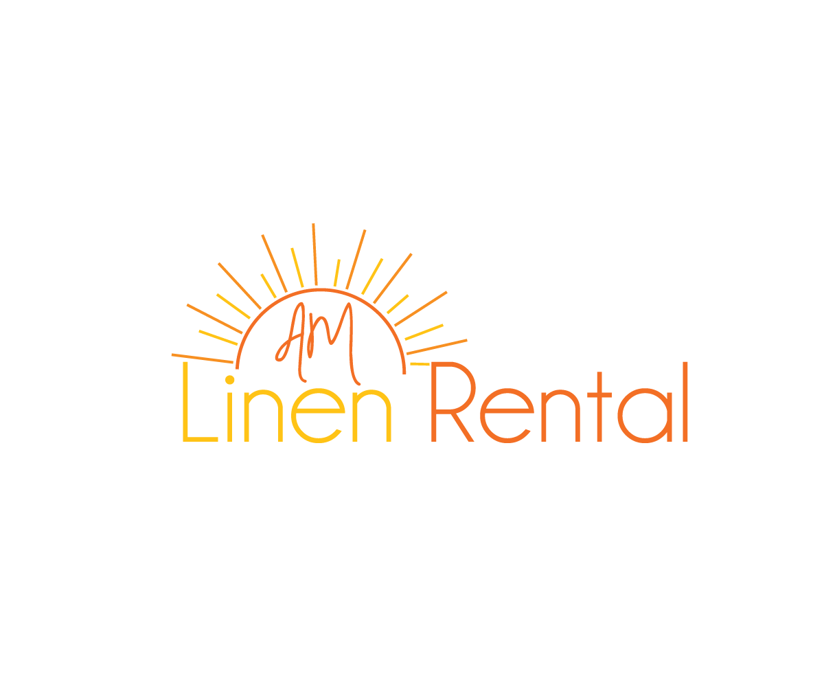
I'm looking for a logo that fits in with other feminine logos. The company name is AM Linen Rental. I would like to use muted versions the colors orange and yellow and the logo must have a sunrise component. Our current logo has a very busy and masculine look to it, and we are looking to freshen up our brand as we launch nationwide. Our current logo is attached. I do not like this logo when it is next to a bunch of feminine logos in various industry publications. It sticks out and doesn't look right. I want something very clean and pretty, but that still utilizes a sunrise (for the AM).
Marché(s) Cible(s)
21-45 engaged females; also professionals in the event/wedding industry (caterers, banquet managers, wedding planners, country club managers, etc.)
Secteur / Type d'entité
Events
Texte du logo
AM Linen Rental
Styles de logo qui vous intéressent
Logo pictural
Un objet réel (texte facultatif)
Logo abstrait
Conceptuel / symbolique (texte facultatif)
Styles de police à utiliser
Couleurs
Couleurs choisies par le client et à utiliser dans le design de logo:
Aspect
Chaque curseur illustre les caractéristiques de la marque client et le style que doit transmettre votre design de logo.
Élégant
Audacieux
Léger
Sérieux
Traditionnel
Moderne
Sympathique
Professionnelle
Féminin
Masculin
Coloré
Conservateur
Économique
Haut de gamme
Exigences
Doit avoir
- -Muted, darker shades of orange and/or yellow
- -A Sunrise
- -A white background on the logo
- -MUST be able to be embroidered on a BLACK shirt
- -Be feminine looking
- -All capital letters, preferably with AM L and R a bit larger than the rest of the letters, but still all capital letters.
Bien d'avoir
- Something that looks elegant, expensive
- I've attached a logo on this page with the orange basic sunrise. This is one I was playing with and like where it's going. I absolutely do not like my old one, with the shading of the orange and yellow. It's too masculine and busy.
Ne doit pas comporter
- unknown