

 Rafraîchir
International printing supplier needs full stationery design
Vous souhaitez remporter un projet comme celui-ci ?
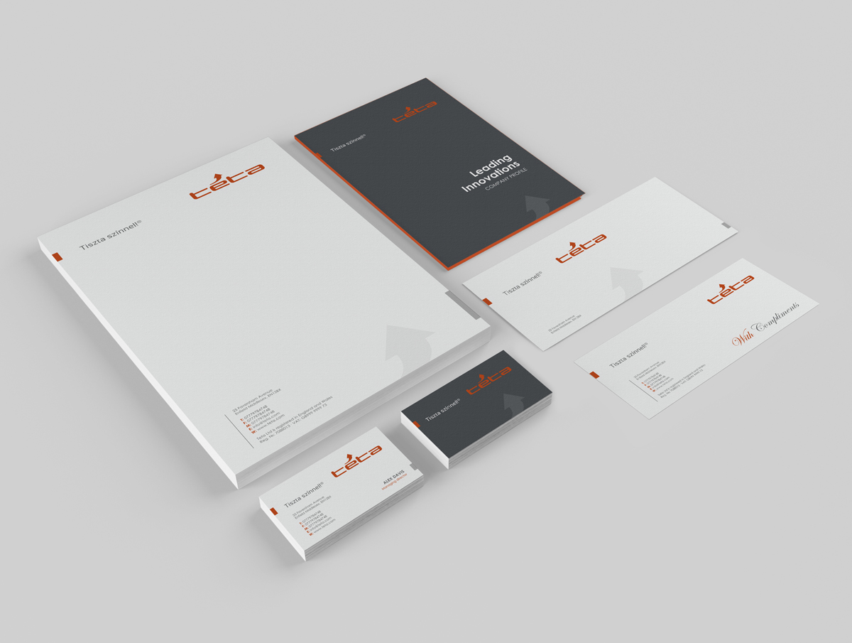
Ce client a reçu 44 designs de papeterie de la part de 4 designers. Il a choisi ce design de papeterie de logodentity comme design gagnant.
Inscrivez-vous Trouvez des Projets de Design
-
 €270
€270
-
 44 designs
-
 4 designers
Brief de Design de Papeterie
We would like a full stationery design to line up with our new logo and branding.
(In order to symbolise our responsiveness and fast service in the logo, we used an arrow as the accent on the “e“ in the company name.)
What designs we are looking for:
-font to be used in all documentation
-letterhead
-business card
-envelope TC4 (229x324 mm) and LC6 (114x162 mm)
-fax header
-email header
-smaller product labels (69x36mm and 104x73mm)
-bigger product label (A5)
-logo for email signature
-rubber stamp pattern
-flag pattern
Our company (Téta) is B2B and is based in Central Europe. We operate in the printing press industry supplying press rooms with inks, additives and professional advice.
The design should thus communicate professionalism, responsiveness and swiftness.
Our current logo is attached and our main branding is based around the following colours:
Dark grey: RAL 7016
Orange: RAL 2004 (close to PMS 1655)
Light grey: RAL 9006 (or Pantone Cool Gray 10)
The Look and Feel Slider below should aid anyone in terms of what we imagined the stationery to look like.
Secteur / Type d'entité
Business
Aspect
Chaque curseur illustre les caractéristiques de la marque client et le style que doit transmettre votre design de logo.
Élégant
Audacieux
Léger
Sérieux
Traditionnel
Moderne
Sympathique
Professionnelle
Féminin
Masculin
Coloré
Conservateur
Économique
Haut de gamme
Exigences
Doit avoir
- Logo should be clearly visible on all elements.
The designed or chosen font should match the logo's font and it should be easy to read.
The bigger product label must have an area coloured orange, which needs to contain (maximum 4) industry standard hazard symbols by law. Therefore, these legal constraints need to be included in the design of the product labels. It would be ideal if they could be integrated with the company's orange colour scheme and the rest of the stationery.
Bien d'avoir
- The logo and slogan (Tiszta színnel!®) should be presented together on all of the proposed designs.
The arrow in the logo would be an ideal symbol to use across the different elements.
The designs should be similar for all the different stationery elements, communicating a clear image and professionalism.
Ne doit pas comporter
- Expensive or impractical solutions in elements of the stationery (i.e. cut-outs, metallic font colours, special materials etc.) should be avoided.
Too many colours on each of the elements of the stationery are not needed, keep it simple.