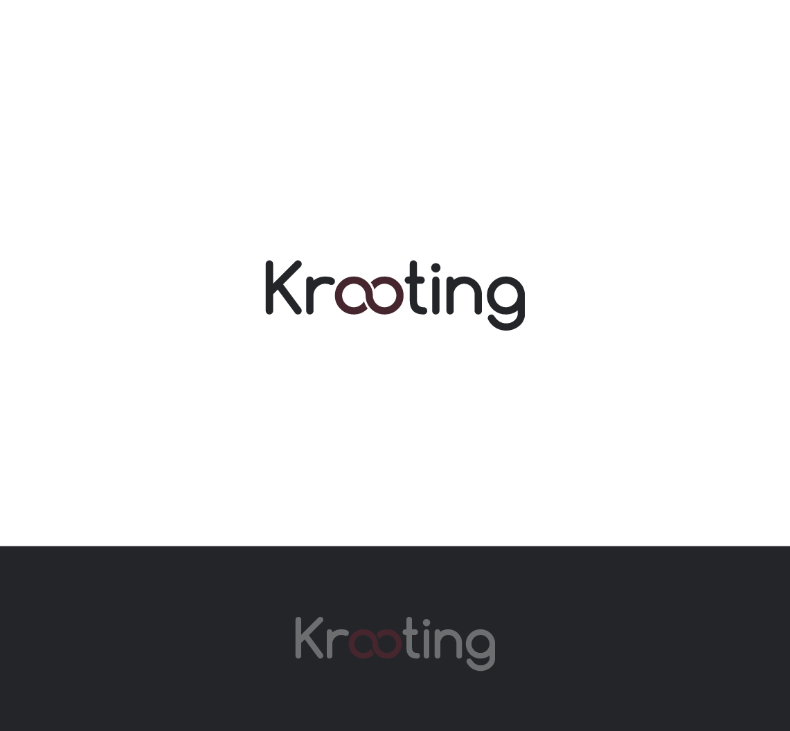
Krooting - Job board operating primarily in English speaking countries.
Vous souhaitez remporter un projet comme celui-ci ?
Ce client a reçu 46 designs de logo de la part de 24 designers. Il a choisi ce design de logo de arcoalex comme design gagnant.
Inscrivez-vous Trouvez des Projets de Design-
 £220
£220
-
 46 designs
-
 24 designers
Brief de Design de Logo
Krooting.com is to be a new job board. When launched it will be populated with vacancies from the LogicMelon job distribution platform. Due the volume of vacancies currently distributed by LogicMelon it will be easily be within the top 10 boards in the UK (when measured by monthly volume) and within a year the top 3.
Krooting makes reference to the word ‘recruiting’. It is a friendly and accessible sounding word, which could lend itself to becoming a character in time. The vision for the font is that it is simple, rounded, clear and has a cool edge to it, bringing in the personality of the brand.
The site is being developed on a black and white theme similar to http://www.beoplay.com/products/beoplayh2
The clients (advertisers) will be limited to users of the LogicMelon platform, these are split 70/30 between recruitment agencies and corporate. Agencies vary in size from 1 man bands to the 4,000+ user accounts such as Randstad. Our corporate clients in the UK are generally large enough to support their own recruitment function rather than having to use recruitment agencies, they have no specific industry background although we do have a significant number in the health sector such as BUPA. Other than that they range from companies as diverse as Screwfix, Farrow and Ball, to the Renault F1 team.
The branding should also have a wide appeal for job seekers across a number of sectors and job titles.
The logo should focus on the name and follow the greyscale colour palette. It should be sleek, modern, clean and friendly.
The logo should be easily identifiable and work well across digital platforms including web and social media.
Marché(s) Cible(s)
Target market is really potential job candidates in the UK, US/Canada, Australia/New Zealand and South Africa.
Secteur / Type d'entité
Distribution
Texte du logo
Krooting
Styles de police à utiliser
Aspect
Chaque curseur illustre les caractéristiques de la marque client et le style que doit transmettre votre design de logo.
Élégant
Audacieux
Léger
Sérieux
Traditionnel
Moderne
Sympathique
Professionnelle
Féminin
Masculin
Coloré
Conservateur
Économique
Haut de gamme
Exigences
Doit avoir
- None
Bien d'avoir
- The logo is going to be seen by a wide audience. Our current software handles around a million applications per month in the UK alone. The logo needs to appeal to both men and women throughout a wide variety of sectors and positions.
Ne doit pas comporter
- Nothing fussy or cluttered.