

 Rafraîchir
Sci-Fi/Fantasy Book Review Blog Needs Logo
Vous souhaitez remporter un projet comme celui-ci ?
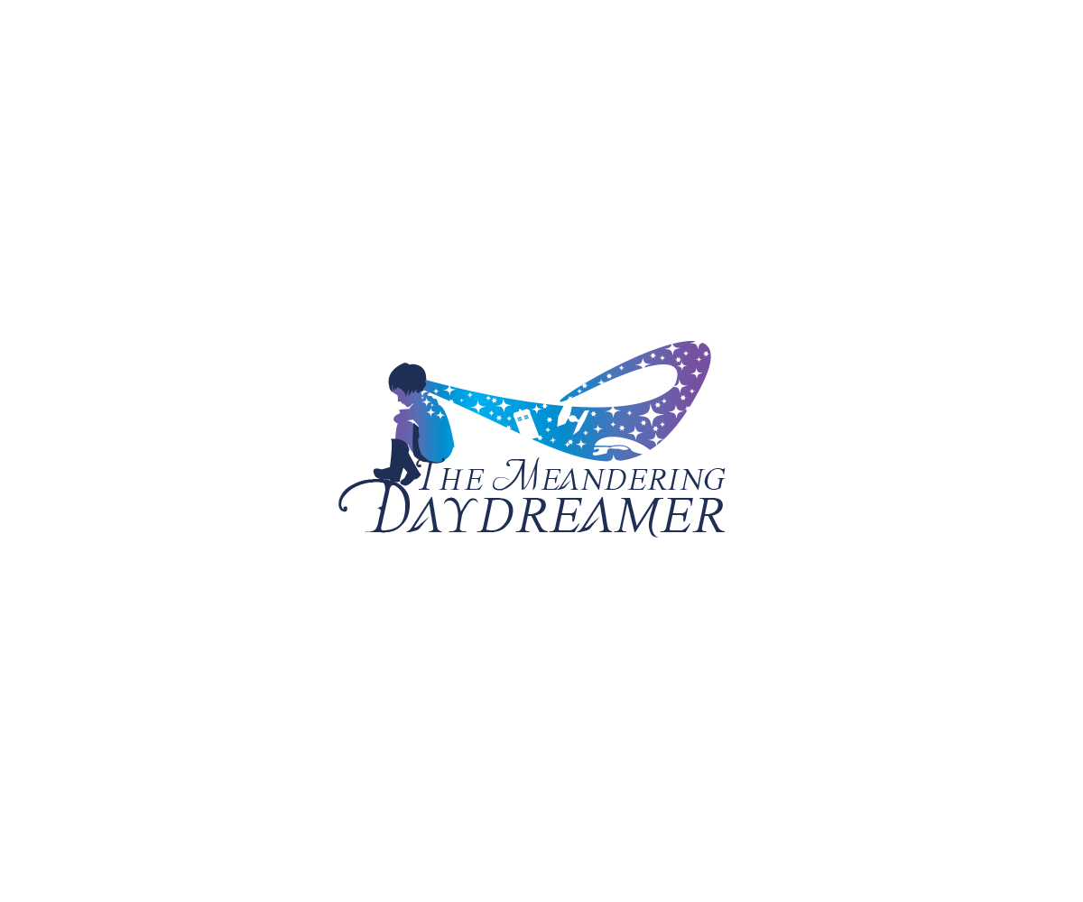
Ce client a reçu 137 designs de logo de la part de 34 designers. Il a choisi ce design de logo de Edgeukated comme design gagnant.
Inscrivez-vous Trouvez des Projets de Design
- Garanti
-
 US$160
-
 137 designs
-
 34 designers
Brief de Design de Logo
I am starting a new blog that will review science fiction and fantasy books and movies with a new fresh perspective. My reviews will have humor, include gif reactions, and appeal to underrepresented groups who aren't normally associated with reading this particular genre. I am a chemist and nerd at heart.
Get creative as you want, however I think it would be cool to have the word daydreamer turn into flying birds as you get closer to the end of the word.
I want the logo to reflect curiosity for the unknown.
Marché(s) Cible(s)
20-30's young professionals that enjoy science fiction and fantasy.
Texte du logo
The Meandering Daydreamer
Styles de logo qui vous intéressent
Logo pictural
Un objet réel (texte facultatif)



Logo mot symbole
Logo (texte seulement)


Styles de police à utiliser
Aspect
Chaque curseur illustre les caractéristiques de la marque client et le style que doit transmettre votre design de logo.
Élégant
Audacieux
Léger
Sérieux
Traditionnel
Moderne
Sympathique
Professionnelle
Féminin
Masculin
Coloré
Conservateur
Économique
Haut de gamme
Exigences
Doit avoir
- As an African-American woman I would love to incorporate a woman of color. Popular silhouettes from sci-fi and fantasy (for example: death star and the wheel of time) would be great, please feel free to be creative.
- Incorporate some type of winding road as well as a book in some way.
- I would like the daydreamer to dissolve into birds. I want this to represent the free-ness and whimsical aspect of my blog
- Here's an idea, a young woman (25-30 years old) sitting on a book and the words "The meandering daydreamer " below.
- Please be creative! You don't have to stay in the realm of ideas I have presented! I am open to seeing new things
Ne doit pas comporter
- The logo should be very horizontal not extremely long vertically

