Recording studio and music production services
Vous souhaitez remporter un projet comme celui-ci ?
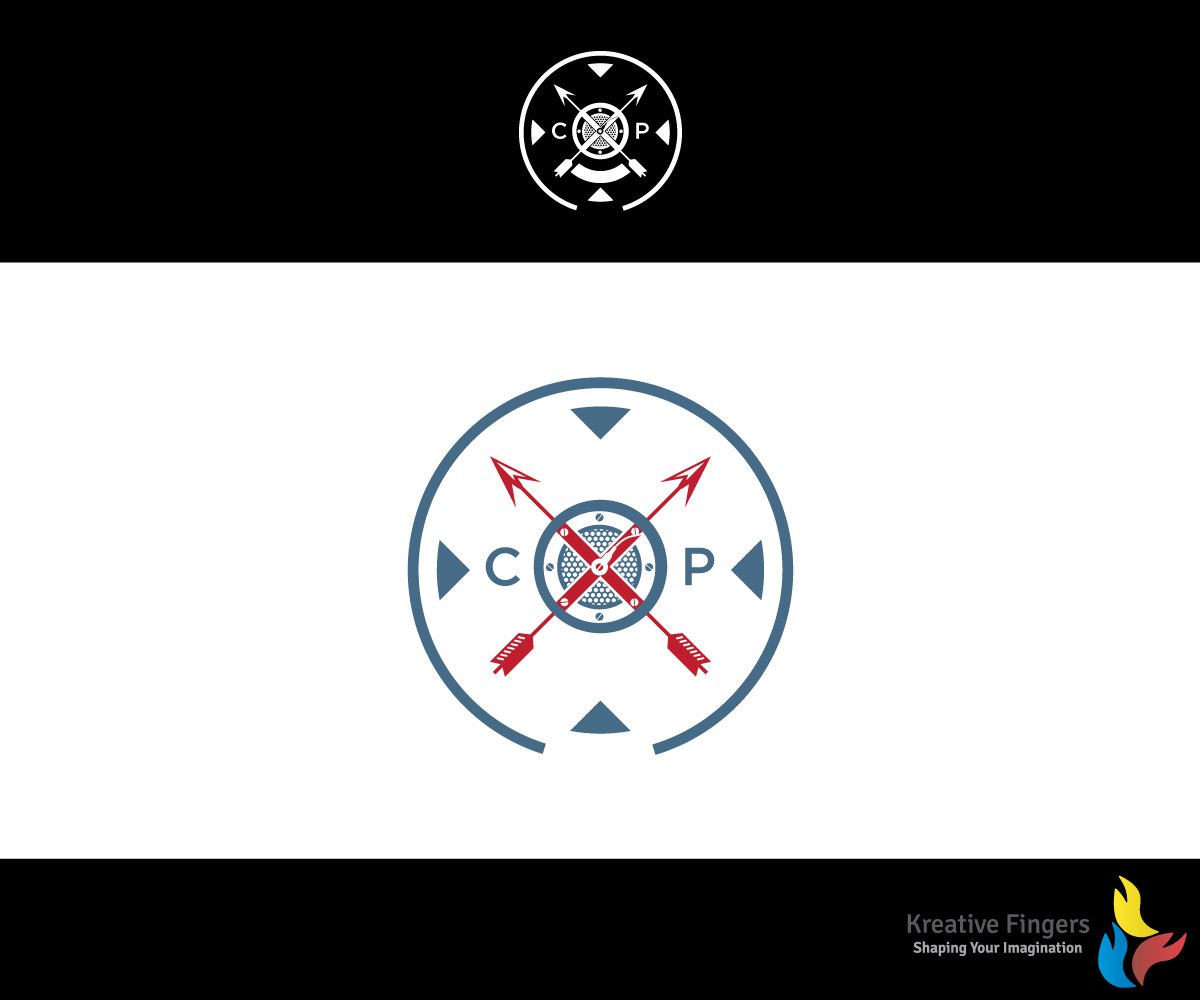
Ce client a reçu 69 designs de logo de la part de 21 designers. Il a choisi ce design de logo de Kreative Fingers comme design gagnant.
Inscrivez-vous Trouvez des Projets de Design- Garanti
-
 US$260
-
 69 designs
-
 21 designers
Brief de Design de Logo
I have an original logo I would like used as the basis for the new logo.
The current logo is a shield design. The lettering and font are a bit dated (I created this in Iraq with Photoshop - lost the .psd files though.)
I would like the color scheme to be Pelham blue with black and white accents. The word CXP Studios should appear and the year 2006. Creative license on how those are incorporated.
This will be used on business cards and websites.
Mises à jour
the year "2006" should appear not "2016"Also, the letter's "CXP" are now the only requirements for text. The year "2006" no longer is mandatory. Added Wednesday, August 31, 2016
Marché(s) Cible(s)
Professional music performers, singer/songwriters, and entertainment professional requiring audio services (voice over, score production).
Secteur / Type d'entité
Performing Art
Texte du logo
CXP Studios
Styles de logo qui vous intéressent
Logo abstrait
Conceptuel / symbolique (texte facultatif)
Logo de Lettermark
Acronyme ou logo texte (texte seulement)
Styles de police à utiliser
Aspect
Chaque curseur illustre les caractéristiques de la marque client et le style que doit transmettre votre design de logo.
Élégant
Audacieux
Léger
Sérieux
Traditionnel
Moderne
Sympathique
Professionnelle
Féminin
Masculin
Coloré
Conservateur
Économique
Haut de gamme
Exigences
Doit avoir
- The shield and X design are important. The attached logo should be considered the spirit of the logo not an exact request to match. It should be a shield though. Going for a subtle nod to my career as a Soldier without being too in your face about it.
- The name of my company is "Circle X Productions" hence the circle and X imagery.
Bien d'avoir
- Perhaps a microphone grill as the "cap" replacing the star? Maybe two arrows crossed - tribute to the special forces crest (attached)
Ne doit pas comporter
- The star in the middle seems a bit too USA for me.