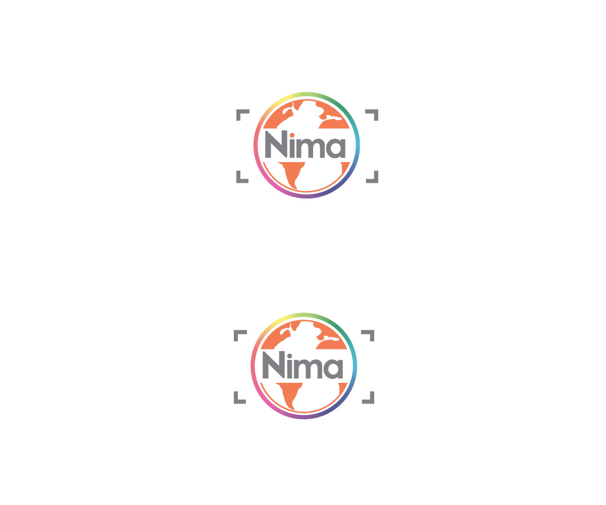
Creative photography company needs to design a logo

Vous souhaitez remporter un projet comme celui-ci ?
Ce client a reçu 174 designs de logo de la part de 34 designers. Il a choisi ce design de logo de carlu.johnsons comme design gagnant.
Inscrivez-vous Trouvez des Projets de Design- Garanti
Brief de Design de Logo
We need to design a logo for a new company of creative photography. Sell services what we call "photographic experiences", ie, pictures of events or special situations, such as deliveries / births, artistic nudes. And also we organize photographic journeys in small groups where people receive a basic theoretical workshop digital photography. NO do studio photography, NO we take pictures of weddings, baptisms, communions or. It is not traditional photography. The logo will be used on the website of the company. I want a creative but simple logo.
Mises à jour
If you believe that another colors could work fine, please feel free to use them. The web background will be white and the web is very minimalistic, so its nice that the logo has some color in order to attract the eyes. Thank you! Added Saturday, August 20, 2016
Marché(s) Cible(s)
Target audience: people between 30 and 60 years. Creative, who wants to experiment with photography of a non-traditional way.
Texte du logo
Nima
Styles de logo qui vous intéressent
Logo d'Enseigne
Logo contenu dans une forme
Logo mot symbole
Logo (texte seulement)
Styles de police à utiliser
Aspect
Chaque curseur illustre les caractéristiques de la marque client et le style que doit transmettre votre design de logo.
Élégant
Audacieux
Léger
Sérieux
Traditionnel
Moderne
Sympathique
Professionnelle
Féminin
Masculin
Coloré
Conservateur
Économique
Haut de gamme
Exigences
Doit avoir
- The company is called Nima. I want N to be uppercase and lowercase letters other. The letter "i" take the point.
Bien d'avoir
- I like design integrated into the letters. I would like the point of the letter "i" was part of the logo design in some way. I like circular elements.
Ne doit pas comporter
- I do not want italics. I do not like logos that have a drawing aside the letters. I do not like very straight lines.