Premium watch retailer in Moscow Needs a Logo design improvement
Vous souhaitez remporter un projet comme celui-ci ?
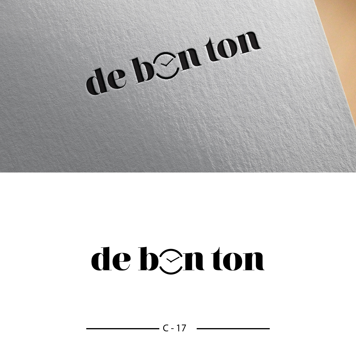
Ce client a reçu 217 designs de logo de la part de 64 designers. Il a choisi ce design de logo de Designanddevelopment comme design gagnant.
Inscrivez-vous Trouvez des Projets de Design- Garanti
-
 US$310
-
 217 designs
-
 64 designers
Brief de Design de Logo
de-bon-ton (www.de-bon-ton.ru) is a 9 shops multi brand watch retailer in Moscow bringing a completely new shop format to Russian capital Moscow: bringing new trendy watch brands from around the world ( First to detect new hot brands from around the world) and great service through specialy trained staff.
de-bon-ton aims to showcase watches as lifestyle accessories.
The name "de bon ton" was inspired by the famous "gazette du bon ton" that ultimately became the magazine Vogue.
The actual logo + signature (cf joint files) CAN NOT be changed as they are used in the retail shops and registered as such. What we need is to add a visual element to this logo to make it recognizable to the client (visual signature such as Nike, Starbucks, apple...). this symbol must show case the disruptive character of the brand and out line the stylish/fashion positioning.
The visual element SHALL NOT have any common direct link to the watch industry (Swiss flag, watches components,…). main colors are dark blue and black . References could be the mosaic construction of the watch in store display or the "gazette du bon ton" , but this is not mandatory.
The winning concept will be a strong and highly recognizable visual elements that client could associate the brand de-bon-ton with.
You will find in a joint file examples of logos that we have proposed to the client: they liked the boldness , but not the direction . They felt it is not safe enough to go into that direction
Marché(s) Cible(s)
Moscow, Russia.
Secteur / Type d'entité
Retail
Texte du logo
de bon ton
Styles de logo qui vous intéressent
Logo pictural
Un objet réel (texte facultatif)
Logo abstrait
Conceptuel / symbolique (texte facultatif)
Couleurs
Couleurs choisies par le client et à utiliser dans le design de logo:
Aspect
Chaque curseur illustre les caractéristiques de la marque client et le style que doit transmettre votre design de logo.
Élégant
Audacieux
Léger
Sérieux
Traditionnel
Moderne
Sympathique
Professionnelle
Féminin
Masculin
Coloré
Conservateur
Économique
Haut de gamme
Exigences
Doit avoir
- 1) use the dark blue (featured in the shop) and/or black color
- 2) the size of the visual must be reasonable in comparaison to the logo size (not too big / not too small)
- 3) The visual must be strong and easily identifiable
Ne doit pas comporter
- 1) ANY ALTERATION of the existing brand name (font + size) + signature
- 2) any common direct link to the watch industry (Swiss flag, watches components,…)
- 3) The visual anchor CAN NOT be made out the "D" "B" "T" letters (nor any other letters
- 4) The visual anchor can not be an animal