The BETTERMAN Foundation needs a logo design
Vous souhaitez remporter un projet comme celui-ci ?
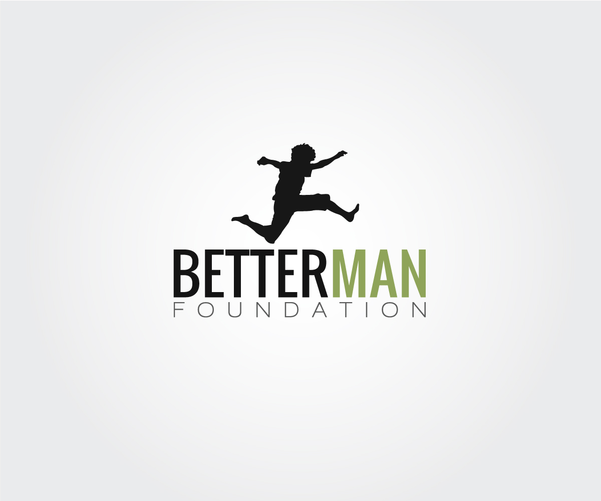
Ce client a reçu 38 designs de logo de la part de 21 designers. Il a choisi ce design de logo de Primitive Studio comme design gagnant.
Inscrivez-vous Trouvez des Projets de Design- Garanti
-
 A$200
A$200
-
 38 designs
-
 21 designers
Brief de Design de Logo
We are an Australian not-for-profit organisation that work with boys and young men aged 10 - 25 years and those involved in their lives.
Our aims are to empower young men to make positive choices and establish happy and healthy futures.
With men continuously over represented in statistics in relation to things such as violence and suicide in Australia, The BETTERMAN Foundation raises awareness, as well as educating and supporting young men themselves by placing qualified and experienced professionals in schools and services right across the country to deliver programs and other services.
Secteur / Type d'entité
Foundation
Texte du logo
BETTERMAN Foundation
Aspect
Chaque curseur illustre les caractéristiques de la marque client et le style que doit transmettre votre design de logo.
Élégant
Audacieux
Léger
Sérieux
Traditionnel
Moderne
Sympathique
Professionnelle
Féminin
Masculin
Coloré
Conservateur
Économique
Haut de gamme
Exigences
Doit avoir
- I feel the logo should be masculine, have appeal to both young people and professionals ie. schools.
Bien d'avoir
- I've uploaded a logo I found on iStock photos of the silhouette of a teenage boy happily jumping. I like this but am not sure if I can use iStock photos in logos - pretty sure I can't. Having this is not a 'must have; though I like the idea of having something positive and 'boyish' (teenage and young men; not small boy) in the logo itself, though again, certainly not a 'must have.' Think Australian, think professional, think teenage boys. May be sports crest or even 'stamp' style could work?
Ne doit pas comporter
- I really don't want it to look 'cheap' especially the text. I don't want the text too look like something I've done in a 'word' doc. I really don't like the logo's for the other major not-for-profits, reach.org.au and beyondblue.org.au; they look incredibly dated.