City of Boston Archaeology Program Needs a Logo Design
Vous souhaitez remporter un projet comme celui-ci ?
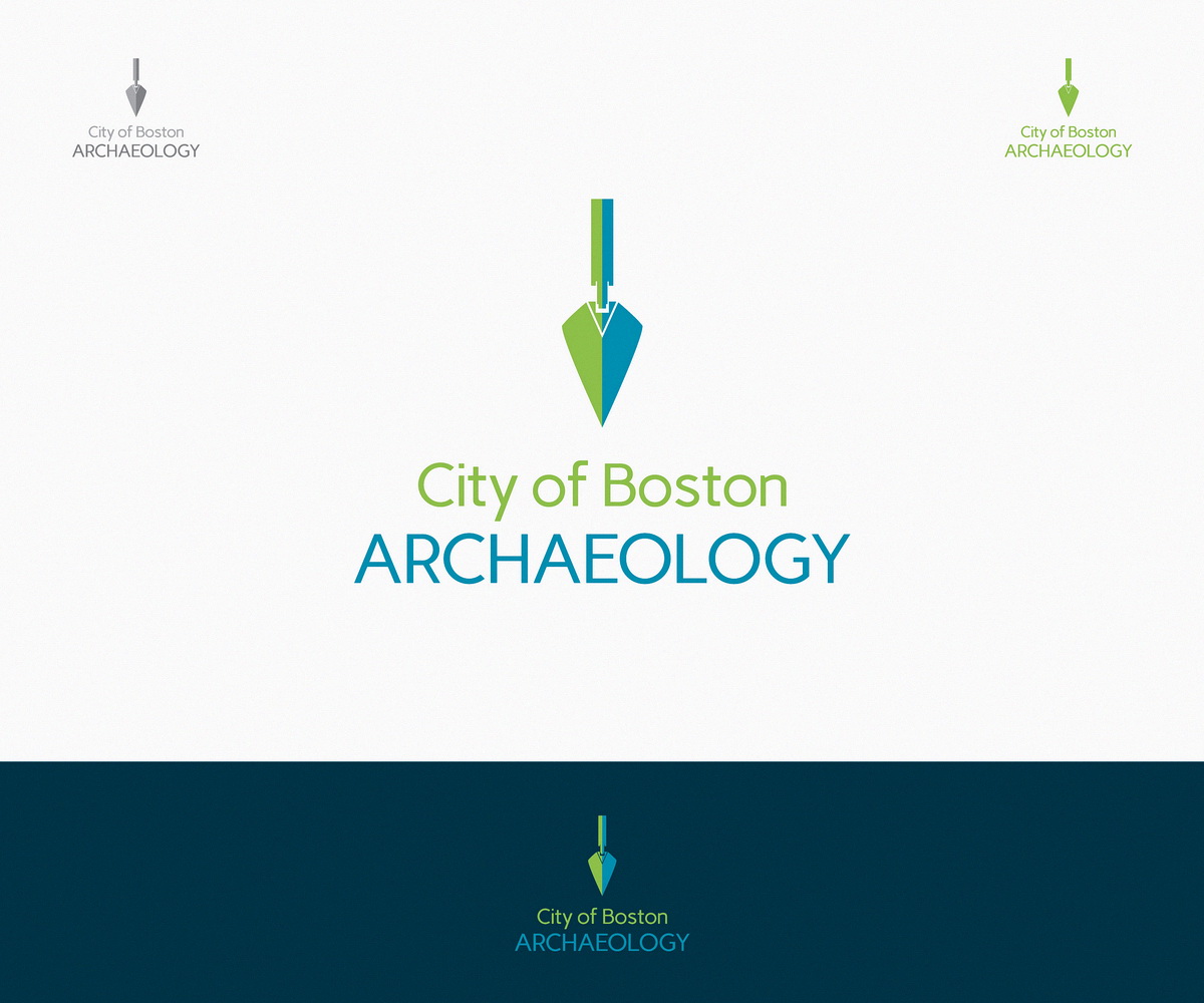
Ce client a reçu 63 designs de logo de la part de 17 designers. Il a choisi ce design de logo de logotweek comme design gagnant.
Inscrivez-vous Trouvez des Projets de Design-
 US$200
-
 63 designs
-
 17 designers
Brief de Design de Logo
The City of Boston's Archaeology Program is turning 30 and needs a new logo. We conduct archaeological surveys across Boston on public land and non-profit properties, host educational events across the city, and manage an archaeological lab containing over 1,000,000 artifacts with the goal of preserving, protecting, and promoting the City's archaeological heritage.
Our facebook page: https://www.facebook.com/BostonArchaeologyProgram will provide some photos of what we do and what we find, though artifact-specific logos are not preferred (see below).
This logo needs to look appropriate for digging, going to local schools, working in our laboratory processing artifacts, and in City Hall where we review construction/development projects. We hope to use it on shirts, banners, business cards, and online, so monochromatic or designs that lend themselves easily to single-color printing is preferred. Blues and greens are preferred, but there is no limit to color options.
The city has over 200 archaeological sites documented, almost equally-split between Native American and Euro-American sites, so we do NOT want artifact-specific designs (bottle, arrowhead, etc.) and would instead prefer something related to actual archaeological field work such as soil levels, trowels, dirt, below-ground-ness, science etc.
This is critical: We do NOT dig dinosaurs. Archaeologists study people.
Regarding logo text: "City of Boston" should be kept together. "Archaeology" can be separated. "Archaeology" can be slightly larger than "City of Boston" but both should be easily readable.
There does NOT need to be a Boston-specific visual reference in the logo.
Mises à jour
Thank you, designers, for all of your submissions! This monday, we will begin the process of choosing the final design. We hope to make the final choice by Friday, the 27th.
Added Saturday, September 21, 2013
Marché(s) Cible(s)
The citizens of Boston
Secteur / Type d'entité
Non-Profit
Texte du logo
City of Boston Archaeology
Styles de logo qui vous intéressent
Logo d'Enseigne
Logo contenu dans une forme
Logo pictural
Un objet réel (texte facultatif)
Logo abstrait
Conceptuel / symbolique (texte facultatif)
Aspect
Chaque curseur illustre les caractéristiques de la marque client et le style que doit transmettre votre design de logo.
Élégant
Audacieux
Léger
Sérieux
Traditionnel
Moderne
Sympathique
Professionnelle
Féminin
Masculin
Coloré
Conservateur
Économique
Haut de gamme
Exigences
Doit avoir
- the text "City of Boston" and "Archaeology"
The logo must give the impression that we are SCIENTISTS
Bien d'avoir
- Trowels are probably your best bet, since they are used daily, and on all types of sites but we are open to other ideas. The challenge we had trying to design a trowel logo ourselves was a goal to keep the logo roughly round or square shaped, which is difficult with a trowel. We are open to more conceptual designs, though they will still need to convey something archaeological.
The style can be modern, though it should look professional, too. A successful logo used by our same department can be seen here: http://greenovateboston.org/wp-content/themes/greenovateboston/img/logo_big.png
Soil levels/colors, outdoor scenes, square holes, etc. could also work.
Pictoral/Combination logo preferred, but Emblem Logo will also work too.
Ne doit pas comporter
- Do not show bones, coins, treasure chests, or anything that implies we dig up people or are treasure hunters. No metal detectors, dinosaurs, whips, fedoras, fossils.
Archaeologists do not dig dinosaurs, we study people of the past.
Does not need to include the outline of the city's borders or the skyline.
Does not need to have a Boston-specific reference or city seal other than the text "City of Boston"
If gradients are used, please design so that if printed in solid colors or monochromatic the design will still be visually interesting.