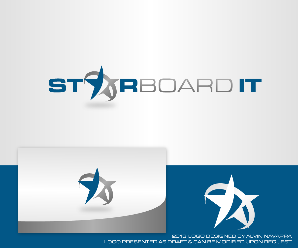
Logo for Renamed Company - Starboard IT

Vous souhaitez remporter un projet comme celui-ci ?
Ce client a reçu 52 designs de logo de la part de 19 designers. Il a choisi ce design de logo de alvinnavarra comme design gagnant.
Inscrivez-vous Trouvez des Projets de DesignBrief de Design de Logo
Our business is looking for a logo to complement the name change. The company has recently changed its name to Starboard IT and will relaunch the company using this new name.
Special Note: We would prefer to use the current website theme for the new logo so that we can keep the costs of changing our website and associated material to a minimum. However, if you have great design idea that is outside the current theme then we welcome these ideas and will give it full consideration.
• New Name: Starboard IT
• Old Name: Orizon IT
• Current Website: http://www.orizonit.com.au
• Industry: Information and Communications Technology (ICT).
• Main product/service: Our services span everything from proposing and delivering IT solutions tailored to the requirements of each client, to assisting businesses take the journey into Cloud services, to managing the IT assets for clients, to providing consulting and advisory services.
• Brand values or stories important to your brand: The word Starboard is derived from the first initial of each company director Richard, Steve and Tim. We are an energetic, forward thinking company that prided itself on solving pain points that its clients are experiencing across a range of business IT systems.
We want to convey our company core values and other feelings
• Core values:
Innovative
Communicative
Collaborative
Customer Focused
Integrity
Ownership
• Professionalism
• Forward thinking
• Confidence
• Calm
• Soothing
• Trustworthy
Colours and fonts
One requirement is the logo should be usable again a white background, e.g. White background on a website or a white background on a business card.
Refer to the Special Note above. In summary, we would prefer to stay with the current colour theme to keep the costs of changing to a minimum. In saying that, we are not averse to the use of other colours that highlight or accents the current theme.
If you want to be more adventurous and use a completely different theme, then we are very open to this and will give the design full consideration.
For informational purposed, the current website uses a White-Blue-Grey colour theme, in particular the hex codes are:
blue: #3774b7
grey: #757575
No specific fonts are required. However, the logo needs to be easy to read and it would be preferable that the fonts are readily available across a wide range of platforms, such as MS Office, PhotoShop, Illustrator, etc.
Where will this logo will be used
• Website
• Email signatures for staff.
• Stationary.
• Brochures and marketing products
• Signage – Office and industry events
• Business cards
Marché(s) Cible(s)
• Business to business operation model
• Targeting many industries but more likely to include:
o Banking
o Insurance
o Financials
o Legal sector
o Professionals
• Targeting organisations in the Small to Medium Businesses (SMB, between 10 and 200 staff) and niche markets in the larger enterprise businesses.
• No specific gender will be targeted.
• Targeting a particular age group? Being a B2B model, target age is the working age. 18 – 65 years of age.
Secteur / Type d'entité
Information Technology
Texte du logo
Starboard IT
Styles de logo qui vous intéressent
Logo mot symbole
Logo (texte seulement)
Logo de Lettermark
Acronyme ou logo texte (texte seulement)
Styles de police à utiliser
Couleurs
Couleurs choisies par le client et à utiliser dans le design de logo:
Aspect
Chaque curseur illustre les caractéristiques de la marque client et le style que doit transmettre votre design de logo.
Élégant
Audacieux
Léger
Sérieux
Traditionnel
Moderne
Sympathique
Professionnelle
Féminin
Masculin
Coloré
Conservateur
Économique
Haut de gamme
Exigences
Doit avoir
- We tend to like simple, clean, fresh designs. It would be preferable if the logo incorporates the company name. An example of this is Coca-Cola, where the logo is incorporated into the name. We want to project a forward thinking professional approach to IT. The logo needs to be memorable and simple so that someone can explain the design easily in words.
- For more information refer to the design brief that has been uploaded.
Bien d'avoir
- We have included examples of logos we like and dislike in the design brief that has been uploaded.
Ne doit pas comporter
- Stand alone logos that do not incorporate the business name. We have included examples of our dislikes in the design brief that has been uploaded.