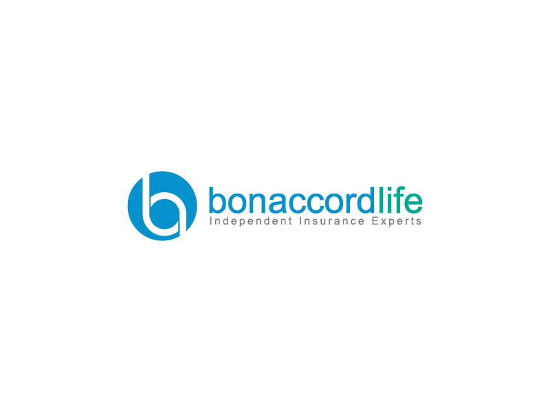
New logo for UK based life insurance broker
Vous souhaitez remporter un projet comme celui-ci ?
Ce client a reçu 190 designs de logo de la part de 61 designers. Il a choisi ce design de logo de ErTistic comme design gagnant.
Inscrivez-vous Trouvez des Projets de Design-
 £120
£120
-
 190 designs
-
 61 designers
Brief de Design de Logo
We need a more modern logo that still conveys trust. We help people save money on income protection and life insurance by comparing leading providers and completing the application for them. Currently we have the tag line "independent insurance broker" which I don't think we need. Instead on the right and below could we see what .com looks like? Colour wise the main ones are dark green and blue. The font needs significantly modernised and the logo symbol also looks dated. Our logo is currently out of sync with our website - www.bonaccordlife.com which is something we need to address. The final design should communicate trust, professional, friendly and down to earth. Thanks.
Marché(s) Cible(s)
Aged 30-55 homeowners with kids looking to protect their families and also those aged 50+ looking for funeral life cover.
Secteur / Type d'entité
Financial Service
Texte du logo
Bon Accord Life
Styles de police à utiliser
Couleurs
Couleurs choisies par le client et à utiliser dans le design de logo:
Aspect
Chaque curseur illustre les caractéristiques de la marque client et le style que doit transmettre votre design de logo.
Élégant
Audacieux
Léger
Sérieux
Traditionnel
Moderne
Sympathique
Professionnelle
Féminin
Masculin
Coloré
Conservateur
Économique
Haut de gamme
Exigences
Doit avoir
- More modern design, much better font. Updated, modernised symbol
Bien d'avoir
- Possibly instead of the tag line a subtle .com