Mark Hopkins Photography - Design Tweek
Vous souhaitez remporter un projet comme celui-ci ?
Ce client a reçu 88 designs de logo de la part de 34 designers. Il a choisi ce design de logo de Creative™ comme design gagnant.
Inscrivez-vous Trouvez des Projets de Design-
 US$360
-
 88 designs
-
 34 designers
Brief de Design de Logo
There are elements in the logo that must be adhered to:
Name font: Trajan Pro Normal
Tag Line Font (if used): Dear Joe Casual (Tag line is NOT required in logo)
MH initials graphic (uploading rastor and vector versions) Tag line is OPTIONAL... variations appreciated.
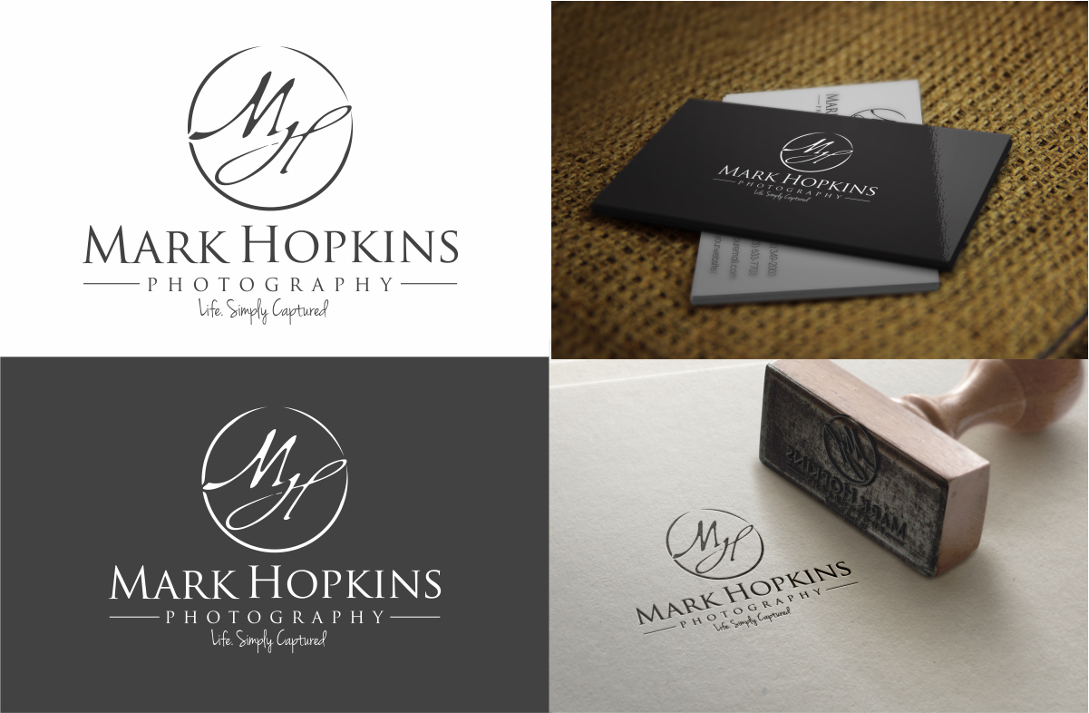
Name: Mark Hopkins Photography
Tagline: Life. Simply Captured. (TM please)
Colors: Grayscale Only; dominant black. Rasters can have grayss, but I'm interested in mainly in a strait binary image structure. HOWEVER... feeling something? Take a chance and go on spec.... take a leap. :)
Need both vector and rastor for commercial printing and web (respectively)
Please visit website for feel: www.lifesimplycaptured.com
I'm very happy with current banner logo (included in uploads) but it's too wide for practical use outside my own website, and needs to be condensed to a 1:1 or 3:2 ratio suitable for multiple print uses.
I want a fresh look on what I currently have that respects the elements I already have, but fits a tighter space. SERIOUS bonus if MHP is somehow prominent and stands out as I often shorten my name as such.
If you have an notion to go WAY outside the box.... do it. I'm not opposed to new ideas, but to be considered, MUST be amazing as it will be a re-brand for me.
Some elements I relate to....Fresh, but structured. Consistent and grounded. Fun, but professional. I know, like EVERY other company out there? :) I cater to a LOT of large corporations, so a dominance toward professional and structured is priority.
Attachment Details:
MH--Initials.png (Rastor of required MH signature logo)
Sample---Current-Full-Web-Banner-(Logo).png (Sample of current wide banner that needs to be condensed)
Sample-WebBanner-Condensed.png (Unsatisfactory self condensed version of wide web view)
Mises à jour
Added Thursday, June 23, 2016
Marché(s) Cible(s)
25+ age group... businesses.... real estate agents, people with headshots.... corporate.
Texte du logo
Mark Hopkins Photography - Life. Simply Captured.
Styles de logo qui vous intéressent
Logo mot symbole
Logo (texte seulement)
Logo de Lettermark
Acronyme ou logo texte (texte seulement)
Styles de police à utiliser
Couleurs
Couleurs choisies par le client et à utiliser dans le design de logo:
Aspect
Chaque curseur illustre les caractéristiques de la marque client et le style que doit transmettre votre design de logo.
Élégant
Audacieux
Léger
Sérieux
Traditionnel
Moderne
Sympathique
Professionnelle
Féminin
Masculin
Coloré
Conservateur
Économique
Haut de gamme
Exigences
Doit avoir
- Trajan Pro font for name. Supplied MH initials (my own)
- But, as stated, I'm open to NEW and FRESH designs.... got an idea? Roll with it.....
- Must be suitable as-is with little change for Web, embroidery, screen print, etc.... must transition nicely from rastor to vector or vice versa.
Bien d'avoir
- Tag line: Life. Simply Captured.
- Nice, but meh.... it's my web URL so.....
Ne doit pas comporter
- Frilly shit.