Blood Testing Health App
Vous souhaitez remporter un projet comme celui-ci ?
Ce client a reçu 121 designs application de la part de 7 designers. Il a choisi ce design application de jeckx2 comme design gagnant.
Inscrivez-vous Trouvez des Projets de Design-
 US$2000
-
 121 designs
-
 7 designers
Brief de Design Application
We are looking for a graphics designer to create a web app for us so that we may insert it into a health management website system.
For branding purposes we are at www.Personalabs.com and we are revamping our website... Example of new colors attached.
How we work...
We are a blood testing company based in the USA.
We offer a blood testing service nationwide in the USA.
We allow customers to order tests directly from us, visit a lab, have their blood drawn, or submit a urine sample, the lab tests it and they send the results back to our computer system and we share it with the customer.
The benefits of this are the customer does not need to go to the doctor and pay for the doctors visit to order these tests, which save them money. The tests are cheaper than going through the doctor. The customer simply uses us to get the test and the results and they can then take the results to their doctor... this process has saved them money. Others may be interested in regular check ups for blood work etc... and this allows them to do it with out needing a doctor, or if you have no insurance, this is a cheaper option too. We are quicker than a doctor, customers do not need appointments etc.
Hopefully you now have a better understanding as to what we do.
Here is the spec.
The app screen size is 750 px wide by 700 px high. ( A pdf is attached to show where the app is going to go, it is on page 3 of the pdf) The customer will have the ability to scroll… therefore the length of the page can be longer.
The app will consist of the following sections
Entry Page –
This will be the first page the user sees upon opening the app. This will be where they are directed from to the sections of the app discussed below. This needs to be branded for PersonaLabs with a modern look.
1 – Order Test (Giving them the ability to purchase a blood test within the app)
2 – PersonaLabs Dashboard (A dashboard that has everything they could need to use our service_
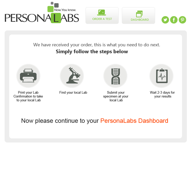
How it works Section on entry page – this will be a simple set of graphics showing how the service works. We already have the graphics for this, they do not need to be built again. They are attached to this brief
Basic structure of sections –
Order Test –
This page contains all tests, filed in categories – and Sub categories – Each test needs a link to an Information section – Price – Buy Now – Cart Process
PersonaLabs Dashboard –
A page of icons along the top of the app
- My Confirmation
- My Nearest Lab
- My Receipt
- My Orders
- My Account
- My Results
- My Inbox
- Contact Us
Sections in more detail -
Order A Test –
Show all categories/ sub categories – There are 23 categories, 14 sub categories, and within these categories are 300 tests - Here is the information for the categories etc - http://www.personalabs.com/panels.aspx?PanelGroupID=4 Just in case it helps :)
We need to present this in a graphic format that is spacious, modern (evernote, odesk web appearance is the direction we are going for) We need it to be clear and not overwhelming to the customer.
Functionality idea…
Customer clicks category/ subcategory and tests appear.
Customer sees small 35 word description. For more information the test opens into a lightbox or expand the container which ever graphic designer believes to be most visually appealing
Buy Now must always be visible, along with price of the test
Buying process explained – Customer clicks buy now –
They are then taken to a Review Order screen ( This contains Order summary and choose payment method – insert payment details )
– Confirm payment –
Confirmation screen appears, thanking them.
They are then taken to the PersonaLabs Dashboard...
PersonaLabs Dashboard –
"My Confirmation" - Print Confirmation Order (PDF is in brief, we want this web based not a pdf download)
"My Nearest Lab Location" - This does not need to be designed because the web developer has this part under control, but we do need the icon in the dashboard
"My Receipt" - Print receipt - This does not exist in our system yet. So we need to create this from scratch - It will need to have - The test they are purchasing and the amount of the test - The customers name - The order ID - Must provide printer friendly option too
"My Orders" - This will have a list of orders - At the end of each order will be a status update of either "Test results" "Open order"
A graphic table format would be perfect. This will be linked to relevant results if they have been received. I have also attached a version of what the customer currently sees on our website. We know it is nasty ;) We are redesigning... but the information is there for this section to help design it with the right info. If the results are ready it will say in this list.
"Results Ready" will be a link to show those results once the customer has clicked the link, and the results will appear in the app, under the icons. There must be a printer friendly version too.
"My Results" Developer will sort this page out but we need the icon... It will be exactly like my orders but only show test results
"My Account" - This will be a place for them to update their personal information - Name, DOB, Address, Email Address
"My Inbox" - An inbox interface - Our way of contacting the customer for promotions we are running etc – We need a design of how this screen will appear. We also need the icon in the dashboard to have a notification on it if there are messages in the customers inbox. A little red 1, or circle with number of messages in the inbox.
"Customer Service" - This does not need to be designed because the web developer has this part under control, but we do need the icon in the dashboard
Icons appear along the top of app ( example - Mac icons/ iphone app icons) When the customer clicks an icon the content always appears below the icons
Here is more information for the icons and what should appear when each icon is clicked.
Screens to be designed –
Entry Page
Order A Test Page
Review Order Screen/Payment Screen - Show a lightbox that shows payment has been confirmed. Customer clicks close and are on the Confirmation Screen
PersonaLabs Dashboard - Screens mentioned in detail above
We can't wait to see your designs!
Please email any questions.
Mises à jour
Project Deadline Extended
Reason: We needed to add more money for the project
Added Monday, September 09, 2013
Hi all this is the first time we have used design crowd and understand the budget was too low for this project. We have now increased the budget to $2,000 and extended the deadline by another week
Added Monday, September 09, 2013
Hi all we are receiving some really great designs. I just added an example of the space that the web app will be going into... It is called "dossiaapp.pdf"
Added Friday, September 13, 2013
Hi guys updated the brief. Hopefully this will help with the dashboard part of the design
Added Friday, September 13, 2013
Secteur / Type d'entité
Graphic Designer
Aspect
Chaque curseur illustre les caractéristiques de la marque client et le style que doit transmettre votre design de logo.