quirky conscious eatery needs a logo update/design
Vous souhaitez remporter un projet comme celui-ci ?
Ce client a reçu 126 designs de logo de la part de 37 designers. Il a choisi ce design de logo de wonderland comme design gagnant.
Inscrivez-vous Trouvez des Projets de Design-
 US$160
-
 126 designs
-
 37 designers
Brief de Design de Logo
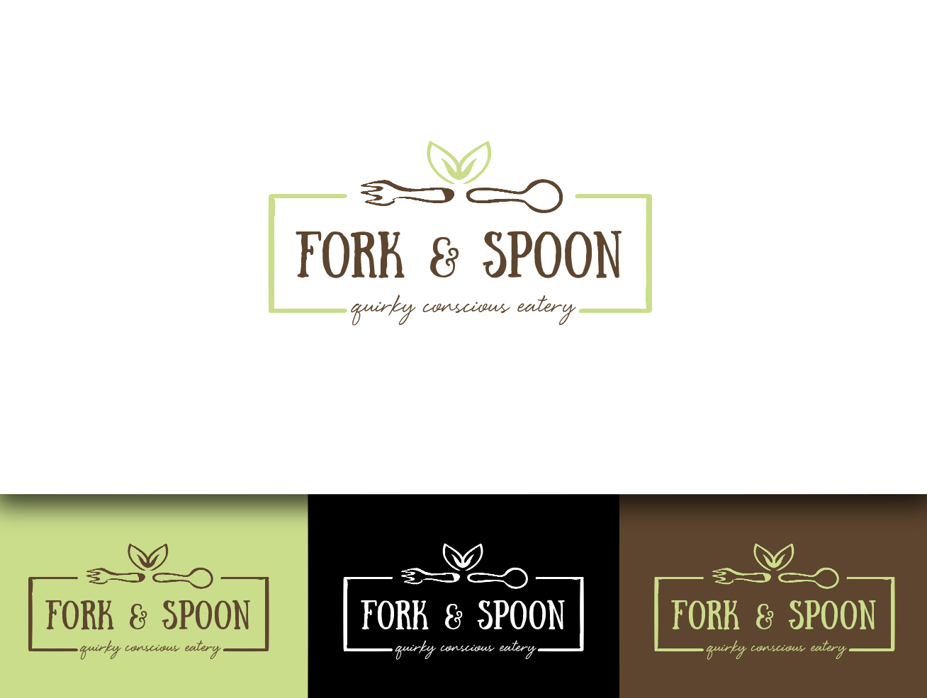
The eatery is Fork & Spoon in Bangor Me, and had a logo done a few months ago. I like that logo, quite a bit, but it feels like it is missing something. Currently the place serves only vegan food, I am buying it and will expand to other items, such as dairy, and wheat. I want the feel to be like a comfortable cafe, but cool enough for people with a few bucks and pleasant enough for those a tad more conservative. It features salads, smoothies and some juices. It will get an updated help with an entire bakery component and soups, ice cream, etc. MY passion is seasonal and locally sourced food. I would like a logo that builds on what is there, but one that can feature the name with the logo, or have the logo stand alone with out the name. I would like this to go on signs, menus, stickers, and apparel, like T-shirts and aprons. I like the colors brown/black, and green, sort of the earthy part and then interested in a splash of color, yellow? orange? I would like it simple, like I said I like the one in place, but it needs something more. I am not in love with the font on the current logo.
Marché(s) Cible(s)
customers seeking quick local food, made and prepared in house, that tastes great. From people wanting a snack to wanting a meal to sit down with or take to go.
Secteur / Type d'entité
Restaurant
Texte du logo
Fork & Spoon
Styles de logo qui vous intéressent
Logo pictural
Un objet réel (texte facultatif)
Logo abstrait
Conceptuel / symbolique (texte facultatif)
Logo mot symbole
Logo (texte seulement)
Styles de police à utiliser
Aspect
Chaque curseur illustre les caractéristiques de la marque client et le style que doit transmettre votre design de logo.
Élégant
Audacieux
Léger
Sérieux
Traditionnel
Moderne
Sympathique
Professionnelle
Féminin
Masculin
Coloré
Conservateur
Économique
Haut de gamme
Exigences
Doit avoir
- Easy logo, I do like for the most part the one there, but it needs more? less? I'm not sure, the right person will get why I am not happy with it. I like the simplicity of it. I like the classic look. I like having a name in the logo that can stand alone, or an image, like the one that is in place, that could also stand alone.
- As far as the script, for below, I am interested in clean, although, I have always loved script, more worried about it being easily seen from afar.
Bien d'avoir
- I would like it to be able to be reproduced in black and white and or color depending on the application, or even just one color (reducing future printing costs). I am interested in a healthy, natural vibe, but not at all hippie-ish.
Ne doit pas comporter
- be too busy, or hard to read.