Rebrand Makeup company logo !
Gagnant
Vous souhaitez remporter un projet comme celui-ci ?
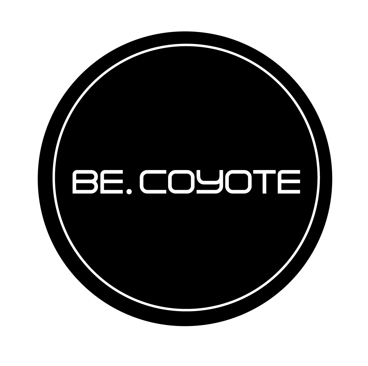
Ce client a reçu 75 designs de logo de la part de 23 designers. Il a choisi ce design de logo de Thomasdesign comme design gagnant.
Inscrivez-vous Trouvez des Projets de Design-
 A$160
A$160
-
 75 designs
-
 23 designers
Brief de Design de Logo
We are a makeup company doing a bit of rebranding.
Would like to improve on our current logo.(I have uploaded it)
I have attached also the best that I can come up with for our new logo. I do like this but feel it could be better.
I want to keep it simple. The reason its a black circle is because we sell makeup in jars that have black lids, so the logo will be printed on the lids.
Would love to see an improvement on my new logo design idea. Or if you have better idea I would also love to see it.
Secteur / Type d'entité
It Company
Texte du logo
BE. COYOTE or BE COYOTE
Aspect
Chaque curseur illustre les caractéristiques de la marque client et le style que doit transmettre votre design de logo.
Élégant
Audacieux
Léger
Sérieux
Traditionnel
Moderne
Sympathique
Professionnelle
Féminin
Masculin
Coloré
Conservateur
Économique
Haut de gamme
Exigences
Doit avoir
- The shape of the logo to be a black circle.
Bien d'avoir
- I think I prefer the text to be on one line (like the new logo idea I created) , rather then the two lines (like our current logo)
Fichiers
Télécharger tous les fichiers - 0,1 MBJPG
current BE COYOTE LOGO Monday, 09 May 2016 13:28:10
lundi 9 mai 2016
JPG
new logo idea Monday, 09 May 2016 13:28:10
lundi 9 mai 2016
Paiements
1e place
A$160