

 Rafraîchir
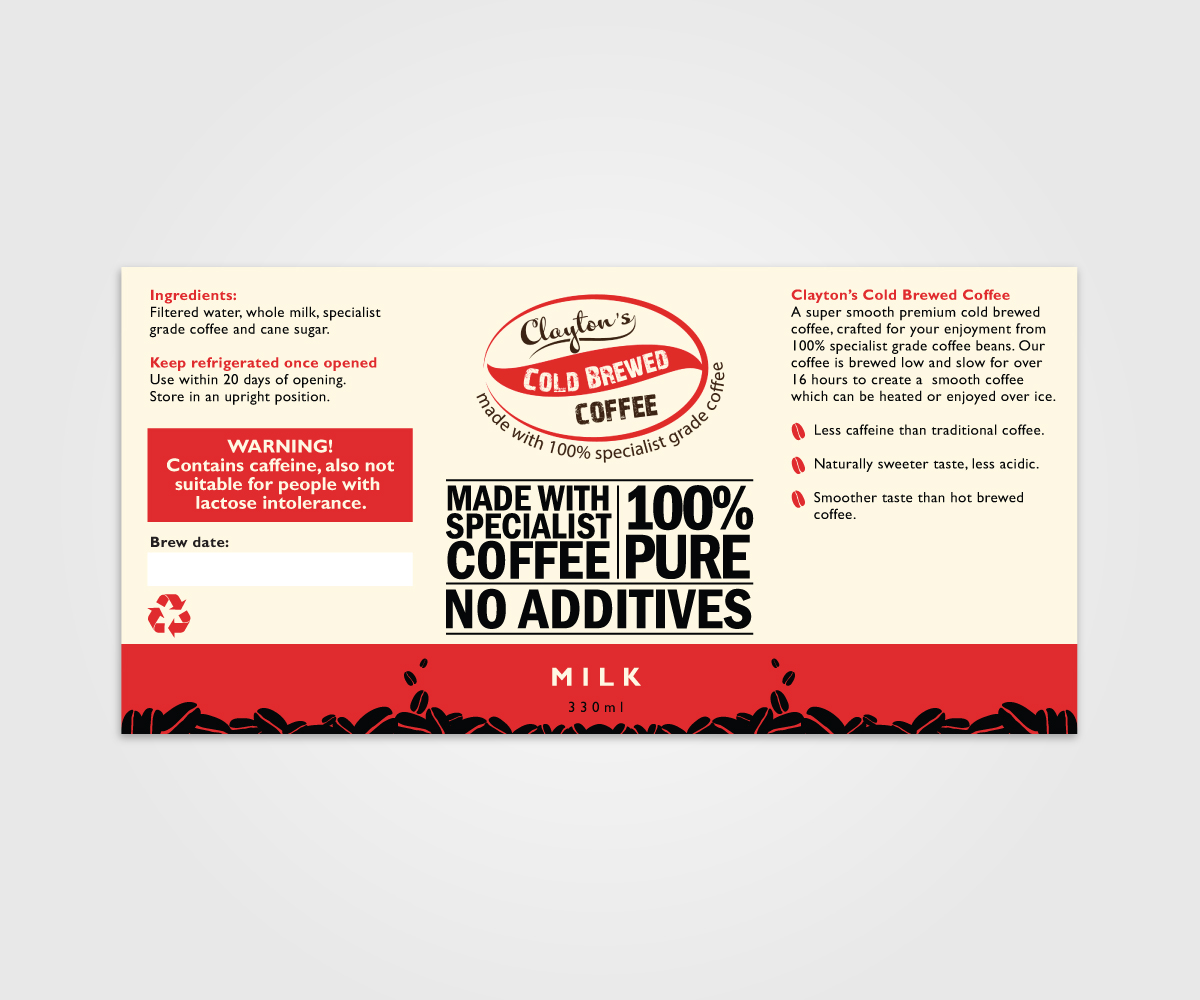
Small scale cold brew coffee producer needs a label for its products
Vous souhaitez remporter un projet comme celui-ci ?
Ce client a reçu 46 designs étiquette de la part de 7 designers. Il a choisi ce design étiquette de digi-b comme design gagnant.
Inscrivez-vous Trouvez des Projets de Design
- Garanti
-
 £210
£210
-
 46 designs
-
 7 designers
Brief de Design Étiquette
We are a cold brew coffee producer and am now going the next step and getting our products onto the retail market.
Cold brewed coffee is coffee that which is brewed over a long period of time so its coffee which is brewed opposed to boiled this allows for a smoother taste and removes the acidic taste note often experienced in hot normal coffee. We currently offer three varieties from this core product. The first being a ready to drink neat version, the second being coffee and milk and the final a coffee and coconut milk.
In terms of design of the label i am looking for an artisan style to maintain the craft nature of the product. yet possible the use of abstract art to increase the appeal of it on the shelf.
in terms of a message i am looking to portray one of the quality of our product such as no additives and the use of specialist grade coffee that is in season.
As a colour scheme i am pretty flexible except to that of bright blue and white as it has too much of a similarity to heath products.
The images below are possible ideas and my current logo
Marché(s) Cible(s)
As i am using spiciest grade coffee this will create a high price point. Current consumption statistics suggest that the major consumption group is the 20 - 40 year olds working professional. Yet its a popular product in arty urban centers such as brighton and bristol
Secteur / Type d'entité
Retail
Styles de police à utiliser

Aspect
Chaque curseur illustre les caractéristiques de la marque client et le style que doit transmettre votre design de logo.
Élégant
Audacieux
Léger
Sérieux
Traditionnel
Moderne
Sympathique
Professionnelle
Féminin
Masculin
Coloré
Conservateur
Économique
Haut de gamme
Exigences
Doit avoir
- The use of graphics and images to better poetry the image for the product, yet i am still looking for a classical appearance so old school outer labels, but the most important feature will be to maintain the arazan appearance for the product
Bien d'avoir
- If i could have a sharp contrast between the difference and the product so a sharp difference. Gentle colours which are not too sharp and bold but more mellow. Possible use of abstract art in the text to improve the overall apperance
Ne doit pas comporter
- modern sharp images as i want an old school type image, I don't want sharp whites, blues and reds as they are too closely related to the heath care


