Retail Food Store & Cafe sells quality local produce in Brisbane, Australia
Vous souhaitez remporter un projet comme celui-ci ?
Ce client a reçu 243 designs de logo de la part de 22 designers. Il a choisi ce design de logo de mantabjoss comme design gagnant.
Inscrivez-vous Trouvez des Projets de Design- Garanti
-
 A$310
A$310
-
 243 designs
-
 22 designers
Brief de Design de Logo
We require a logo for a Retail Food Store & Cafe showcasing produce from within a 360km radius of Brisbane.
The attachment 'produce area' details the area from which we source our produce. Consider using the coastline within your design.
The target market is busy, working professionals.
The products offered are high in quality and presentation. The store has a luxurious feel.
We sell fresh produce such as fresh fruit and vegetables; dairy; wheat & flour; fresh eggs; cured meats; fresh seafood; bottled sauces; pickles and jams, which are all made on site; as well as coffee; dine in and take away meals.
Please see attached 'logo samples' file for examples of designs we like.
COLORS
As well as the colors indicated (light olive green & light aqua), we also would like to explore a light brown; like coffee with some milk added.
If you have other colors in mind that evoke quality and luxury, please use them.
FONT
A preferred font style is 'Beaufort Extended Light'.
A CONCEPT TO WORK ON
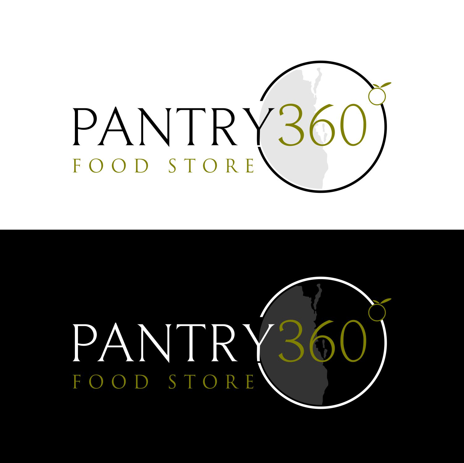
'Pantry360Logo_Concept' is an attachment that we would like someone to work on.
You may need to zoom in to best see the logo.
Ideally the words - FOOD STORE would start in line with the 'P" in PANTRY and finish in line with the 'Y' in PANTRY.
The small circle is meant to be a variety of foods which we serve. It's positioning is very important, as it can also represent the degrees symbol.
Attachment 'velocity logo' may also give some inspiration.
Marché(s) Cible(s)
Busy professionals who need quality food prepared for them.
Secteur / Type d'entité
Food Store
Texte du logo
Pantry 360
Styles de logo qui vous intéressent
Logo pictural
Un objet réel (texte facultatif)
Logo mot symbole
Logo (texte seulement)
Logo de Lettermark
Acronyme ou logo texte (texte seulement)
Styles de police à utiliser
Couleurs
Couleurs choisies par le client et à utiliser dans le design de logo:
Aspect
Chaque curseur illustre les caractéristiques de la marque client et le style que doit transmettre votre design de logo.
Élégant
Audacieux
Léger
Sérieux
Traditionnel
Moderne
Sympathique
Professionnelle
Féminin
Masculin
Coloré
Conservateur
Économique
Haut de gamme
Exigences
Doit avoir
- A visual reference to the fact that all produce is from a 360km radius of Brisbane.
- This could be done with a circle and/or points indicating locations where produce is sourced from. The text could be incorporated... or not.
Bien d'avoir
- Ability to use logo in pure black and white.
Ne doit pas comporter
- Anything too obvious, cheap or generic