4 Banners Required for Credit Card Comparison website
Vous souhaitez remporter un projet comme celui-ci ?
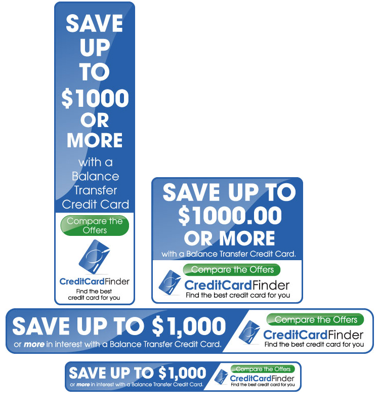
Ce client a reçu 11 designs de bannière de la part de 3 designers. Il a choisi ce design de bannière de David Smith comme design gagnant.
Inscrivez-vous Trouvez des Projets de Design- Garanti
-
 US$250
-
 11 designs
-
 3 designers
Brief de Design de Bannière
Project:
Creation of online advertising banners for use on Google AdSense network and for display advertising on MySpace.com
Headline to appear on all banners:
Save up to $1,000 or more in interest with a Balance Transfer Credit Card. Compare the offers on (logo)
Formats
- 728 x 90
- 468 x 60
- 300 x 250
- 160 x 600
Background:
Credit Card Finder (http://www.creditcardfinder.com.au) is a credit card comparison service that compares the best credit cards in the Australian market. It helps consumers to find the right credit card for them. CCF want to attract more people to our site to compare and apply for credit cards online. The primary focus is for customers to compare the card offers on our comparison tables and apply online as opposed to going to a bank, calling or going to the bank site directly.
Desired Outcomes:
1. Viewers click on the banner and go through to Credit Card Finder
2. New people click on the banner ad and go to our website, compare the cards and apply online
3. Get people to subscribe to our credit card email alert service
Note: Would prefer to have banners ASAP (sooner than 5 days if possible). Designers who act on it quickly, and supply great designs will most likely be awarded the winner
Mises à jour
Thanks for the great work so far - we are really liking the submissions :)
Question - does anyone that has submitted a design so far have the ability to create flash banners? We are also considering our options as we have heard that flash banners are sometimes more effective
Cheers
Jeremy
Marché(s) Cible(s)
- Australian Credit Card users
- 18+ male and female
- Savvy people wanting a better deal on their credit card
Secteur / Type d'entité
Credit Card
Exigences
Doit avoir
- - Need to quickly explain the simple concept that the website provides.
- Don’t want to use metaphors, prefer to use screenshots of the comparison table
- Simple 1 line headline with an easy call to action
Bien d'avoir
- - Suggest different headline to the one we''ve proposed
Ne doit pas comporter
- The design should not use old-style, serif fonts like Times New Roman. Do not include illustrations of money bags or gold bullions or tacky design elements you see on low quality money-related websites.