Get Thinny CANADA!
Vous souhaitez remporter un projet comme celui-ci ?
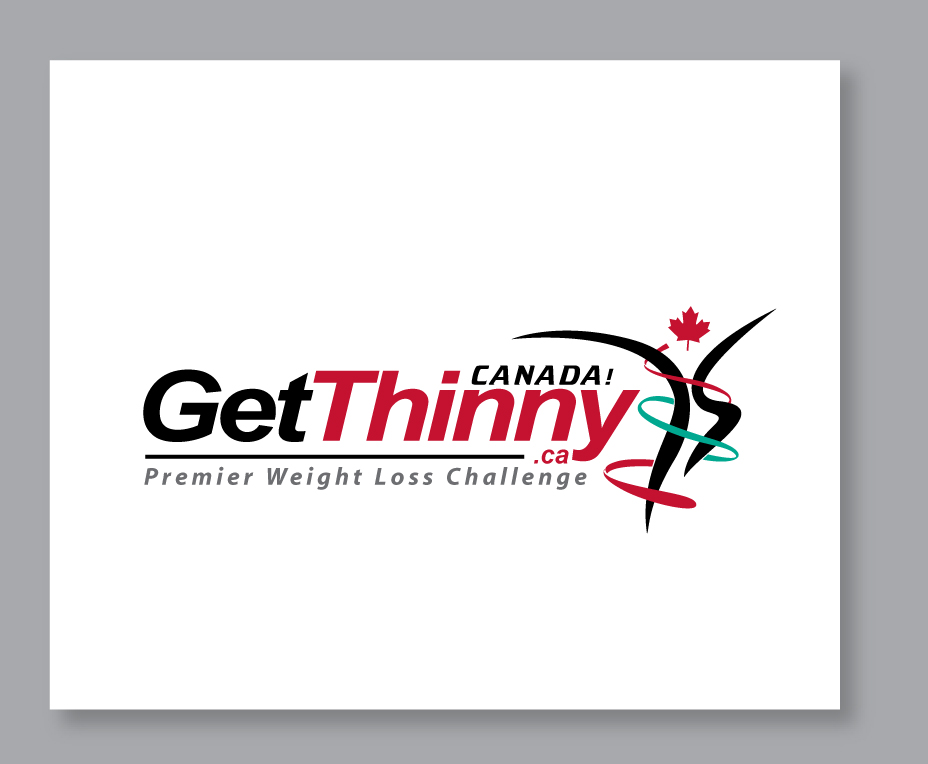
Ce client a reçu 115 designs de logo de la part de 29 designers. Il a choisi ce design de logo de Logo4smita comme design gagnant.
Inscrivez-vous Trouvez des Projets de Design- Garanti
-
 US$200
-
 115 designs
-
 29 designers
Brief de Design de Logo
We need a logo design for a Canadian Weight Loss Challenge with some of the following criteria:
- a simple bold, clean, modern design. Attention getting.
- GetThinny.ca CANADA! must be in logo. The '.ca' can be smaller or not as prominent or vertical.
- no space between GetThinny.ca using different fonts, colours, bold, upper/lower case.
- Subtitle 'Premier Weight Loss Challenge' (optional)
- a creative maple leaf logo with optional measuring tape
- Canadian official colors are red and white
- portray healthy weight loss (thinny = thin + healthy)
- portray Canadian pride. The more Canadian feel the better.
Marché(s) Cible(s)
80% women, age 18+
Secteur / Type d'entité
Weight
Texte du logo
GetThinny.ca CANADA!
Styles de logo qui vous intéressent
Logo pictural
Un objet réel (texte facultatif)
Aspect
Chaque curseur illustre les caractéristiques de la marque client et le style que doit transmettre votre design de logo.
Élégant
Audacieux
Léger
Sérieux
Traditionnel
Moderne
Sympathique
Professionnelle
Féminin
Masculin
Coloré
Conservateur
Économique
Haut de gamme
Exigences
Doit avoir
- Red, white and black colors. A modern! Clean, creative maple leaf.
Bien d'avoir
- Subtitle: Premier Weight Loss Challenge