Mobile device purchase and deployment for K-12
Vous souhaitez remporter un projet comme celui-ci ?
Ce client a reçu 19 designs Wordpress de la part de 2 designers. Il a choisi ce design Wordpress de pb comme design gagnant.
Inscrivez-vous Trouvez des Projets de Design- Garanti
- Projet Lié 2
-
 US$250
-
 19 designs
-
 2 designers
Brief de Design Wordpress
Seeking: a great eye, creativity and some good technical sense to design the basic theme, provide the skeleton for a website for a small business. The site functionality should be straightforward with the right wordpress theme and plug-ins; where I really need your expertise is the design and identity, hence the request for logo and business card design for consistent message.
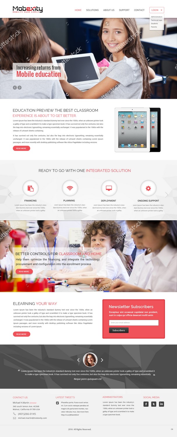
The business: We partner with private schools (mostly K-12, in the future perhaps colleges) to purchase, configure, deploy and manage mobile devices (mainly iPads), applications and content (ebooks, courseware, etc.) . Services include helping the schools determine the appropriate technology package (hardware, network, software support, services), help them optimize the financing, and integrate the technology procurement and configuration into the enrollment process. Our solutions are a combination of consulting, financing and technology management.
The users: Two key segments: School administrators and teachers will be interested in the solutions above, with an emphasis on the pedagogical advantages, ease of use and flexibility. Administrators will be interested in the above plus the option of making the solution a source of revenue to the school.
Parents and students will be interested in getting the latest devices, with hardware and software fully configured and supported, at a price comparable or favorable to buying it themselves, with the option for yearly upgrades to the latest technologies. Generally elementary school (a few), middle school (majority), high school. Many parents appreciate knowing that they can implement controls (functionality, apps, hours of usage, age restriction) similar to those of others in the school; others want to customize.
The feel: should be professional but friendly for non-techies; I tend to prefer more abstract and precise to cartoony; however I should acknowledge my own biases which are more technical and quantitative; Basic positioning is making the complex simple for schools and for parents.
Style: Can’t go wrong with Apple-inspired design. See http://www.apple.com/education/it/ for the type of positioning, strengths, and basic messaging. Note that this is part of campus-based technology offering. Prefer clean, plenty of white space. Ok to contrast with detail when merited (love graphs, charts, creative use of visual display of quantitative info)
Platform: Must be responsive (i.e. look good and have all functionality on desktops, laptops, tablets. Phones would be ideal but understand there may be trade-offs. Strongly prefer Wordpress as a CMS platform because of full range of plug-ins and ability to change hosting providers and themes (minimal lock-in).
info-Architecture: Open to alternatives but here’s current vision for top-level pages: Home/Solutions/About Us/Support. Home is landing page. Solutions describes what we do and describes different options, mainly for administrators and teachers. About us describes the company and has contact info. Support page will be knowledge base and ticketing system, probably by framing a support solution (freshdesk or zendesk). Footer will have links to terms and conditions, copyright info.
A key functionality will be the ability to add client-organization landing pages. Example: www.domainname.com/schoolname should show a school specific landing page. Initially this will be an order form, with default options selected for that school. Over time, it may become a client portal with log-in and dashboard functionality, downloadable documentation for that school's users.
Logo/identity. I will upload current working draft of logo; feel free to use/adapt/ignore or simply take it as input. Our basic selling point is “mobile education...made simple” which could be a tagline if it works. “Could be “mobility...made simple”. We also talk about "increasing returns to education" based on the concept of "convexity". (More on this below.)
The design element that appealed to me is in the “x” since the name of the service is combination of mobility and convexity, so I like the idea of a curves and lines (like a graph and parabola); convexity technically describes the curve in a type of graph. (Can be looked up for examples, search for convexity - often finance but the idea is increasing returns to scale, so applied to education, "increasing returns to education".)
Marché(s) Cible(s)
The users: Two key segments: School administrators and teachers will be interested in the solutions above, with an emphasis on the pedagogical advantages, ease of use and flexibility. Administrators will be interested in the above plus the option of making the solution a source of revenue to the school.
Parents and students will be interested in getting the latest devices, with hardware and software fully configured and supported, at a price comparable or favorable to buying it themselves, with the option for yearly upgrades to the latest technologies. Generally elementary school (a few), middle school (majority), high school. Many parents appreciate knowing that they can implement controls (functionality, apps, hours of usage, age restriction) similar to those of others in the school; others want to customize.
Secteur / Type d'entité
Education
Coordonnées pour la Carte de Visite
Please see attached business card; note that the mailing address has changed. It is now 52 Hamilton Drive Portsmouth, RI 02871. Other details
Texte du logo
Mobility made simple or increasing returns to education - see attachment for current version, feel free to use as input and/or improve on; or come up with something better
Styles de police à utiliser
Aspect
Chaque curseur illustre les caractéristiques de la marque client et le style que doit transmettre votre design de logo.
Élégant
Audacieux
Léger
Sérieux
Traditionnel
Moderne
Sympathique
Professionnelle
Féminin
Masculin
Coloré
Conservateur
Économique
Haut de gamme
Exigences
Doit avoir
- Modern, precise feel. I've always been told to stick with reds and blacks plus white, but that may be outdated advice these days.
Bien d'avoir
- Business card should have a QR code that should be non-disruptive, i.e. either small or integrated into design in a creative way. I can generate new QR, willing to use colors or other new approaches.
Ne doit pas comporter
- Avoid cartoonish figures, please. Generally prefer logo types to logos (e.g. FEDEX logo or UPS over an abstract image of a computer).
Fichiers
Télécharger tous les fichiers - 1,2 MB
Paiements
Total
US$250
Date limite du projet
22 mars 2016 17:14:50 UTCOptions du projet
Projet(s) Lié(s)
- offrant un design de logo de US$69 au gagnant
- offrant un design de carte de visite de US$29 au gagnant